infographics
-
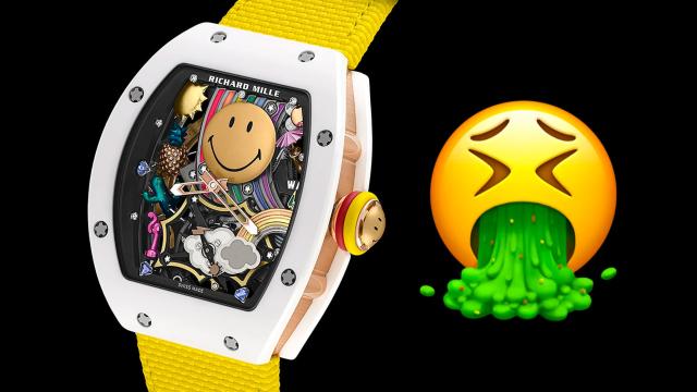
This $1.22 Million Emoji Watch Is Best Summed Up With One Emoji

As much as I love my smartwatch, I can still appreciate the design and engineering that goes into a traditional mechanical timepiece — most of the time. Richard Mille hopes to capitalise on the era of mobile devices and the devolution of the written word with a new watch packed full of three-dimensional emoji, but…


-

Largest Cave Art in North America Discovered in Alabama
A team of researchers scanned the roof of a limestone cave in Alabama and discovered several massive Native American mud glyphs that are estimated to be about 1,500 years old.


-
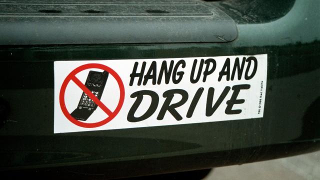
What Are The Worst Bumper Stickers You’ve Seen?
I truly cannot find a single good thing to say about bumper stickers. I don’t know how anyone feels strongly enough about a cause to commit to slapping a bunch of stickers on their precious vehicle (although I know people feel the same way about my tattoos). But I know you’ve all seen some incredible,…

-

These Are The Cars Of The Solar System
Who here likes planets? I know I do—hell, I even live on one! I suspect there’s many fellow planet-enthusiasts out there, which is why I decided to do this: try and find cars named for every planet in our solar system, including our disrespected pal, the dwarf planet Pluto. Aside from a couple of well-known…