A new simulation produced by NASA’s Data Visualisation Studio packs four months of swirling atmospheric activity into a two minute clip that reminds us how unrelenting this past hurricane season really was.
This looks like a timelapse pieced together from images taken by satellites, but it isn’t. Rather, it’s a computer simulation based on real data. Specifically, the model is showing the progression of aerosols – wafts of sea salt, dust and smoke – blowing through the atmosphere from July 31 to 1 November 2017. This visualisation was churned out by the Goddard Earth Observing System (GEOS), a system of maths models developed by the Global Modelling and Assimilation Office (GMAO) at NASA’s Goddard Space Flight Center.
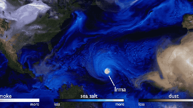
What’s particularly neat about this video is that the hurricanes kind of appear by accident. Hurricanes aren’t aerosols, but because the NASA scientists were tracking the stuff carried by wind around the atmosphere, they were able to visualise the various storm systems as they moved across the Atlantic. NASA explains:
During the 2017 hurricane season, the storms are visible because of the sea salt that is captured by the storms. Strong winds at the surface lift the sea salt into the atmosphere and the particles are incorporated into the storm. Hurricane Irma is the first big storm that spawns off the coast of Africa. As the storm spins up, the Saharan dust is absorbed in cloud droplets and washed out of the storm as rain. This process happens with most of the storms, except for Hurricane Ophelia. Forming more northward than most storms, Ophelia travelled to the east picking up dust from the Sahara and smoke from large fires in Portugal. Retaining its tropical storm state farther northward than any system in the Atlantic, Ophelia carried the smoke and dust into Ireland and the UK.
It’s a gorgeous simulation for sure, but scientists can use models like these to understand all the different things that go on in our atmosphere and how they all fit together to produce weather.