After wearing my Apple watch daily for the past two+ months, I’ve found myself wishing for a simpler interaction model for moving between content and apps. Here’s what I’d propose and why.
The vast majority of my interactions with the Apple Watch involve notifications. I get a light tap on my wrist, raise my arm, and get a bit of useful information. This awareness of what’s happening helps me stay connected to the real World and is the primary reason I enjoy wearing a smartwatch.
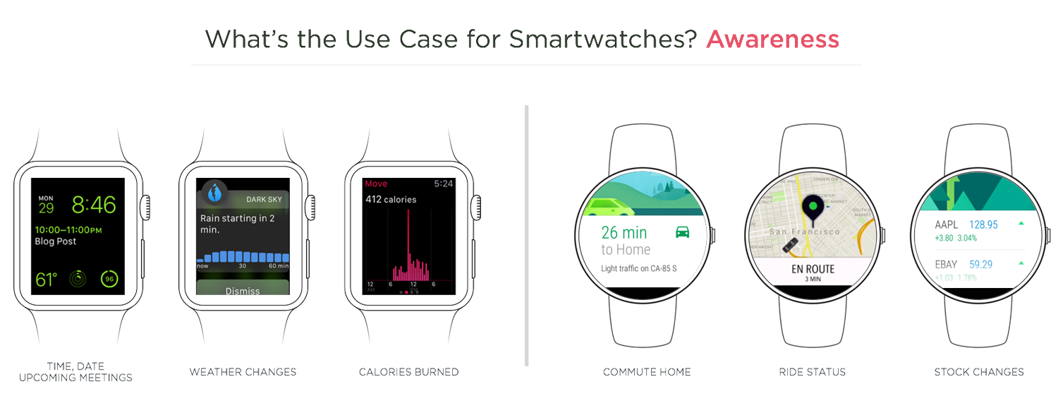
Thanks to “long look” notifications, I’m also able to take action on some notifications — mostly to triage things quickly. Much more rarely do I engage with Glances and even less with apps. This creates a hierarchy of use: notifications, glances, apps.
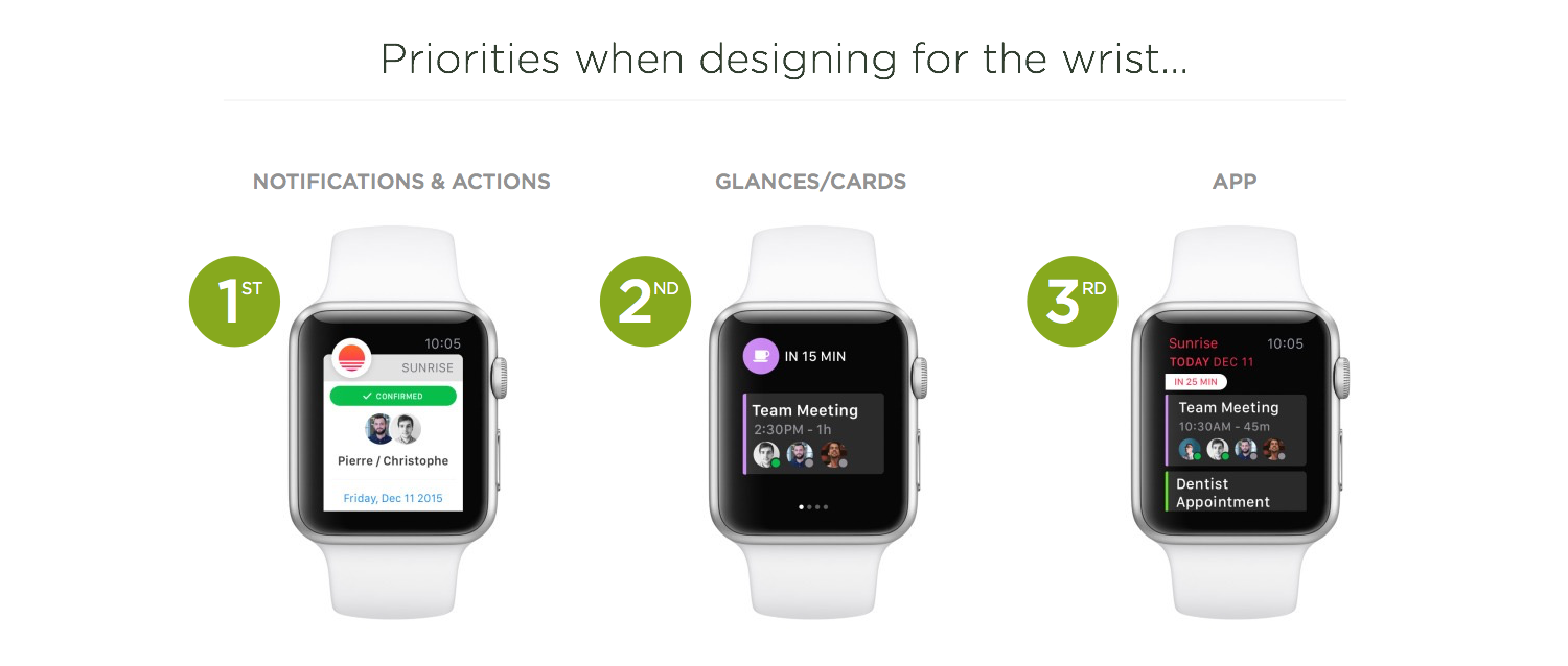
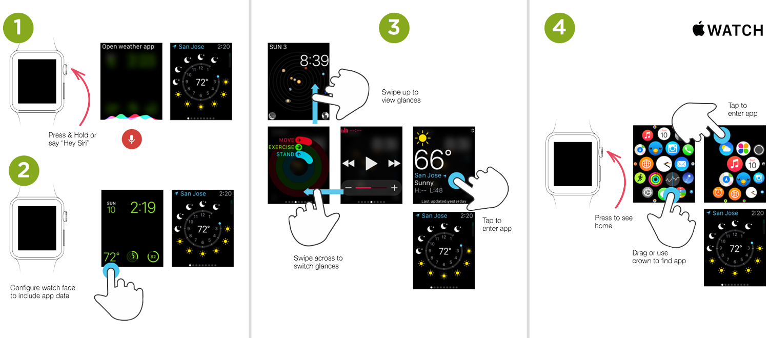
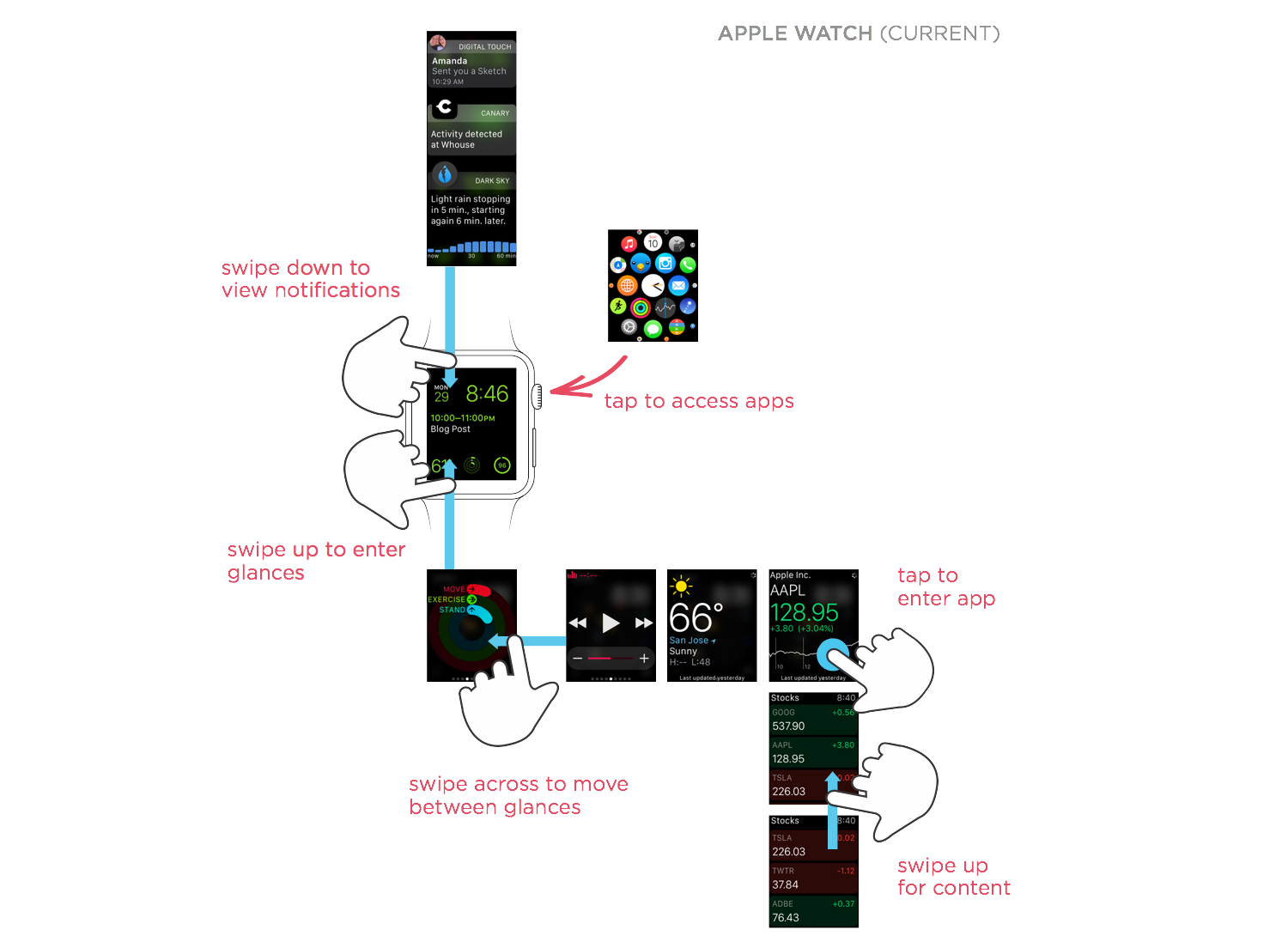
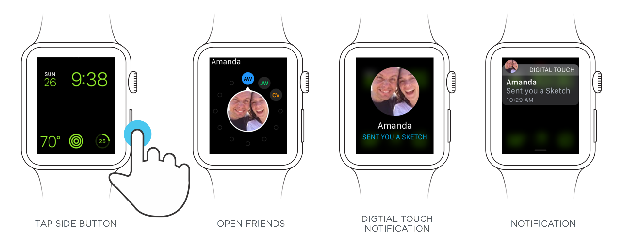
Unfortunately, the Apple Watch’s interaction model doesn’t echo this hierarchy. Instead, there’s a lot of emphasis on apps, which seems to create more UI than is necessary on your wrist. Consider for starters, all the ways to access an app on the Apple Watch (not counting the special case of the Friends app).
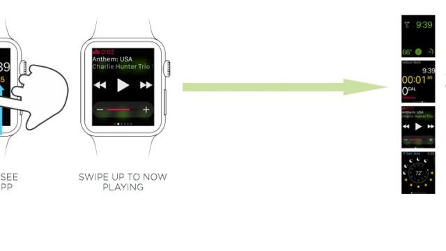
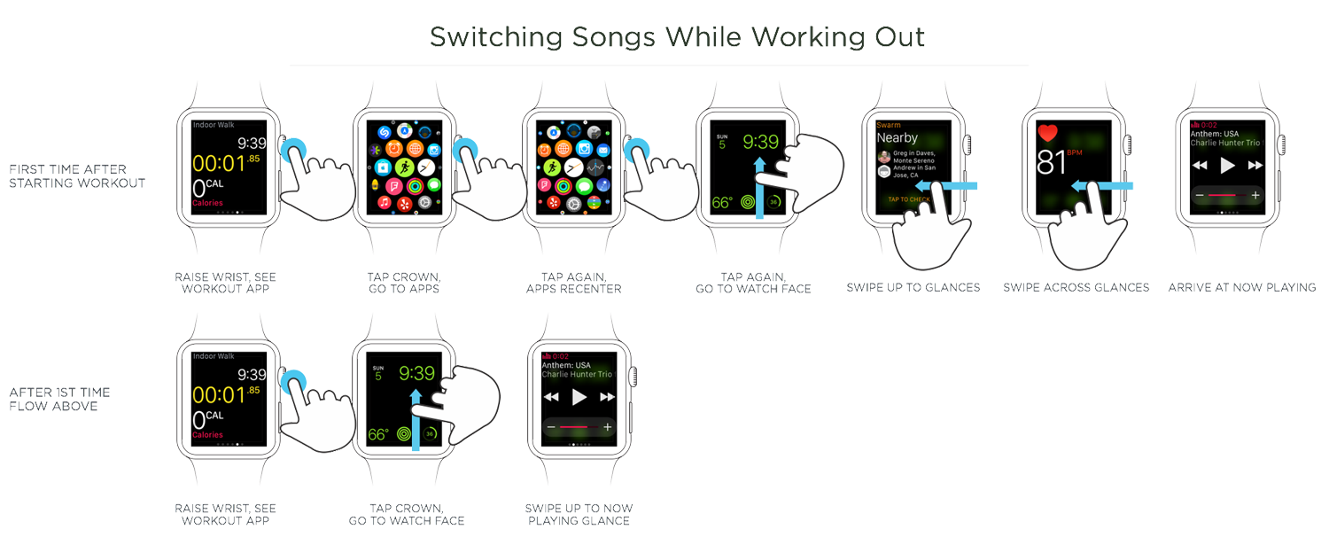
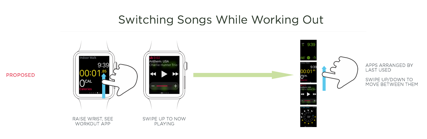
This structure makes the times when I do use apps needlessly complex. As an example, the common use case of listening to music while working out requires moving between watch faces, glances, and apps.
There’s also an app-only way to accomplish the same task but with different results.
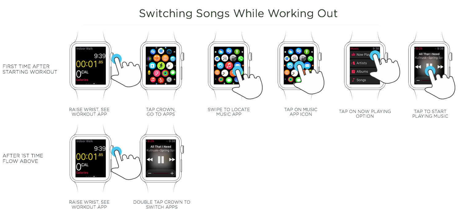
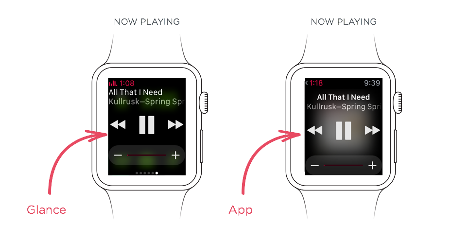
So switching tasks using Glances requires a trip to the watch face and a swipe up but switching tasks using apps requires double-tapping the digital crown. All this is made more confusing when you compare the Music Glance and app: which is which and why does using each result in different OS-level behaviour?
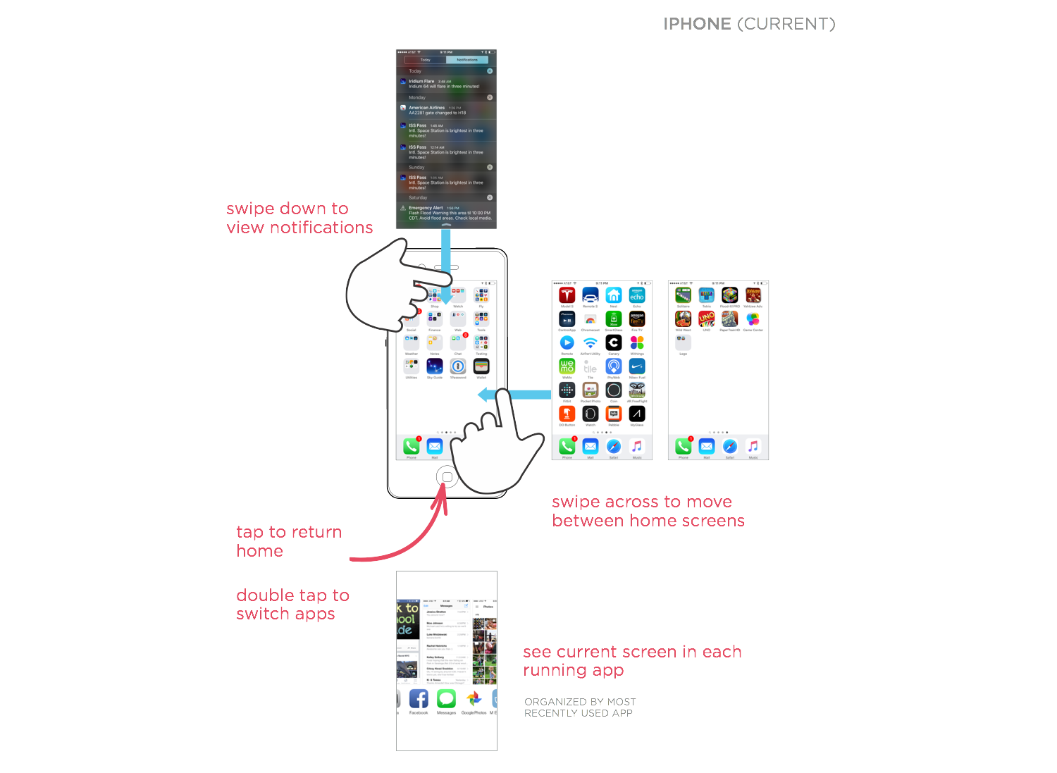
Looking at the interaction model of the iPhone suggests an alternative. Why not echo that (now familiar) structure on the Apple Watch?
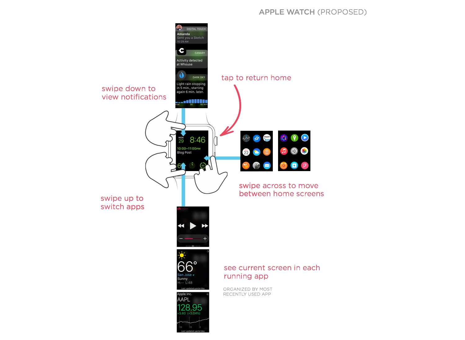
Comparing the current Apple Watch interaction model with this change illustrates the simplification. In the redesign, there’s one layer for home screens (filled with apps and/or complications), one for notifications, and one for currently running apps.
Glances are replaced with the ability to scroll through active apps. But that doesn’t mean “glance-able content” goes ways. In fact, each app could have a “glance-like” home screen as its default (it could even be the Glance) but also display its last used screen when appropriate (like after you’ve recently interacted with the app).
With this model, switching between two active apps is trivial, just swipe up from the bottom to move between them with no confusion between Glances and apps. To return to the watch face, simply press the home button.
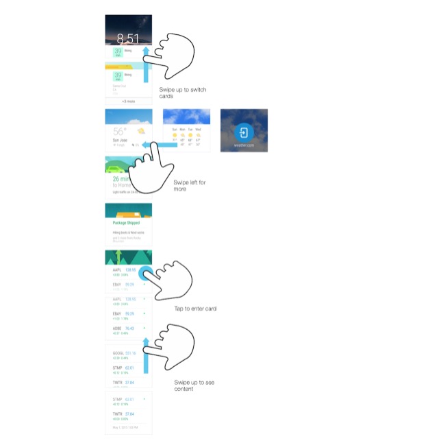
Android wear has had a similar interaction model from the start. Just swipe up from the bottom of the watch face to scroll through active (relevant) apps. Then tap on any app to go deeper.
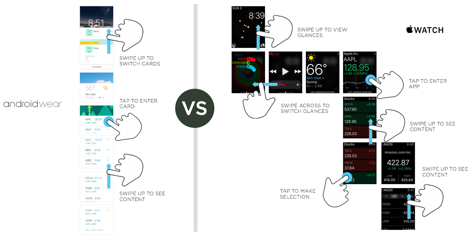
This approach also allows you to scroll through the content within each app easily. Want to go deeper? Simply tap a card to scroll within it, or swipe across to access other features in the app.
When wearing an Android Wear smartwatch, I found myself keeping up with more than I do when wearing the Apple Watch. A simple scroll up on Wear would give me the latest content from several apps ordered by relevance.
In their current state, Glances on the Apple Watch don’t give me that lightweight way of staying on top of the information I care about. Their inclusion in the Apple Watch interaction model seems, instead, to complicate moving between tasks (and apps).
Perhaps this is simply an artifact of what’s possible with the first version of Apple Watch given the current long loading times for apps and Glances. If so, Apple’s interaction model may well be a good fit when performance on the Watch improves.
Or perhaps third party complications will offer a better way to keep up with timely information. In which case, the multiple home screen model I proposed above could give you an effective way to move across multiple watch faces complete with distinct app launchers and complications.
Regardless of how things end up, it’s hard to argue there’s not room for improvement on the wrist.
Luke Wroblewski is an internationally recognised digital product leader who has designed and built software used by more than one billion people worldwide. This post originally appeared on his blog and is syndicated here with permission.