Climate change is happening: global temperatures are rising. Unpicking why it’s happening is of course notoriously difficult, but this interactive chart correlates the observed temperature rises with the effects provided by various natural and man-made sources. The results are pretty damning.
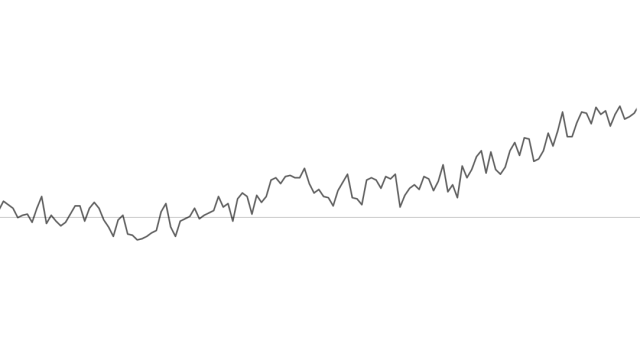
The chart was created by Bloomberg using data from NASA’s Goddard Institutes for Space Studies. Up top on the page is a chart of observed temperature rises since 1880; you can see that the average global temperature has risen by 0.8C. Now, the chart lets you explore what kind of effects other sources may have had. Let’s take a look at just a handful of the ones they offer up. So, was it…. the sun?
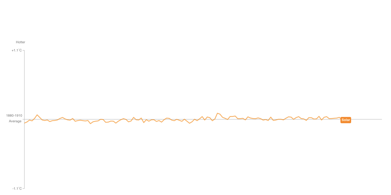
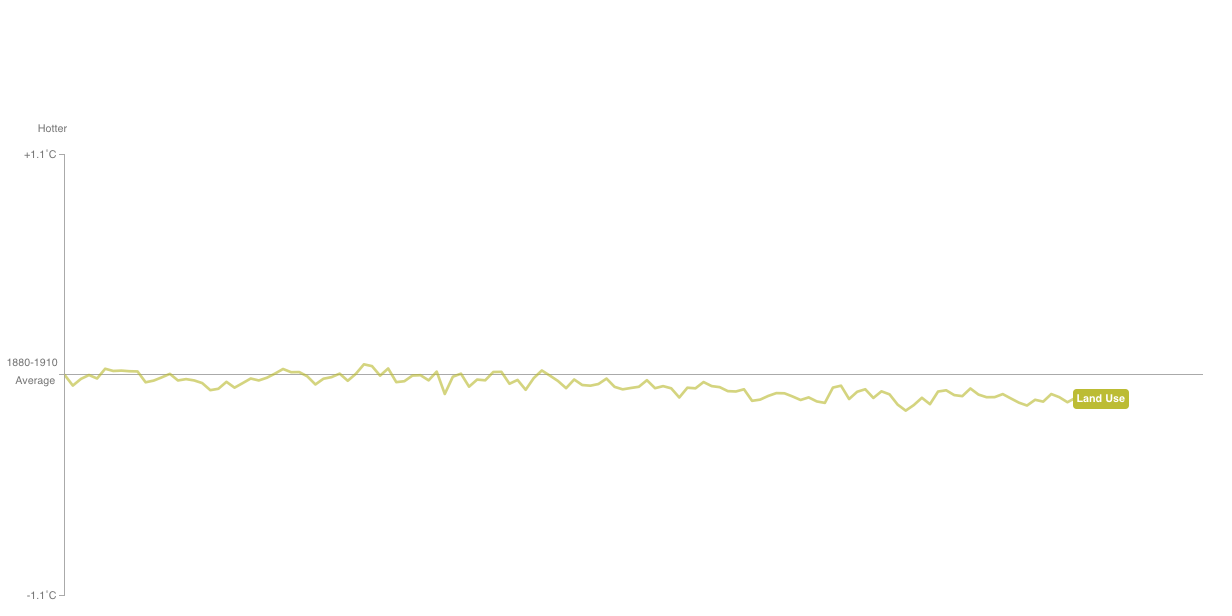
Nope! How about… deforestation?
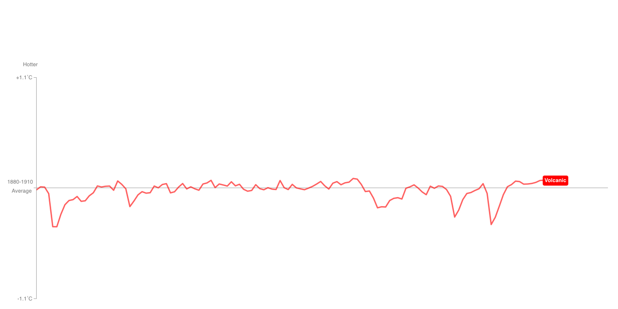
Doesn’t look like it. Let’s go left-field: might it be volcanoes?
Oh how about this one? It looks more like it. This is greenhouse gasses.
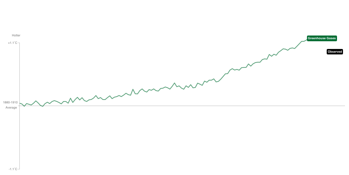
Yep. If you look at the observed temperature rises and compare it to the effects causes by greenhouse gasses, you find an almost exact match. Of course, if you’re not satisfied by this slightly snarky approach, then you can convince yourself at leisure with Bloomberg’s interactive chart which provides more effects to study and compare. It’d definitely worth exploring.