If you’ve logged onto the Internet Archive recently, you might’ve noticed that humanity’s ultimate information dump has a pretty new face. And about time too.
The Internet Archive is a digital library with a Herculean task: providing “universal access to all knowledge”. It houses over 10 petabytes — that’s 10,000,000,000,000,000 bytes — of information. It’s got music, videos, books, software and snapshots of basically the entire internet.
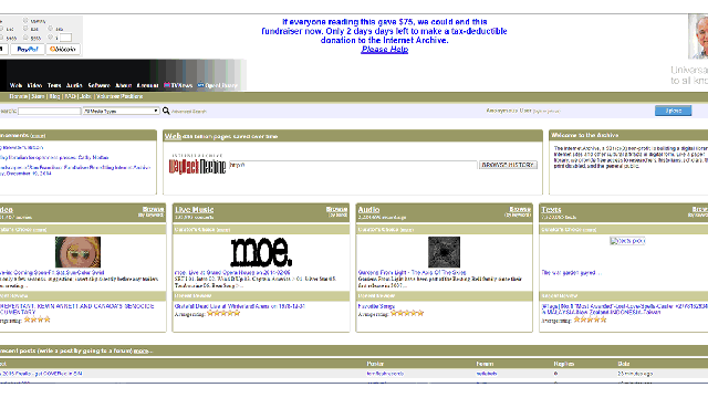
Presenting that much information to the general public requires one hell of a good website, something that the Archive has traditionally lacked. The old design, which has lingered for years, feels like a parking-ticket portal merged with a fly-fishing forum. It’s the very opposite of user-friendly, with unintelligible walls of text, and visual design that just screams public library.
That’s why the not-for-profit has slowly but surely been rolling out a new design to users. The beta went live back in February, and 85 per cent of users are now meant to be seeing the new page. It’s sleeker, far less cluttered, does not involve the words ‘501(c)(3)’ anywhere on the home page — and, most importantly, actually works on mobile and tablet devices.
That’s not just good news for work-obsessed bloggers who like stalking old versions of websites. The Archive has a stupendous amount of cool stuff hidden away, like the thousands of playable MS-DOS games, the 1982 E.T. Atari game, and things like TV news footage from 9/11.
The new design makes it far too likely that you’ll get sucked into a fantastic vortex of old internet culture. Libraries are meant to be repositories of human knowledge; think of this redesign as the 21st Century Dewey Decimal Classification. But with flatter design.