From psychedelic rock posters to modernist film titles, it might seem like the graphic output from California means anything and everything goes. But there’s a particular California spirit when it comes to design.
That’s what Louise Sandhaus argues in her new book Earthquakes, Mudslides, Fires & Riots: California and Graphic Design, 1936-1986, an ongoing examination of what gives the state its visual distinctiveness.
The book features exuberant, experimental specimens from hundreds of designers, splayed out across the pages with bright fluorescent pink and orange gradients, like the late summer sun sinking over the Pacific. Like the independent, free-spirited work that fills the pages, this is Sandhaus’ personal take on the topic. “It’s not a survey,” says the graphic designer and professor at California Institute of the Arts — many important people working in the state’s history were left out.
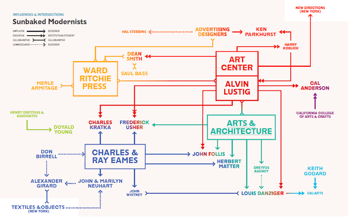
Infographics showing influences are also part of each section, as seen here for ‘Sunbaked Modernists’
Instead, Sandhaus was inspired by British critic Reyner Banham’s Los Angeles: The Architecture of Four Ecologies, the canonical 1976 book about LA’s built environment, which provided a fresh narrative on the city’s design by dividing it up into four typologies. In the same way, Sandhaus’s categories like ‘Sunbaked Modernism’ and ‘California Girls’ allowed her to create a new context for looking at California’s design during its formative years, and to discover new voices based purely based on their work.
Through a research process 14 years in the making, Sandhaus began the project by poring over annuals and through archives, enlisting her students at CalArts to help find under-appreciated design and designers — or in many cases, attaching proper credit and biographies to pieces they found. She also asked legendary designers working in the state for influential but perhaps forgotten voices which inspired them during their formative years. “So much was untold,” she says. “These were people who were highly regarded in their time and then disappeared.”
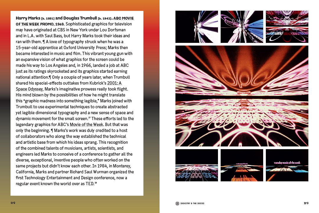
In a spread from the book, the motion graphic work of Harry Marks and Douglas Trumbull shows the convergence of modernism and Hollywood
Sandhaus’ work continued even after the book was finished. Her students at CalArts are building an online, editable repository for the work that didn’t make it into the book and continuing to discover gems from the era. Sandhaus also held an Antiques Roadshow-like event last week in LA, where people brought in anything from graphic t-shirts to yellowing zines to try to identify the designers behind these objects who have been lost to time.
Here are some of the more unusual examples from Sandhaus’s book, with her commentary that illustrates the enthusiasm, activism, and often incredible sense of humour which pervades California’s graphic landscape.
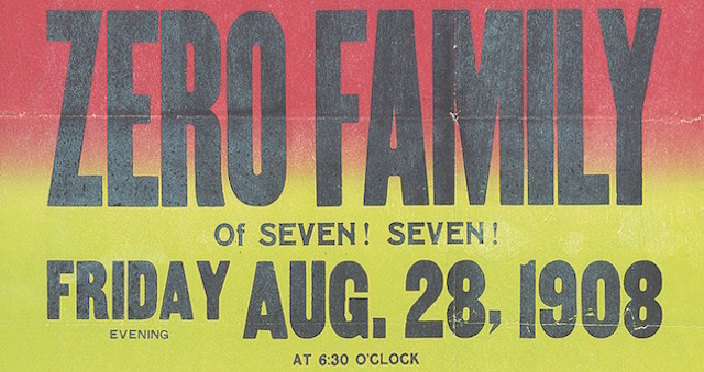
The original San Francisco gig poster
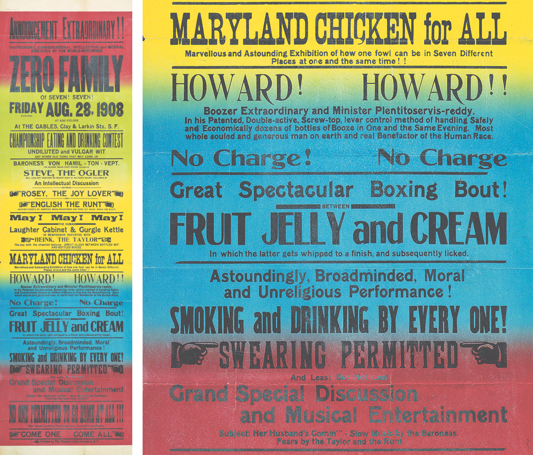
Henry Taylor [d. 1937], PARTY INVITATION, 1908, 18 x 42 IN.
“In San Francisco in 1908, printer Henry Taylor decided to have a dinner party,” says Sandhaus. “He wrote and printed this approximately 18″ x 42″ poster for his seven friends. I was looking at archival issues of Oracle, the publication that popularised the ‘split fountain’ or ‘rainbow roll’ affect that later became a visual trope associated with California hippiedom. But then the archivist at the University of California, Davis library pulled out this fantastic gem. It may have been the first use of the rainbow roll in California!”
The undersung modernist cover artist
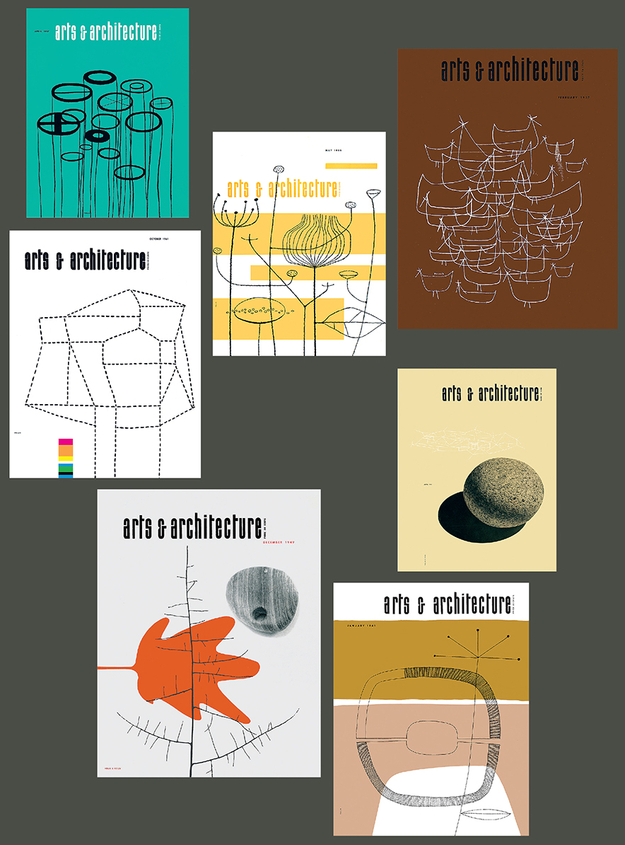
John Follis [1923-1994], ARTS & ARCHITECTURE COVERS, 1950 — 57, EACH 10 x 12, 3/4 IN.
“The attention-worthy graphic design of Arts & Architecture magazine is well-established and John Follis is a household name for the modernist planters he created for Architectural Pottery. He also helped to establish the field of environmental graphics. But it was a revelation to recognise that my favourites of the A&A covers had all been designed and illustrated by Follis,” says Sandhaus. “His distinctive simple palette, with abstract drawings or simple photos, and patterns are especially satisfying — particularly when they are viewed collectively.”
The Mad Men of the West Coast
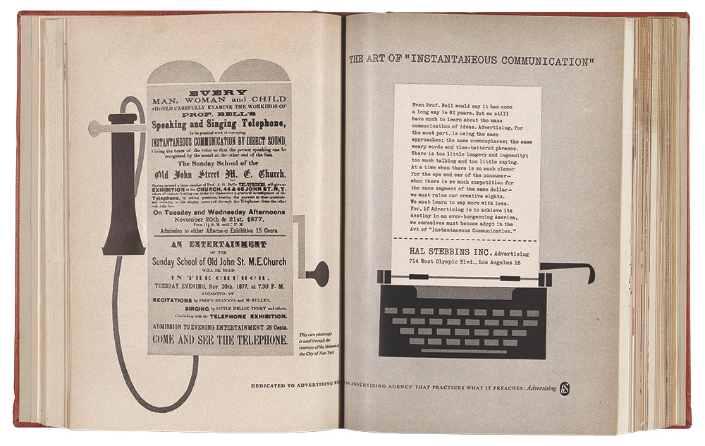
Advertising Designers: Louis Frimkess [1912 — 1979], Ken Parkhurst [b. 1925], and Edd Smith [dates unknown], HAL STEBBINS INC. AD, 1959, APPROX. 11 1/4 x 16 1/2 IN.
“This ad was spotted in Western Advertising an industry trade journal,” says Sandhaus. “It was created by Advertising Designers for Hal Stebbins Advertising, Inc. to sell modern advertising and design. According to Lou Danziger [another LA designer from the same era], Advertising Designers was once an important studio in LA for modern design but recognition of the studio and the work they did seems to have pretty much disappeared.”
The Charles and Ray Eames of illustration
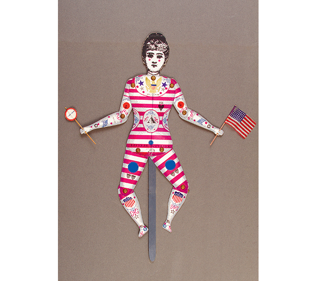
John Neuhart [1928 — 2011] and Marilyn Neuhart [b. 1930], “A FOURTH GREETING,” 1957, 6O x 16 IN.
“An articulated puppet card made for the Fourth of July. When Marilyn Neuhart shared a secret labors-of-love stash done by the couple with their own letterpress, wood type collection, and patient hands, I thought I’d died and gone to design heaven,” says Sandhaus. “It was torture to pick which examples to include at the expense of other equally delicious examples.”
The firm that invented must-see TV
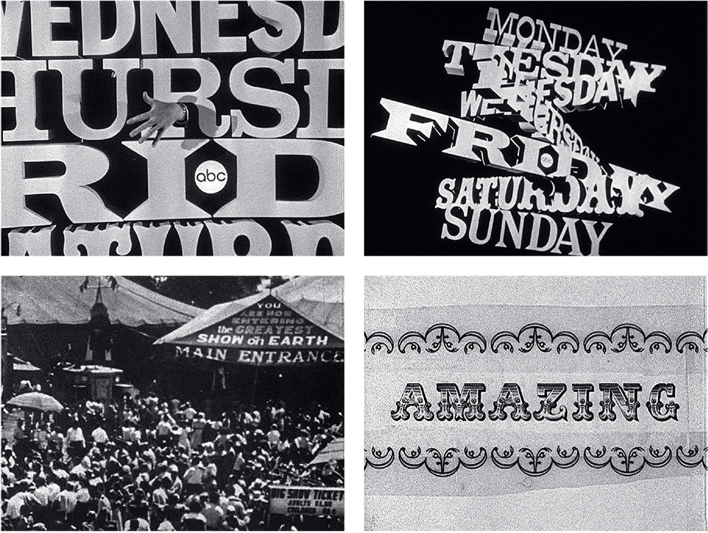
John Urie and Associates [1927-2010], ABC 1964-65 FALL SEASON PROMO, 1964
“I likely stumbled on this work after speaking with Harry Marks, the man who transformed broadcast graphics when he started working for ABC in 1966,” says Sandhaus. “He mentioned someone who was doing the promo work prior to his hiring and a YouTube search led to this energetic promo and bit digging to John Urie and Associates.”
The Saul Bass of video games
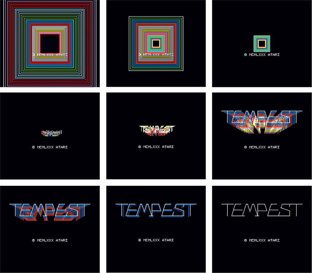
David Theurer [b. 1950], TEMPEST, ATARI ARCADE VIDEO GAME, 1980.
“While a legend in the game design world, Theuer’s contributions to title design are lesser known,” says Sandhaus. “A conversation with grad student Edwin Alvarenga about arcade games and motion graphics led to ingenious and masterful 8-bit vector titles.”
The album cover geniuses
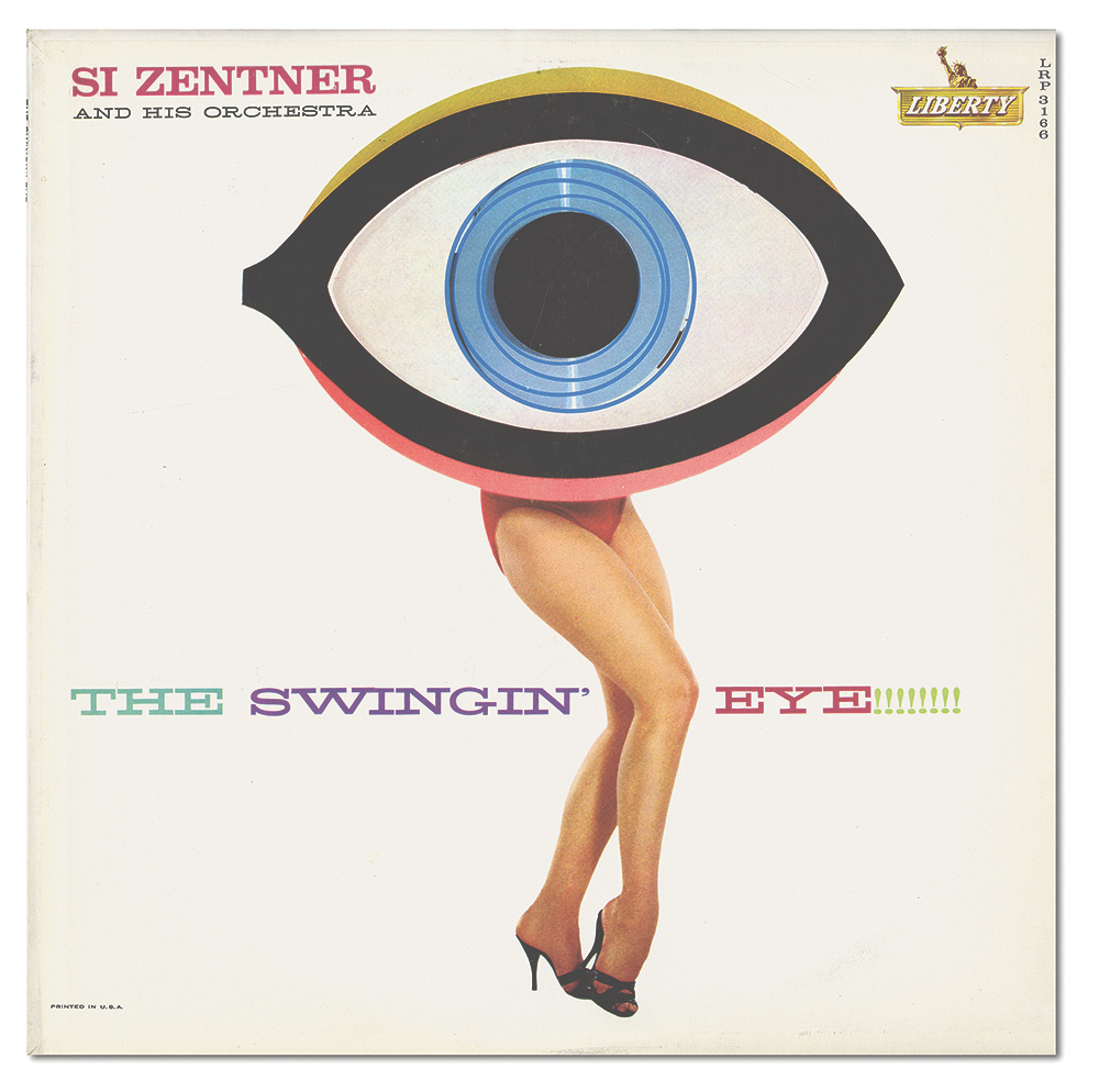
Bill Pate [dates unknown] and Gene Howard [1920 — 1973], THE SWINGIN’ EYE!!!!!!!! ALBUM COVER, 1960, 12 3/8 x 12 3/8 IN.
“Credit for this whimsical discovery goes to the keen eye of punk design legend, Art Chantry,” says Sandhaus. “Created by design group Pate/Francis who later became Group Five, the collective created thousands of genre record covers that have yet to celebrate their day in the California sun!”
The original hippie zine
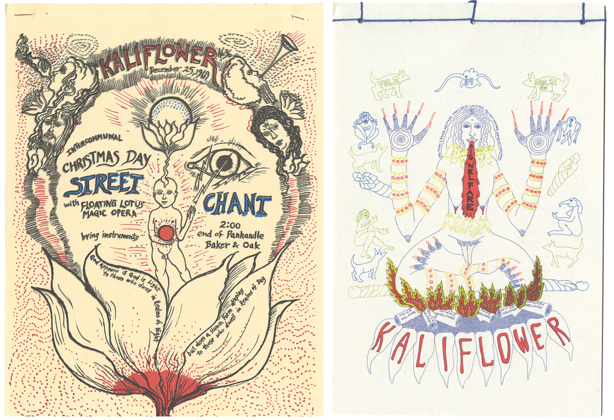
Anonymous, KALIFLOWER, VOL. 1, NO. 36, DECEMBER 25, 1969, 8 1/2 x 11 IN. and KALIFLOWER, VOL. 2, NO. 39, JANUARY 21,1971, 8 1/2 x 11 IN.
“While the graphic contributions of professional graphic design ‘outsiders’ like Sister Corita have been well-documented, the crude artistic enthusiasms of the “Kaliflower” commune that stretch graphic design parameter have escaped attention.”
The women who turned department store ads into art
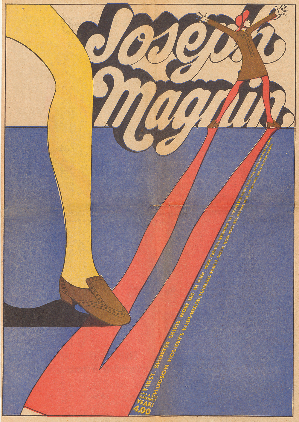
Marget Larsen [1922 — 1982] and Betty Brader [1923-1986], “IT’S A LEG WATCHER’S YEAR!” FULL-PAGE JOSEPH MAGNIN AD, 1967
“Marget Larsen is known in some design circles, but not nearly to the degree of the impact she several times over,” says Sandhaus. “This ad is just one vibrant example of the work she did for the department store, Joseph Magnin. This ad was among a cache of Larsen’s work done will fashion illustrator Betty Brader, shared during a visit with Magnin family members.”
The supergraphics pioneer
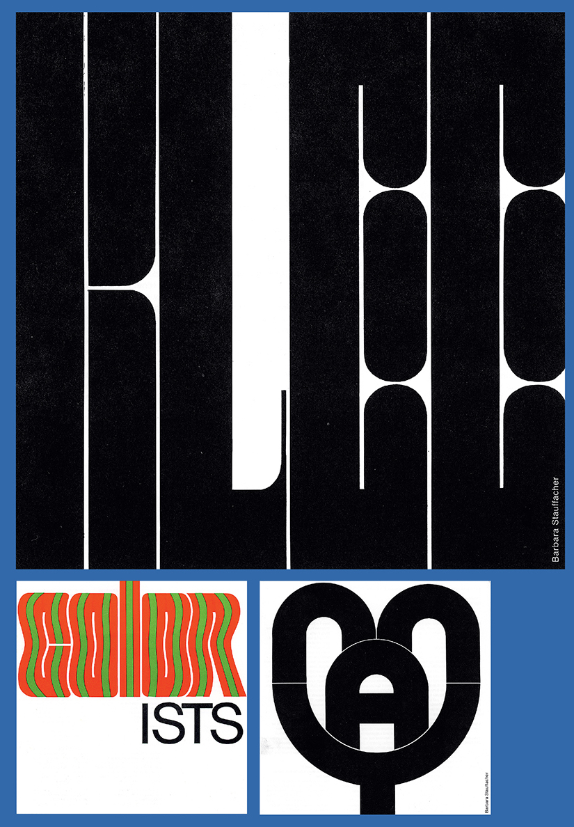
Barbara Stauffacher Solomon [b. 1928], MONTHLY CALENDARS FOR SAN FRANCISCO MUSEUM OF MODERN ART, 1965 — 71, 7 x 7 IN.; 21 x 28 IN. UNFOLDED.
“Solomon’s contribution to Super Graphics — espec ially for Sea Ranch — are fairly well-known, says Sandhaus. “These calendar graphics I recalled seeing years ago in the catalogue for the Graphic Design in America exhibition (1989) catalogue, but it was shock ‘n awe when Solomon brought out her stash of the dozens and dozens of these calendar covers that she hand-lettered during the six year period in which she created them.”