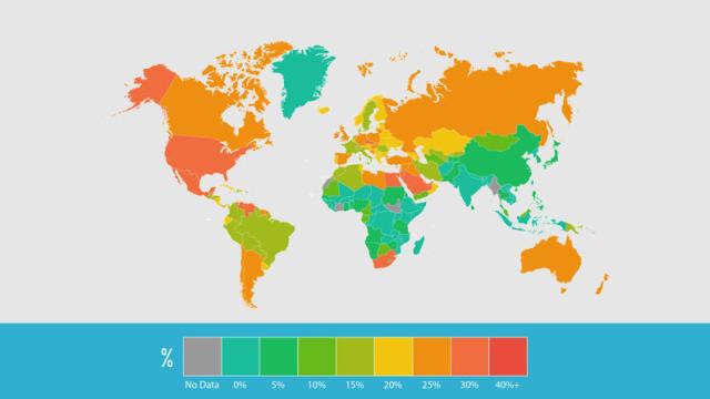
Obesity has hit Australia hard in recent years — but how do our waistlines compare to those around the world? This map, put together from recent obesity data obtained by the CIA, shows that Australia is not alone.
The map, put together by Clinic Compare, shows that the percentage of the population that is clinically obese. Sure, a quarter of Australians are obese, so too Britons. But there are some surprises on the map: 33 per cent of Saudi Arabians, 32 per cent of Mexicans and 30 per cent of Argentinians and are dangerously overweight, for instance.
Western fast food culture, processed food and a lack of exercise is making the entire world fat. Maybe it’s time we all got off our arses. [Clinic Compare]