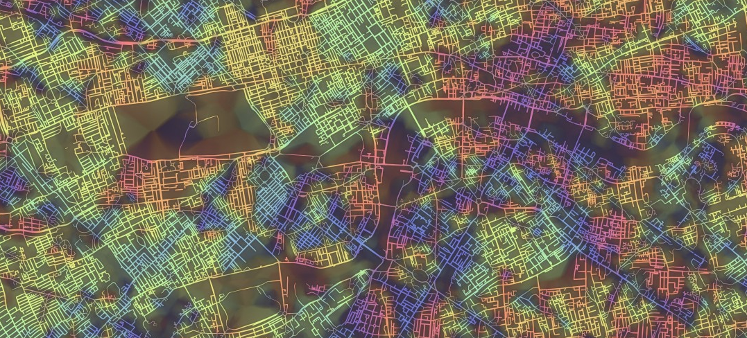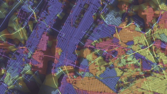
These gloriously rich maps, dripping in trippy neon colour, are more insightful than they may first appear — because their hue actually reveal similarities in the way city streets are oriented.
Made by Stephen Von Worley, the maps reveals similarities — and differences! — in town planning, from monotonous grid iron to quirky organic sprawl. He explains:
That’s every public street, coloured by the predominant orientation of itself and its neighbours, thickened where the layout is most “grid-like” — to use an old-school woodworking metaphor, it’s as if we brushed some digital lacquer over the raw geographic transportation network data to make the grain pop.
There are interactive maps for San Francisco, New York, Washington DC, Los Angeles, Tokyo and more over on his site. New York, above, is interesting: look at the repetition in Manhattan, which only breaks at the southern tip and is in stark contrast to Brooklyn. But if you want a real mess, check out London, at the bottom. You’d wonder how anyone found their way around!
If you’re interested, he also explains the code behind the maps in some detail — or you could just stare at them, all day long, transfixed. Your call! [Data Pointed]