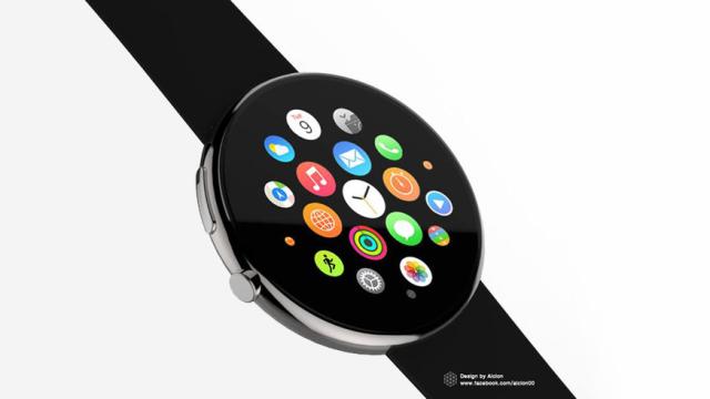
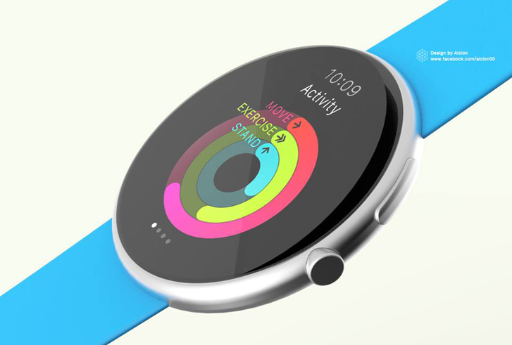
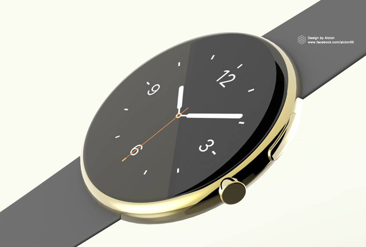
The new Apple Watch was a very exciting surprise: a device with bucketloads of potential that’s also just a wonderfully sophisticated thing to wear too. But what if it were a bit more… round?
These renders, which have appeared on Facebook, show what the new Watch UX from Apple would look like if it sat on a circular screen. And, honestly, we have to say: it looks pretty damn great. The home screen, with its circular icons; the 360-degree health monitoring; even the conventional watch face. They all look so nice on a circular screen.
Of course, we’ve seen such hardware design before in the shape of the Moto 360. It’s not one without its own problems: anything that uses a lot of text, for instance, doesn’t work particularly well on a round screen. But many of the aspects of the Apple UX seems to fit so well with the round face.
Of course, a circular Apple Watch would bring its own problems. The super-smart crown, for instance, wouldn’t work so well, and squeezing the guts into a circular space is far more of a headache for its engineers. (And at an rate, Apple already has a task ahead of it to build a rectangular watch).
But whatever. What we know is that the round case and face look amazing. We just hope that one day — even if it is some way in the future — Apple might make one for us. [Facebook via Phone Arena via Pocket-Lint]