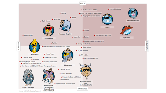
By now, there are so many NSA revelations that it’s hard to discern one from the other. Fortunately, Pro Publica has put together this lovely chart that shows which of the agency’s missions are most controversial.
The data sits on an interactive grid where x-axis relates to location (domestic at the right, foreign at the left) and the y-axis specificity (bulk at the top, targeted at the bottom). Yes, it is inspired by the New York Magazine approval matrix.
But! It’s pretty interesting, even if you’ve barely followed the NSA story. So the phone metadata and PRISM projects, which you’re most likely to have heard about, sit in the quadrant dedicated to bulk, domestic spying — rightly the most controversial amongst US citizens. It’s also worth noting that the targeted domestic quadrant is mercifully bare.
But the biggest take-home? Just how many there are. Go check out the actual grid, which provides details of each project too. [Pro Publica]