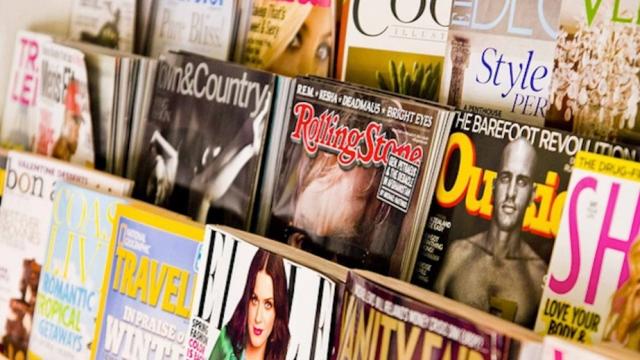
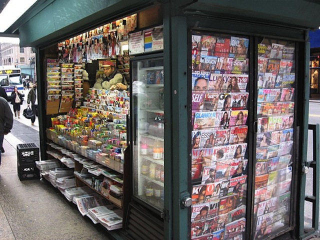
You know the saying: you can’t judge a book by its cover. With magazines, it’s pretty much the opposite. The cover of a magazine is the unified identity for a whole host of ideas, authors, and designers who have created the eclectic array of stories and articles and materials within each issue. And, some would argue, this identity extends to the reader as well.So if, say, you’re seen with an issue of Vogue, you’re don’t just own that copy — you become a Vogue reader.
Have you ever wondered how much thought really goes into the colourful blurs that are magazine covers? This episode of the podcast 99% Invisible explores the fascinating history and rationale behind modern magazine covers. To listen to the full episode, reported by Avery Trufelman, head over here.
Magazine covers are a challenge to design, since they have to be both ever-changing and also consistently recognisable. For this reason, most publications stick to a standard set practices.
This is the anatomy of a magazine cover, starting from the top. Literally.

Credit: Wesley Fryer
The most obvious example is that the name of the publication is always plastered across the top, so that you can identify the brand from the get-go.
After the brand name, the second objective is to relay the new-ness of the latest issue. Magazines want to be sure that readers know they they don’t have this issue yet. There are a few ways to do this, but a good method is to use different colours month to month. Even if the covers look pretty much the same otherwise.
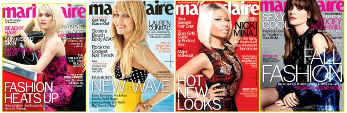
Marie Claire June, July, August, and September of 2013.
Then the photograph. The photograph aims to connect with the reader through eye contact and a recognisable celebrity face. But the photograph wasn’t always part of the equation. Early magazine covers were essentially illustrated.
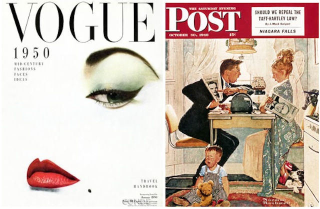
Vogue January 1950; The Saturday Evening Post October 1948
And these illustrated covers usually did not feature celebrities. They were mostly scenes from fantasy or everyday life, or they featured the publication’s illustrated mascot. Some of these characters persist today, like the Playboy bunny, MAD‘s Alfred E. Neuman and Eustace Tilley, the monocled ascot of the New Yorker.
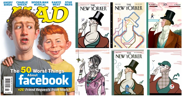
MAD June 2011, Variations of the New Yorker’s Eustace Tilley
Even UK Vogue had an illustrated mascot — Ms. Exeter, an elegant 50-something woman who had an advice column about being a classy, classy dame.
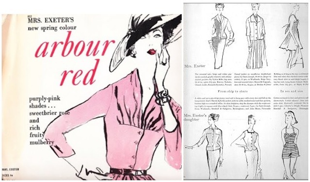
UK Vogue’s Mrs. Exeter, from Gretchen Hirsch and Liz Tregenza
And Esquire had Esky, a moustachioed skirt-chaser in a fedora.
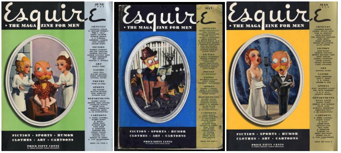
Esquire from June 1948, May 1935, and May 1934
A lot of Esquire covers featured Esky. That is, until George Lois came along. George Lois revolutionised the cover of Esquire, using big bold, eye-catching photographs. You’ve probably seen some of these covers, or at least homages to them.
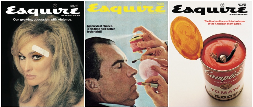
Esquire from July 1967, May 1968, and May 1969
The crazy thing was that Lois didn’t even work for Esquire. He was an ad man. He did commercial work.
From the online portfolio of George Lois
In 1962, Harold Hayes, the newly hired head editor of Esquire, asked Lois to do a cover for him. As Lois tells it, Hayes was desperate and needed a cover in three days. Hayes gave Lois a description of 20 contents in the upcoming issue, including a spread of Floyd Patterson and Sonny Liston, who were about to go head to head in the upcoming heavyweight fight. Everyone was predicting that Patterson would win, and the magazine was going to be released before the fight.
Three days later, Lois delivered a cover of a Floyd Patterson doppelgänger laying flat on his back, dead in the ring. The message was clear: Esquire was calling the fight for Liston.
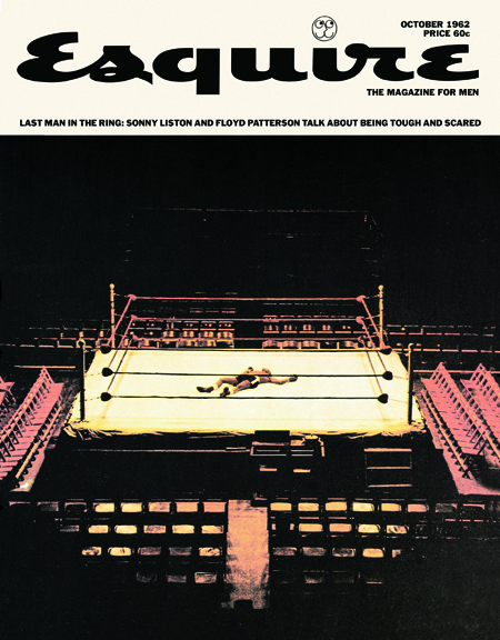
Esquire October 1962
So there was a good chance that Esquire would be wrong, which would be completely embarrassing. But Harold Hayes let Lois go with it. And Lois actually got it right.
Lois went on to create 92 Esquire coversover the next 19 years, most of them just as eye-catching and controversial as his first. Many were one big stark image, with little or no text. They almost look like wall posters, and now many of them are in thepermanent collection of the Museum of Modern Art in New York.
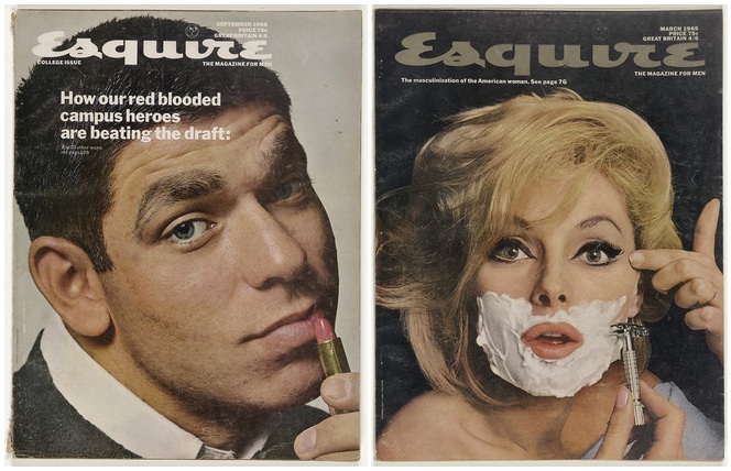
Esquire September 1966, March 1965
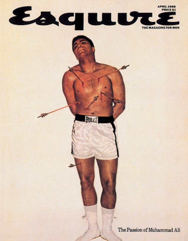
If you’ve seen any of Lois’s covers, or variations of his covers, it’s probably his photograph of Muhammad Ali, which is sometimes cited as the greatest magazine cover of all time. The cover is almost completely white, with Muhammad Ali, shirtless, pierced all over his body with arrows. Like a martyr.
Ali had refused military service, claiming conscientious objector status through his conversion to Islam. Ali was sentenced to jail, stripped of all his titles, and condemned as a draft dodger — some even called him a traitor. The idea of this cover was to suggest that he was a martyr to his religion, but George Lois chose a Christian martyr to represent him — specifically, Saint Sebastian.
Ali called up Nation of Islam leader Elijah Muhammad, and explained the painting on which this photo was based in excruciating detail, before finally putting George Lois on the phone. After a lengthy theological discussion, Elijah Muhammad gave George Lois his OK.
So Lois helped make photographs more or less standard on magazine covers. Then, in 1965, Cosmopolitan ushered in the era of the cover lines, a.k.a. words.
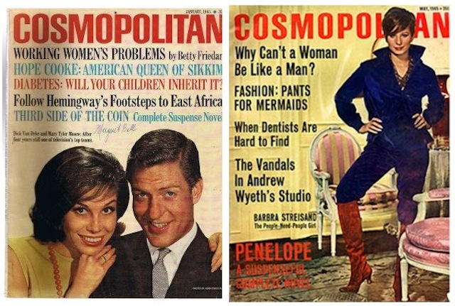
Cosmopolitan from January 1965 and May 1965
Cosmopolitan wasn’t the first to use text on the cover, but they were the first to use it really provocatively, and they set the standard template for what a newsstand magazine looks like today. Covers started to frame their photographs with words, creating a sort of “doughnut” of text around the featured image.
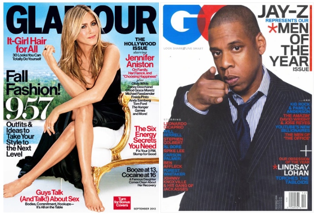
Glamour September 2013; GQ December 2006
Even though magazines are covered in words, there’s tremendous debate among editors and art directors as to how to maximise the value of the key pieces of real estate on a magazine front cover. These key pieces of real estate vary depending on the kind of magazine.
Celebrity weeklies always have their big coverline across the middle of the magazine. And it’s always written in yellow, since it pops on the newsstand and has a very high calibre of colour value. The whole weekly market relies on yellow.
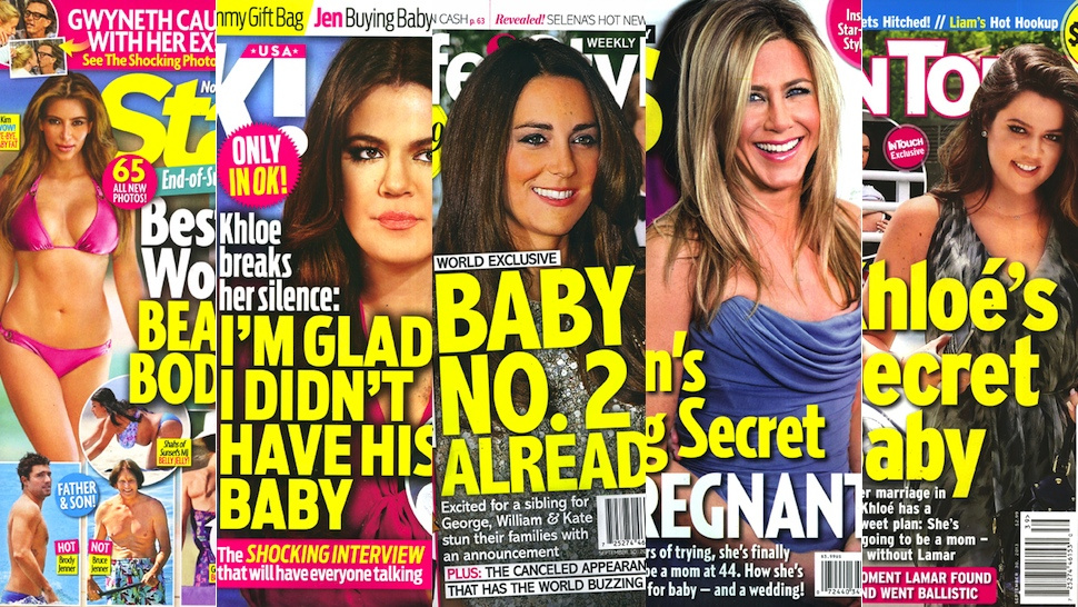
Star, Ok!, Life&Style, Us, In Touch
For the more lifestyle-oriented magazines, the most captivating cover lines go in what’s called the hotspot, located immediately underneath the logo on the left. Unless it’s on the right. Magazines are racked differently in different countries, and racking patterns often shape page layout.
In the UK, a lot of the magazines are shuffled with their left edges overlaying each other, with only the left edge revealed. So in England you get most of your headlines on the left side, or “the leading left edge.”
Credit: Sarah Lee for The Guardian
In the United States, magazines are racked in a waterfall presentation, where you see the top third, so our publications stick their best cover lines high and close to the logo on either side.
Credit: Soul Providers
US publications have many more coverlines than those in the UK. Purely because of the way they’re stacked up for retail.
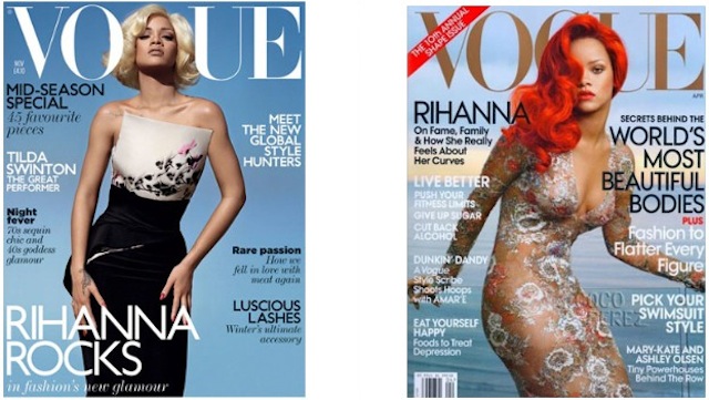
UK Vogue November 2011; US Vogue, April 2011
Magazines that don’t rely on newsstand sales look very different from magazines that do. Titles like The Atlanic, TIME, and the New Yorker have the luxury of not needing to grab someone’s attention at the checkout line.
These are a little more Lois-esque, with big photographs and pictures and not as much text.
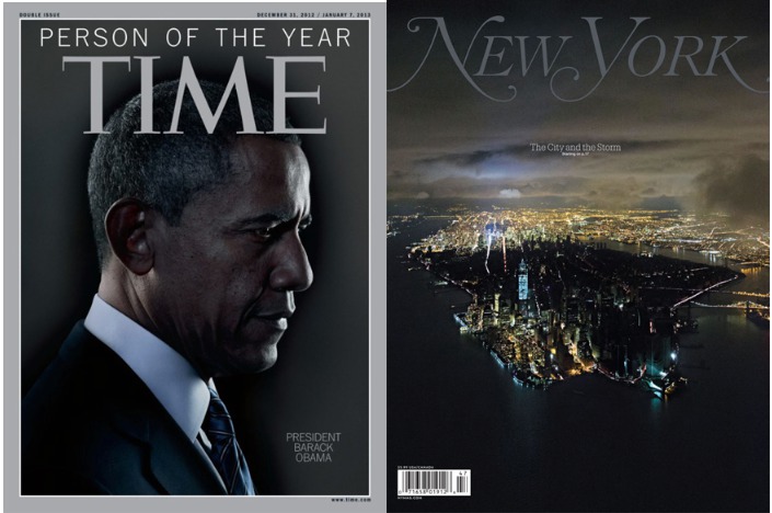
TIME December 31, 2012/January 7, 2013; New York Novemeber 4, 2012
The New Yorker even reverts back to the pre 1960s illustration model:
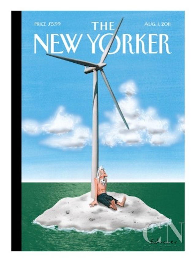
New Yorker August 1, 2011
…Except when you encounter The New Yorker on the newsstand, in which case there’s a little flap on the leading left edge with a list of contents.
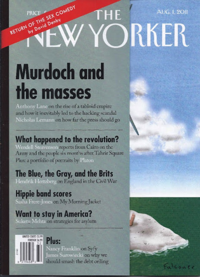
New Yorker August 1, 2011
Big pictures by themselves just don’t sell like they used to. It’s about volume of content. Magazines are expensive on newsstands, and readers want to be reassured that there’s plenty to read inside. Hence the illegible cornucopia of headlines onEsquire today.
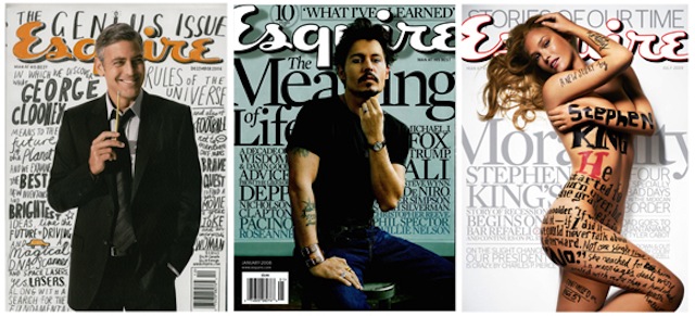
Esquire from December 2006, January 2008, and July 2009
This is the work of David Curcurito, current design director at Esquire. Curcurito’s style is so overloaded with words that it explodes the “doughnut.” The text is not just about communicating what information is in the issue, but showing you that there’s a lot of it.
The text and the image weave in and out of each other in such a way that the words almost act like an image. This is Esquire’s way of standing out from all the other magazines on the rack. But they don’t stand in the same way Lois’s covers did. Curcurito has messed with the standard magazine formula, but he tends to stick to it. Because this formula works. And it has been working for a long time.
But fear not, art directors everywhere, George Lois has a simple solution: mimic his covers.
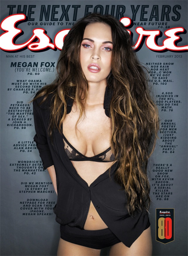
Esquire from February 2013
[99% Invisible producer Avery Trufelman spoke with design legend George Lois, Esquire design director David Curcurito, and coverthink.com blogger and former Rolling Stone art director Andy Cowles. In this episode, Cowles reads from Lois’s book Covering The ’60s.]
99% Invisible, the greatest podcast of all time, is a tiny radio show about design, architecture & the 99% invisible activity that shapes our world. You can Like them on Facebook here or follow them on Twitter here. To subscribe to the podcast on iTunes, head over here.
This post has been republished with permission from Roman Mars. It was originally published on 99% Invisible’s blog, which accompanies each podcast.