We’re living smack dab in the middle of a golden age of data visualisation — or peak data visualisation, depending on your point of view. Beautiful Science, a new exhibition at the British Library, offers a glimpse at how complex info was presented before technology made infographics so inescapably ubiquitous.
The show covers facts and figures from Crimean war deaths to ocean currents, with diagrams dating back to the early 17th century on display. What’s most impressive is how many different styles have been used to illuminate what was, at some point, pure intel; it’s crazy to imagine how quickly your eyes would gloss over if everything here was somehow reverse-engineered into a straightforward spreadsheet.
Instead, you’ve got maps and trees and detailed illustrations that would, under any circumstance, be considered art. And these really are art: not necessarily easy to parse at first glance, but incredible nonetheless, and engaging enough that you want to keep looking.
Here are a few of the works from Beautiful Science. I’m partial to the first one; which is your fave?
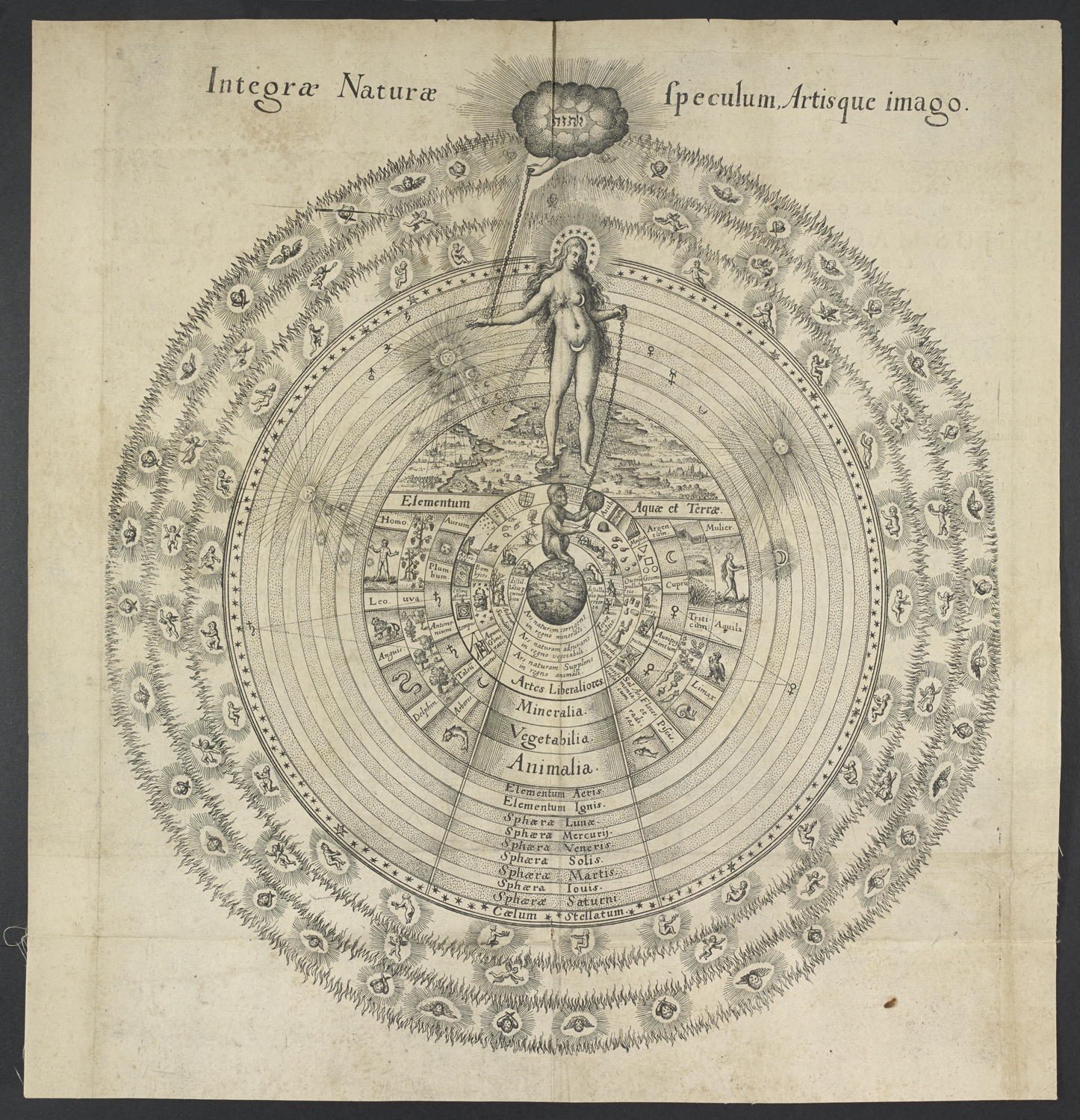
Robert Fludd’s drawing of “The Great Chain of Being” from 1617 is the oldest diagram at the exhibition, creating a hierarchy order of life on earth with respect to the rest of the universe. Sophia, goddess of wisdom is the nude gal in the middle.
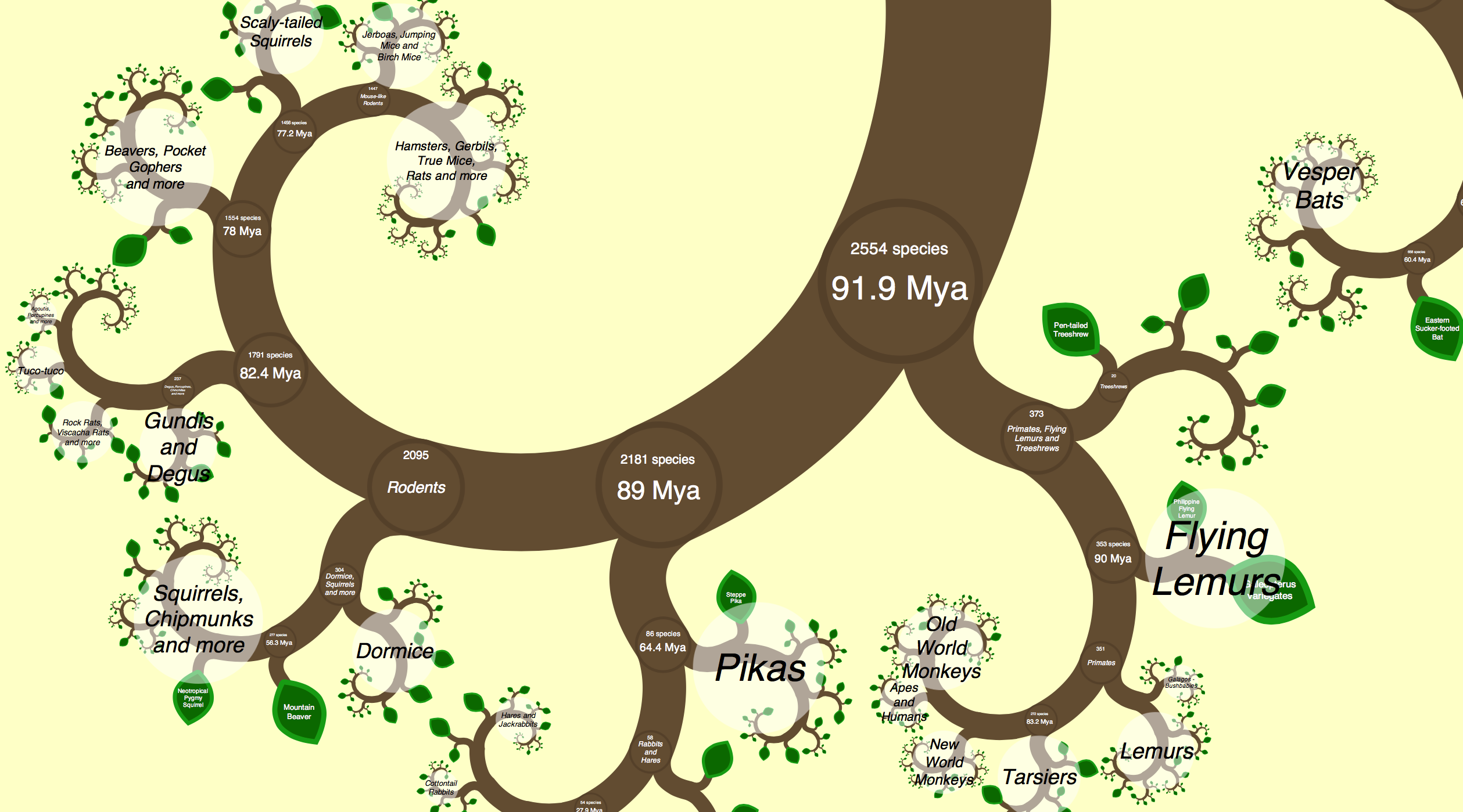
Fractal geometry was used to follow the evolutionary relationships between tens of thousands of tetrapods: mammals, birds, reptiles and amphibians.
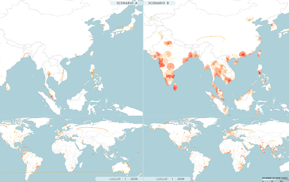
Epidemic Planet is based upon the Global Epidemic and Mobility model, which researchers used to accurately forecast the 2009 pandemic influenza outbreak.
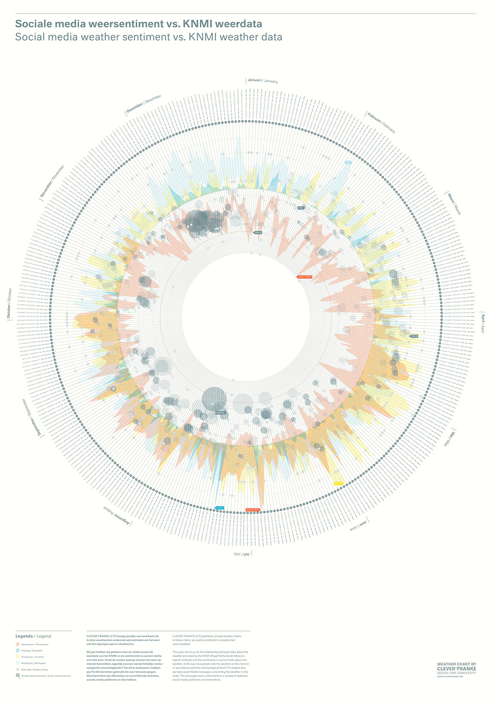
This is what it looks like when you chart 2011’s real-world weather patterns with over 700,000 sentiment-analysed social media messages about the weather.
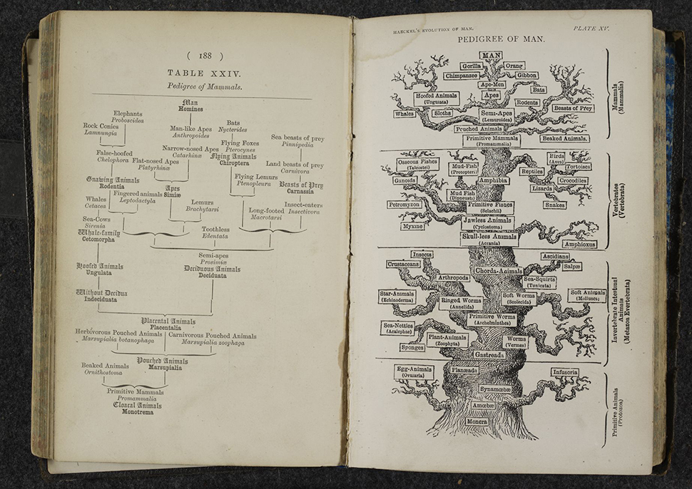
Ernst Haeckel’s attempt to organise all life on earth in the commonly used form of trees.
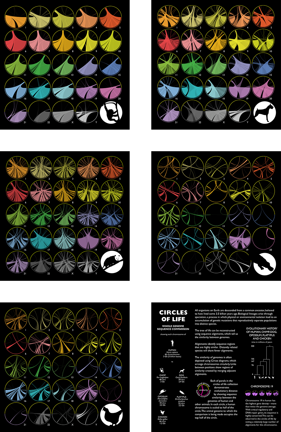
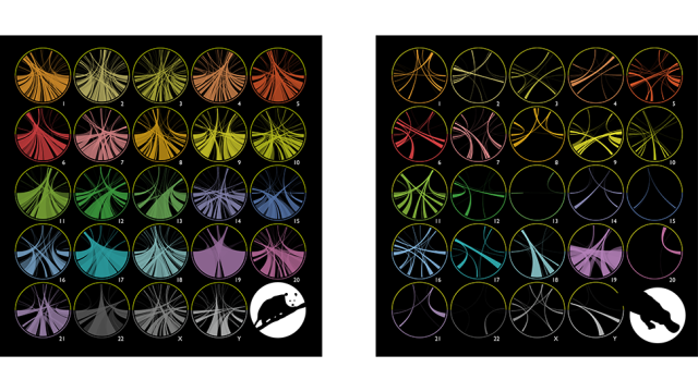
Martin Krzywinski’s Circles of Life was commissioned for the exhibition. The diagrams show the genetic similarities between humans and chimpanzees, dogs, opossums, platypuses, and chickens.
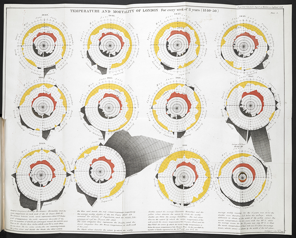
Epidemiologist and statistician William Farr believed that cholera was spread by “bad air” evaporating from the Thames (the source was later discovered to be water-borne bacteria); in 1852 he plotted cycles of temperature and cholera deaths for 1840 to 1850.
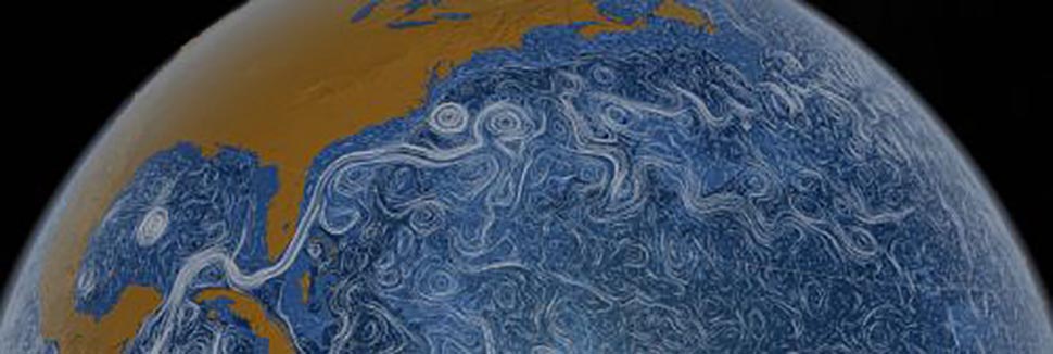
NASA’s Perpetual Ocean visualizes the flow of ocean surface currents from June 2005 to December 2007.
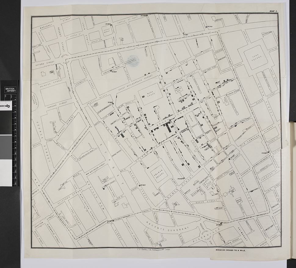
On the Mode of Communication of Cholera by John Snow, London, 1855.
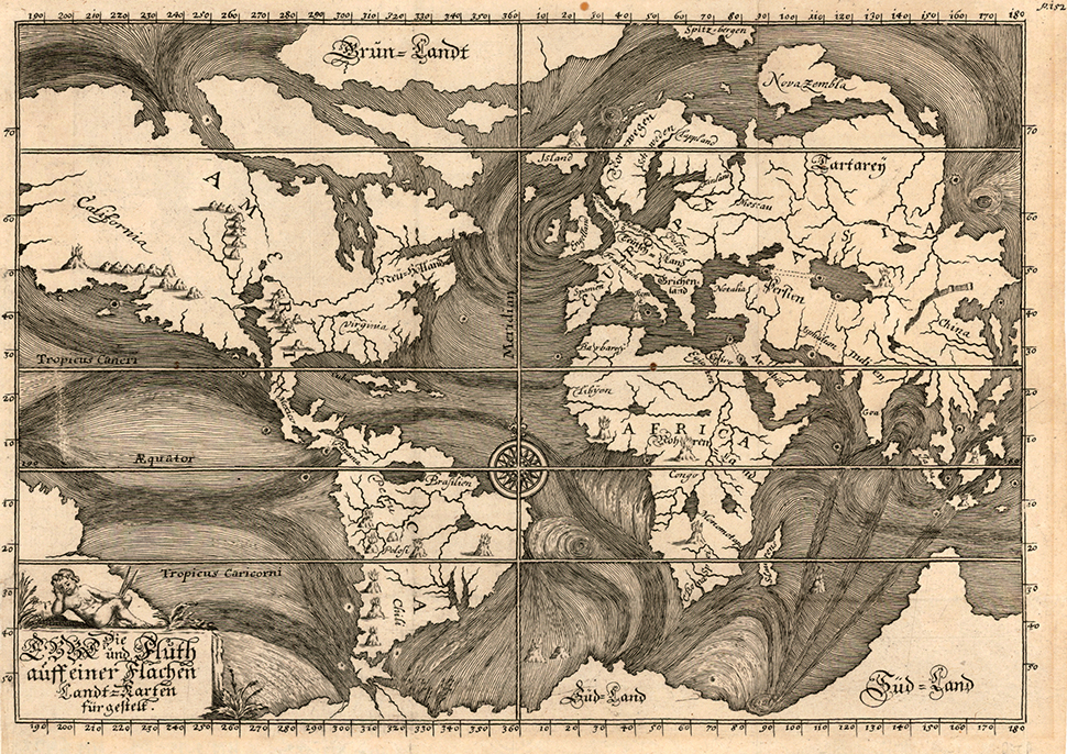
A visual depiction of ocean currents as observed by explorers and mariners in 1865.
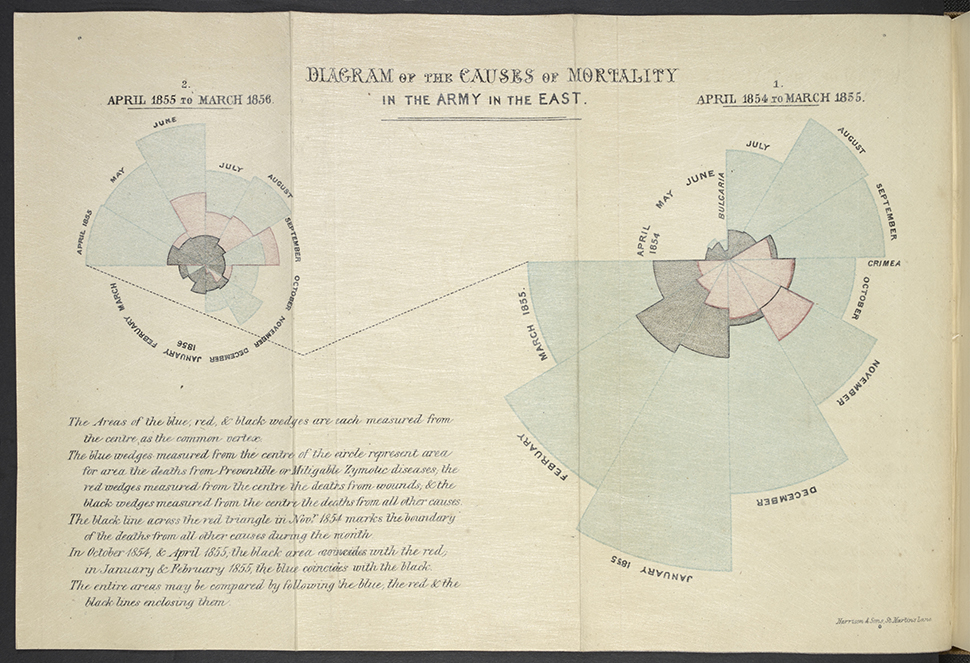
Florence Nightingale’s “rose diagram” depicts the cause of fatalities of British soldiers during the Crimean War: blue represents sickness, wounds are red, and “other” is black.
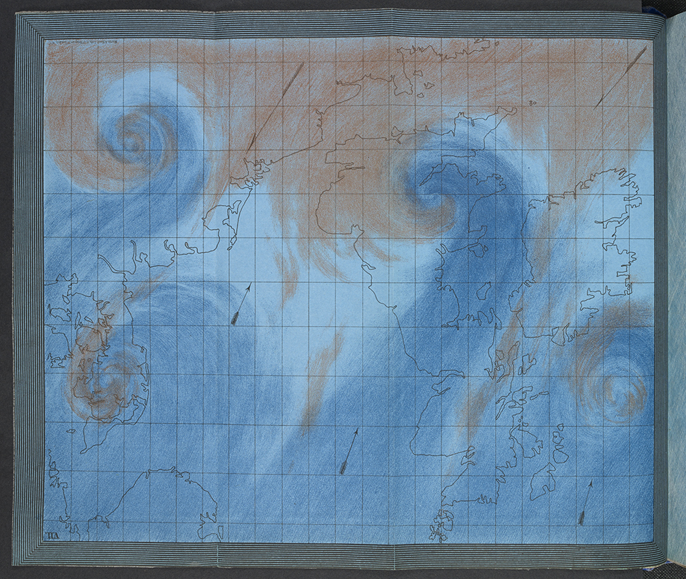
HMS Beagle captain Robert FitzRoy’s illustration shows how storms and cyclones develop on the border between warm tropical and cold polar air masses.