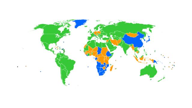
The green is Chrome. The blue is Internet Explorer. The orange-ish colour is Firefox. If you can see any red or grey that would be Opera and Safari respectively.
Although I personally believe all browsers have become horrible in their own ways, having Chrome at the top of most country’s usage list according to Statcounter is certainly a lot better than the alternatives ruling the world. Good job, world. Enjoy the suffering southern tip of Africa, and all of China and Greenland.
How did your favourite browser fare? [Statcounter, Wikipedia, Maps on the Web]
.svg)