Apple’s new WWDC app, meant to guide developers through next week’s mega-conference, is up in the iTunes App Store today. If you look closely, you can see bits of iOS 7 in it. While it’s exceedingly easy to overvalue just how much this app means — Apple surely doesn’t want to tip its hand before the event — there are still some obvious visual clues as to what awaits us in iOS as a whole. Let’s take a look.
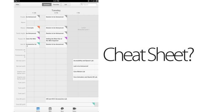
To start, it’s flat. You’ve probably heard that Jony Ive is going to make iOS “flatter”, and we’ve explained what that means a bit, but this is a very nice expression of what flattening means in the real world, with before-and-after examples. Here’s an image of the last three WWDC apps, from 2011 through 2013, in order from left to right (hat tip to Twitter user Yuize):
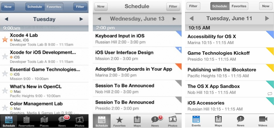
See the differences? You probably notice the drop shadows are more restrained, with a tighter gradient. That’s true across all of the UI elements, but in flat design, it becomes especially important when dealing with more than one layer, like when the schedule grid disappears under Date layer. This is more or less expected, since we knew “flat” was coming, but it’s our first glimpse of what Apple’s flat actually looks like. Which, it should be said, looks a lot like Google’s.
A more subtle change, though, is the loss of the shadow around the selected icon along the bottom row. Now, instead of squaring off the whole button, the app just highlights the icon itself. iOS has always been a rather boxy, regimented UI, but this design is way more open, even within the confines of the app as it looked last year. Assumptions are obviously dangerous, but this could carry over to a more open-feeling iOS in general.
Other observations are tougher to put a finger on, because again, Apple isn’t going to show the whole of its new design tenets in an app the week before its keynote. So things like the slightly clunkish filtering tool remaining intact, or ugly, ugly badges staying as they are, should be taken with a grain of salt. This is an appetizer; the main course comes June 10th.
Still, this peek at the broader picture of iOS 7 is encouraging. It only shows a small bit of what we expect to be an overhauled final product, but it looks as clean, crisp, and functional as we could have hoped for.