Amazon Should Definitely Adopt This Redesign

Gizmodo AU

Amazon may be a bargain hunter’s dream website when it comes to getting certain products from the US, but the site is fugly. It’s also not very user friendly, especially for international shoppers. That’s why Maurice from Queensland web design firm Kintek decided to propose a redesign for the Amazon site. And the results are infinitely better.

Maurice’s explanation of why he redesigned the site is a long and interesting read, but he sums up his approach rather nicely:

I wanted to move away from the liquid layout… at first I was going to do a 1200px max-width fluid layout, but then decided to take it to the next level and work on a 960px fixed width column workspace to show how the content area could be used. After all, there’s a whole new host of 960 sized displays on the market in the form of tablets and high resolution smart phones like the iphone 4. The main problem I ran into with this was the left hand menu. You’ll notice on product pages of Amazon.com the left hand menu is displayed when you hover over “Shop All Departments”. I personally am not a fan of structure changes between different areas of a website. The more seamless you make the experience, the easier you’ll make your website to navigate (to an extent). I decided to keep the functionality more or less the same as the current website.

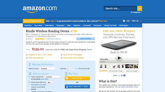
The end result turned this:

To this:

Of course, the complaints and subsequent work of a web designer in Queensland isn’t going to rattle the cage of a global company like Amazon. But we can dream that maybe someone from the US giant will see this and take the ideas on board.

[Kintek Proposed Amazon Redesign]

Discuss

(13 Comments)
  • [–]

    jeremy

    Tuesday, December 14, 2010 at 10:57 AM

    Without A/B testing nobody should say this is “better”. Nicer looking, maybe, better? I doubt it – Amazon’s job is to optimize purchases, and I just bet they already optimize for that using techniques that are evidence based and multivariate. Fixed width is for brochure-ware sites, not super high volume sites that need to work on any device. Nothing to see here.

    • [–]

      Madhava Jay

      Tuesday, December 14, 2010 at 12:38 PM

      You obviously missed one of the core concepts of the blog post which was relating to poor treatment of overseas purchasers.

      Furthermore just because something ticks certain metrics boxes, doesn’t mean it has to look uninspired and out dated.

      Its a great blog post which reminds me of the American Airlines redesign.

      http://dustincurtis.com/dear_american_airlines.html

      • [–]

        boc

        Tuesday, December 14, 2010 at 1:47 PM

        You obviously missed where he didn’t even provide a proper solution to the “international usability” problem.

        In fact he raised several issues with the Amazon site and only addresses eye-candy.

        His solution itself isn’t perfect and even admits so in the comments.

        His “View The Redesign” and “View Original Page” don’t line up properly in Firefox. lol

      • [–]

        Maurice Kindermann

        Tuesday, December 14, 2010 at 2:29 PM

        Well it looks like you might have missed my point boc. Madhavas right, one of the main reasons I wrote the article was because of the poor international usability.

        One purpose of the redesign was to show a universal design for the ‘shipping’ section. Whether you’re in the US or Australia or wherever, there should be 1 drop down option for a county selection, not multiple pages with the same content on it.

        Anyway, I think some people are looking at this way too heavily… like I think Amazon should scratch their website an implement my design, it was just a bit of fun =)

  • [–]

    Mark Swanborough

    Tuesday, December 14, 2010 at 1:18 PM

    Yes, it looks like it should be better… but I’d hate it. The redesign looks like a very average WordPress blog!

    Amazon “break” some of the “rules”, sure. But let’s take a look at both.

    Amazon.com… I go to a product page, what do I see? With *no scrolling* I see 1) images 2) price and availability 3) button to press to buy 4) reviews – then I can navigate to get more info … n) press obvious button to buy

    With the redesign… 1) huge amazon logo – scroll down to the actual content… 2) title 3) price 4) cluster of buttons related to buying 5) image 6) where are reviews? second scroll… ohh, too fast to read… n) navigate multiple choices before figuring out which button to press to buy.

    Strongest point of agreement? Yes, Amazon can do better for their international store, making country of shipping more obvious. But they have a very *very* successful impulse buying model that the redesign would break, and break big-time.

    • [–]

      Aaron McAuley

      Tuesday, December 14, 2010 at 1:40 PM

      Agreed. This redesign is “nice” in an off-the-shelf, web-two-point-oh kind of way, but totally lacks any consideration of purchasing dynamics, market analysis or user interface functionality.

      The only key advantage is the shipping box, which could be integrated into the current Amazon system easily.

  • [–]

    Maurice Kindermann

    Tuesday, December 14, 2010 at 1:25 PM

    Hi Jeremy,

    I think you should be a bit more open minded. Just because Amazon do a/b testing and they spend lots of money on usability testing, doesn’t mean they are right. It also doesn’t mean my redesign is right, but I think we can all agree Amazon.com is a pretty horrible looking website, and that’s what I wanted to show. Stirring the pot so someone at amazon might notice I am unhappy.

  • [–]

    boc

    Tuesday, December 14, 2010 at 1:27 PM

    For a site with multiple layouts and content areas a single mockup of a single page does not represent a redesign.

    It does look nice but, I don’t really see how it would be big improvement.

  • [–]

    Mitchell

    Tuesday, December 14, 2010 at 2:05 PM

    I love it! Well done Maurice.

  • [–]

    Ben Thomas

    Tuesday, December 14, 2010 at 2:53 PM

    That design would work great on my iPad, or any 4:3 shaped screen, but most computers have widescreens these days, and many only have about 700 pixels to play with in the vertical.

    So why don’t web-designers embrace this and stop wasting space either side of a 960-1024 wide column?

    I really hate viewing websites on my macbook 13″ because I can’t see much of the page without scrolling vertically. Widening the browser window doesn’t give me any extra content…

    • [–]

      Madhava Jay

      Tuesday, December 14, 2010 at 4:27 PM

      Well Ben the problem with liquid layouts is paragraphs are unreadable at a certain width.

      And unfortunately Microsoft Internet Explorer doesnt seem willing to come to the party and offer good support for text columns in css.

      I dont care who thinks its a better use of their real estate to have a 1920 wide page, they are wrong. Widescreen cinema view was invented for film, because our eyes move left to right faster than they do up and down, causing less eye strain. It has its advantages when EDITING 4:3 style content as you can have toolbars and panels like in say Photoshop around the thing your editing.

      If your actually read text in 16:9 its terrible, and yet we are cursed because of the film industry to use 16:9 for websites… what was the last WIDEscreen book you read?

      The Very Hungry Caterpillar

      http://www.amazon.com/Very-Hungry-Caterpillar-Eric-Carle/dp/0399226907

      Books are vertical for a friggen reason.

      Filling up the sides of your screen with more stretched text and mis aligned images does not make anything better.

      Not to mention the huge advantage to clarity that so called white space and breathing space gives to focus your eyes into call to actions.

      Anyway, obviously analytical thinking is lost on people who work in 13″ macbooks. :P

  • [–]

    Maurice Kindermann

    Tuesday, December 14, 2010 at 2:54 PM

    Thanks Michell!

  • [–]

    Paul Cherry

    Tuesday, December 14, 2010 at 10:02 PM

    iAmazon 2.0

Join The Discussion