visualizations
-
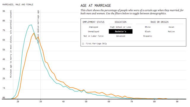
When You’ll Probably Get Married, Visualized

Single? Lonely? Looking for more commitment? Well, this chart will tell you when you’ll probably get married, based on your employment status, education, race and gender.

-
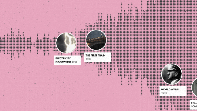
This Beautiful Timeline Lets You Explore Wikipedia’s World History
This amazing visualisation brings together the world’s history from Wikipedia into an interactive timeline stuffed with information and images. If only history lessons at school had been this much fun.
-
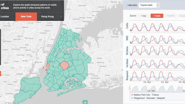
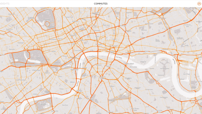
This Website Lets You Study Mobile Phone Use In Cities Around The World
Mobile phone data can provide a rich source of information for understanding human activity. Now, researchers from MIT have built a tool that visualizes mobile phone use in cities around the world, for any of us to study.
-
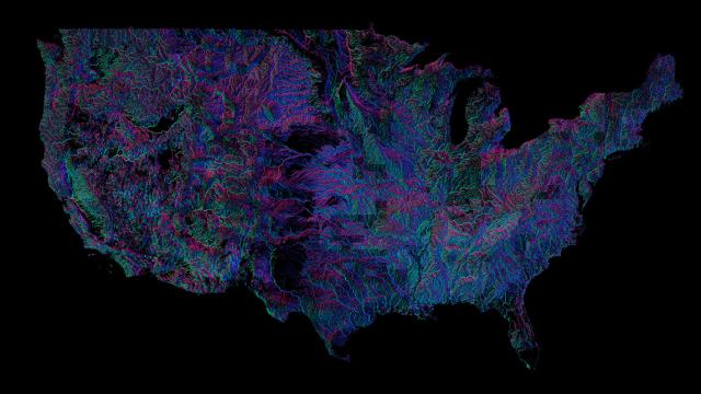
Every River In The US, Coloured According To The Way It Flows
There are over 250,000 rivers in the US, some subtly serene, others tremendously tumultuous. But in this visualisation you can see them all — and the colour shows which way their waters flow.