visualisations
-
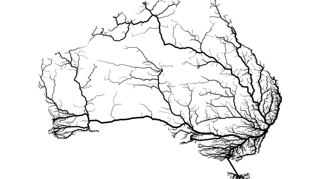
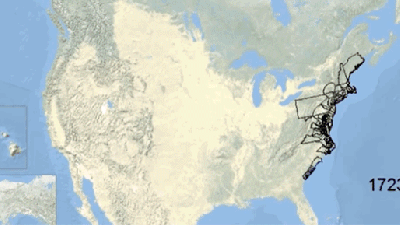
The Fastest Routes To Sydney From Around Australia, Visualised

When do arterial roads look like real arteries? Well, here you go! Thanks to data visualisation, it’s possible to show how connected (or not) a city centre such as Sydney is with the rest of the country.

-
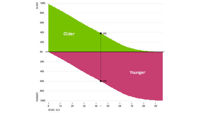
This Painful Chart Shows How Many People Are Younger Than You

Feeling old? This simple chart will reveal the crushing truth of just how many people are younger than you.
-
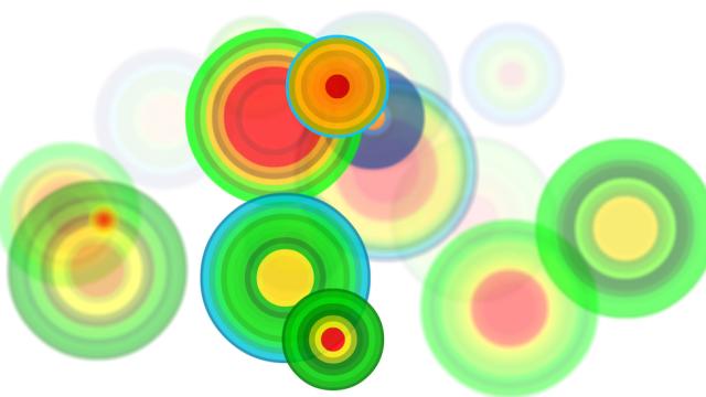
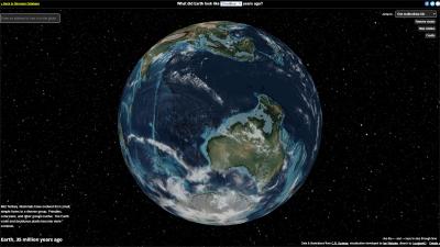
Artists Turn Tectonic Activity Into Stunning Data Visualisations
We usually use words like “immensely powerful” and “destructive” to describe Earth’s tectonic forces. But to artist Ken Goldberg of the University of California, Berkeley, even the most violent agents on Earth have an inner beauty.

-
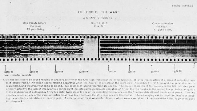
The Sound Of A War’s End, Visualised
Above we see seven seconds of an audio recording from November 11, 1918. On the left we can see three seconds of guns firing. In the middle? The official time of the ceasefire to end World War I and a sudden reprieve from the staccato of weapons blasting. On the right, the first three seconds…