visualisation
-
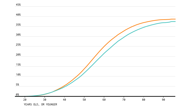
Fun Tool Tells You When You’ll Get Divorced

So, you made one of the biggest commitments of all and got married. Now, how likely is it to stand the test of time? Well, this interactive chart will show you how likely you are to divorce based on your employment status, education, race and gender.
-
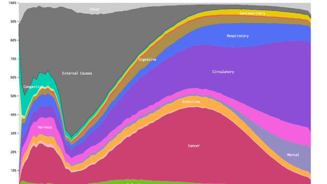
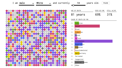
How You’ll Probably Die, Visualised

Ever wondered how things might come to an end? This chart visualises America’s cause-of-death data from the US Centres for Disease Control and Prevention to give you a better idea.

-
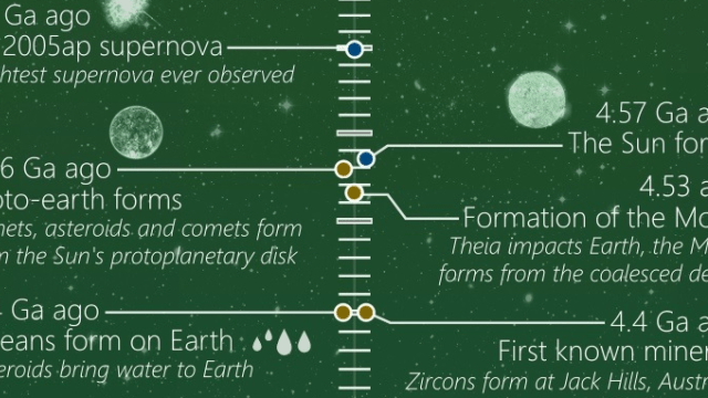
This Timeline Shows The Entire History, And Potential Future, Of The Universe
It can be hard to get your head around the long and complex history of the Universe. But this new timeline by Slovak graphic designer Martin Vargic does a wonderful job of describing the last 13.8 billion years of space — and what might happen in the next 10 billion, too.