logo
-

How LEGO and MIT Came Together To Give Us Lego Robots

Pour one out for Mindstorms. The build-it-yourself LEGO robotics brand is getting discontinued at the end of next year, but that doesn’t mean it won’t forever live on in our hearts. But it almost didn’t happen. In his book The LEGO Story, Jens Andersen writes about the toy company’s growth from making wooden ducks to…

-
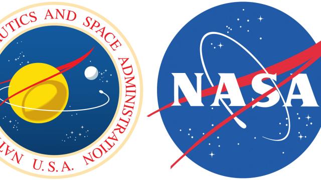
What’s The Red Shape In NASA’s Meatball Logo?
You’ve probably seen NASA’s so-called “meatball logo,” and wondered what it meant. Obviously, the blue sphere represents a planet. What about the red? I’d assumed the chevron stood for aeronautics, and once I heard it represented a certain constellation. But the truth is more interesting.

-
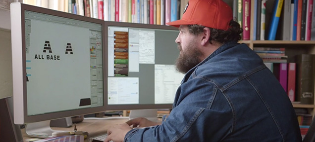
This Is How Professional Designers Create Their Logos
Video: Yesterday, we saw here that famous logos can have hidden meanings, almost like easter eggs designers use to enrich them. But how do those logos come to life? Designer Aaron Draplin explains in this video how his creative process works.
-
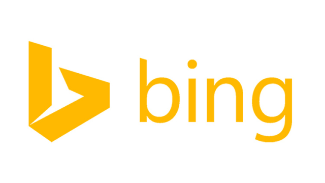
Can A New Logo And Redesign Make Bing Any More Popular?

Out with curly and blue; in with angular and gold. Microsoft’s Bing search engine has just received a major redesign which it’s hoped will reinvigorate the service — but is it really enough?