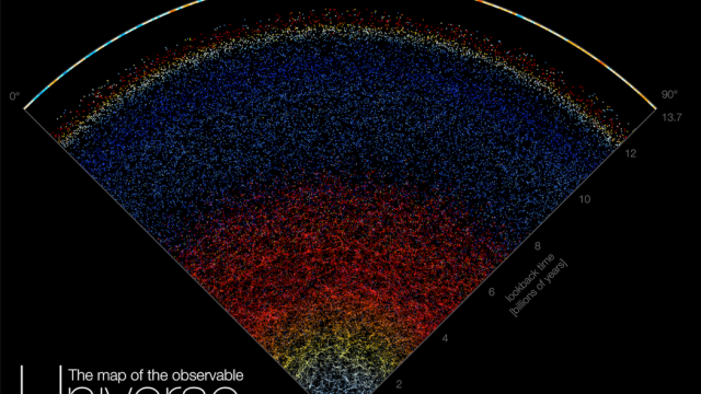
Astronomers have compiled 15 years’ worth of data from the Sloan Digital Sky Survey into an interactive map of the observable universe.
The map includes hordes of cosmic objects, like luminous blue quasars and red elliptical galaxies. You can explore the map here.
“Astrophysicists around the world have been analysing this data for years, leading to thousands of scientific papers and discoveries,” said Brice Ménard, an astrophysicist at Johns Hopkins University and the map’s creator, in a university release. “But nobody took the time to create a map that is beautiful, scientifically accurate, and accessible to people who are not scientists. Our goal here is to show everybody what the universe really looks like.”
The observations from a telescope in New Mexico capture about 200,000 galaxies, each filled with billions of stars and unknown worlds. The data includes many more objects than the 200,000 displayed, but if the researchers showed them all, the map would be an unnavigable sea of dots.
In that way, the map is a simplification, but the alternative would simply be overwhelming. The Milky Way — the galaxy 100,000 light-years across that we call home — is just a single pixel at the base of the map.
In theory, the underlying data for the map (and thus, the map itself) may include some of the 40-quintillion odd black holes that are estimated to be in the observable universe. Of course, black holes are so gravitationally intense that light can not escape them, so they don’t show up as light sources in the map. But quasars — very bright galactic cores — are powered by supermassive black holes at their centres, and those are visible in the map.
“We are used to seeing astronomical pictures showing one galaxy here, one galaxy there or perhaps a group of galaxies,” Ménard said. “But what this map shows is a very, very different scale.”
Users can scroll up on the map, essentially travelling back in time to see older, more red-shifted objects. A ticker on the bottom of the map shows how far back in time the user is at any given point.
Unfortunately, you can’t click on individual galaxies to figure out what (or where) they are. But nonetheless, the map serves its purpose: showing just how small and new we are in comparison to the history of the universe and all its cosmic contents.
More: The World’s Largest Digital Camera Is Almost Ready to Look Back in Time