Amazon’s Prime Video streaming service is getting a redesign, finally.
If you’re a regular user of Prime Video, you’re probably familiar with its unimpressive user interface.
It’s not very intuitive and it’s quite difficult to navigate, lacking the ease of use that rivals like Disney+ and Netflix have.
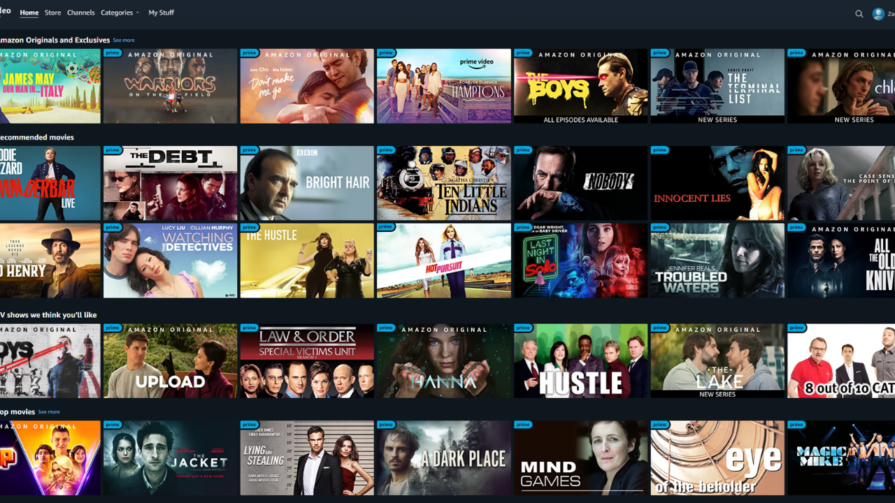
It especially struggles with content categorisation on the main page, but most of its problems stem from content navigation, offering unbroken blocky snapshots of shows and movies. It’s all a bit much.
Well, it’s getting a facelift. The Prime Video redesign directly focuses on being able to “find your favourite content”.
Prime Video is the second most popular streaming service in Australia by market share, with a subscription bundled with Amazon Prime and Twitch Prime.
“We are introducing a redesigned, simplified main navigation menu that is easily accessible. This helps customers browse our broad selection (including movies, TV shows, sports, and premium channels) and find what they’re looking for quickly and easily,” Prime Video said in a media release.
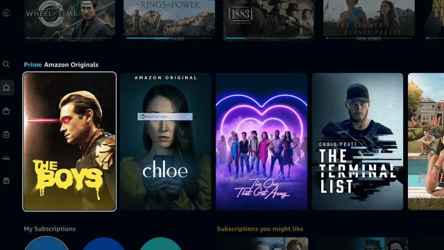
“Customers have an easy path to the titles included with Prime membership, such as The Marvelous Mrs. Maisel, The Boys, and the highly anticipated The Lord of the Rings: The Rings of Power. For our living room apps, the new navigation menu has been relocated to the side of the screen for improved access.
“The app will launch with six primary pages: Home, Store, Find, Live TV, Free with Ads, and My Stuff. Customers will also have sub-navigation options to more easily browse by content or offer type, such as ‘Movies,’ ‘TV shows’ and ‘Sports’ on Home, and ‘Channels’ or ‘Rent or Buy’ on Store.”
With the redesign, live sports will be given their own category, so that they’re easier to find. The homepage will also feature a title card menu for major titles, highlighting the major releases that have come to the platform.
There are also easy navigation widgets down the left side of the screen.
The rollout of Prime Video’s redesign starts this week on the Android app (across Android devices like phones and TVs) and on the Firestick. I’m yet to get the updates on my Android TV or phone, but an update will likely become available eventually.
iOS and web-based versions will need to wait a bit longer.