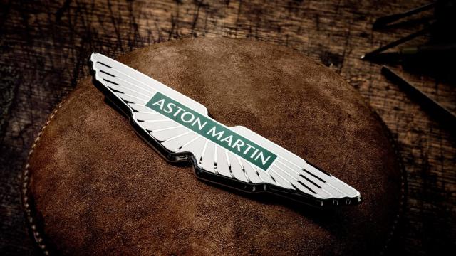
In one way or another Aston Martin has had its wings logo for 90 years. The emblem first appeared on its cars back in 1932 and it’s still present to this day. Now, the British car maker has given the iconic emblem a minimalist update, its first logo refresh in nearly 20 years.
Aston Martin first started using the wings logo in 1932. Designed by SCH Davis, they were said to be inspired by Egyptian scarab beetles. Since then, the emblem has gone through several changes to reach the eighth iteration of the logo, which the brand has unveiled today.
The new design, which was developed in partnership with British art director and graphic designer Peter Saville, is a minimalist take on the outgoing logo. Because, why would you mess too much with a cool emblem like the one Aston has had for decades?
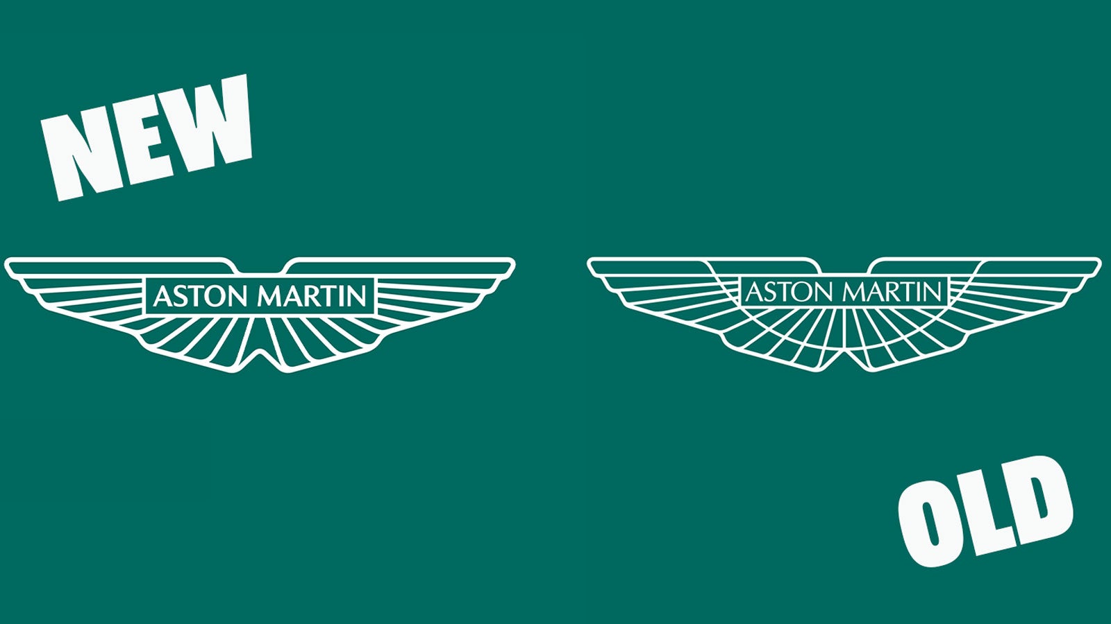
Gone is the semi-circle that ran through the middle of the old emblem and there is now one less ‘feather’ in the design, thanks to the bottom two joining up. It looks sleek, it’s not a dramatic change and you’re unlikely to spot it unless you’re up close, but it remains a wonderful logo. Nice work Aston.
For its rollout on Aston Martin’s cars, the company has partnered with Birmingham jeweller Vaughtons to create the enamel badges that will adorn the firm’s “next generation of sports cars.”
In a statement, Aston Martin executive vice president and chief creative officer, Marek Reichman, said:
“Adding Peter Saville, an icon in British graphic design and an inspirational creative figure to me personally, took our exploration and evolution of the wings to another level. And now, to see this new identity, hand-crafted in physical form at Birmingham’s jewellery quarter, is a proud moment for everyone involved.
“It’s the first step to the wings taking centre stage on our next generation of ultra-luxury performance sports cars.”
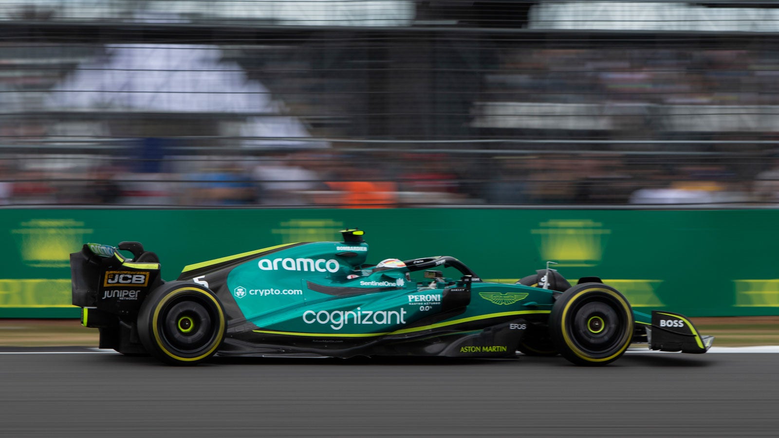
The addition of the new logo to Aston Martin’s corporate image and its road cars brings it all in line with the firm’s Formula 1 team. Eagle-eyed readers might notice that this new logo is the same as the one run on the side of Aston Martin’s F1 racers, as well as across its team wear and merchandise.
This emblem was proudly showcased last year when the firm rebranded the Racing Point F1 team.
As well as running with the new logo on its F1 cars this weekend, Aston Martin will also mark 100 years since its first grand prix entry by fitting the cars of Sebastian Vettel and Lance Stroll with its original button logo.
Maybe that’s the secret tweak they need to turn round the fortunes for the team?