Gmail is getting a new look on the web, which should be heading your way soon (if it hasn’t arrived already). It’s intended, Google says, to better integrate Gmail with the Chat and Meet components that you may or may not make much use of — and it means you’ve now got a few new options when it comes to getting Gmail looking the way you want.
To see if the new look is available to you, open Gmail on the web and click on the cog icon in the top right corner. If you haven’t switched over to the updated interface already, you might well see a message on this menu asking if you’d like to do so — if not, be patient, because you’ll probably get the invite soon.
By the way, when you do adopt the new design on the web, the same menu will show a Go back to the original Gmail view option if you find all the changes just a bit too much. It’s not clear how long the old layout is going to stick around as an alternative, because we’re assuming that eventually the previous interface will be gone for good.
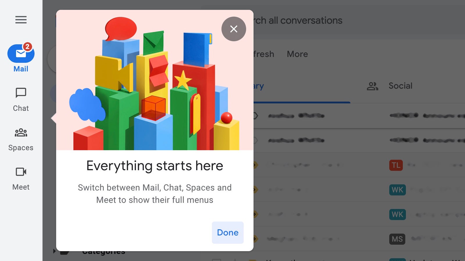
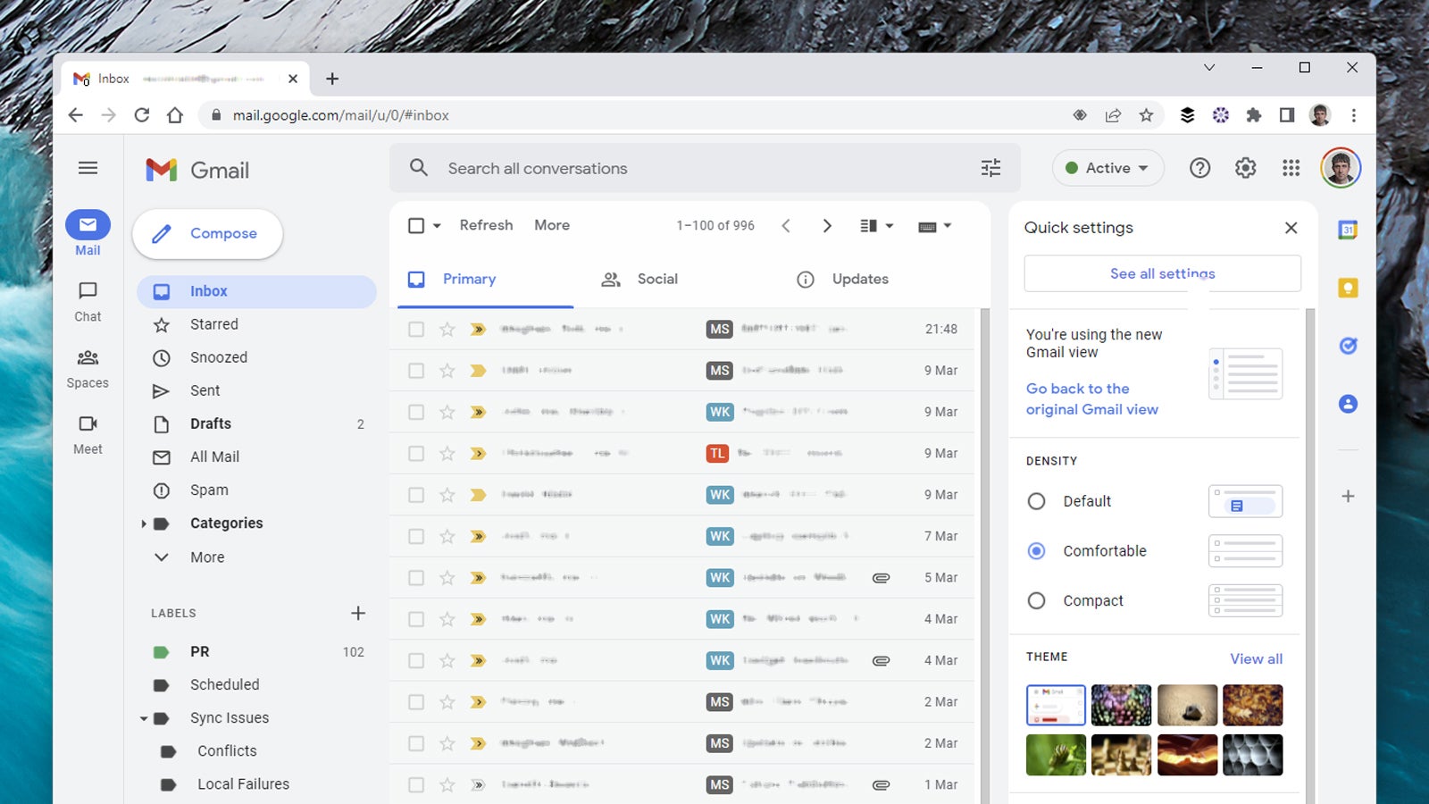
Make the switch (a browser tab refresh might be required) and you’ll see that there’s a lot more pale grey around by default, with your actual emails and various other bits of screen furniture standing out in white. Also new is a sidebar on the far left, where you can switch between Mail, Chat, Spaces and Meet.
The integration between these different apps is the main change in the updated interface. You’ll see that notification bubbles appear on the buttons if you’ve got a new chat, email or call, so you don’t have to keep swapping between various browser tabs to get to all of Google’s different communication tools.
Click on any button to go to the full screen interface for that specific tool. Click the hamburger menu at the top to show and hide the app-specific navigation panes — for Gmail its your folders and your labels, for example, and for Chat it’s your most recent conversations. These navigation panes also pop up as overlays if you hover the cursor on top of the Mail, Chat, Spaces and Meet buttons.
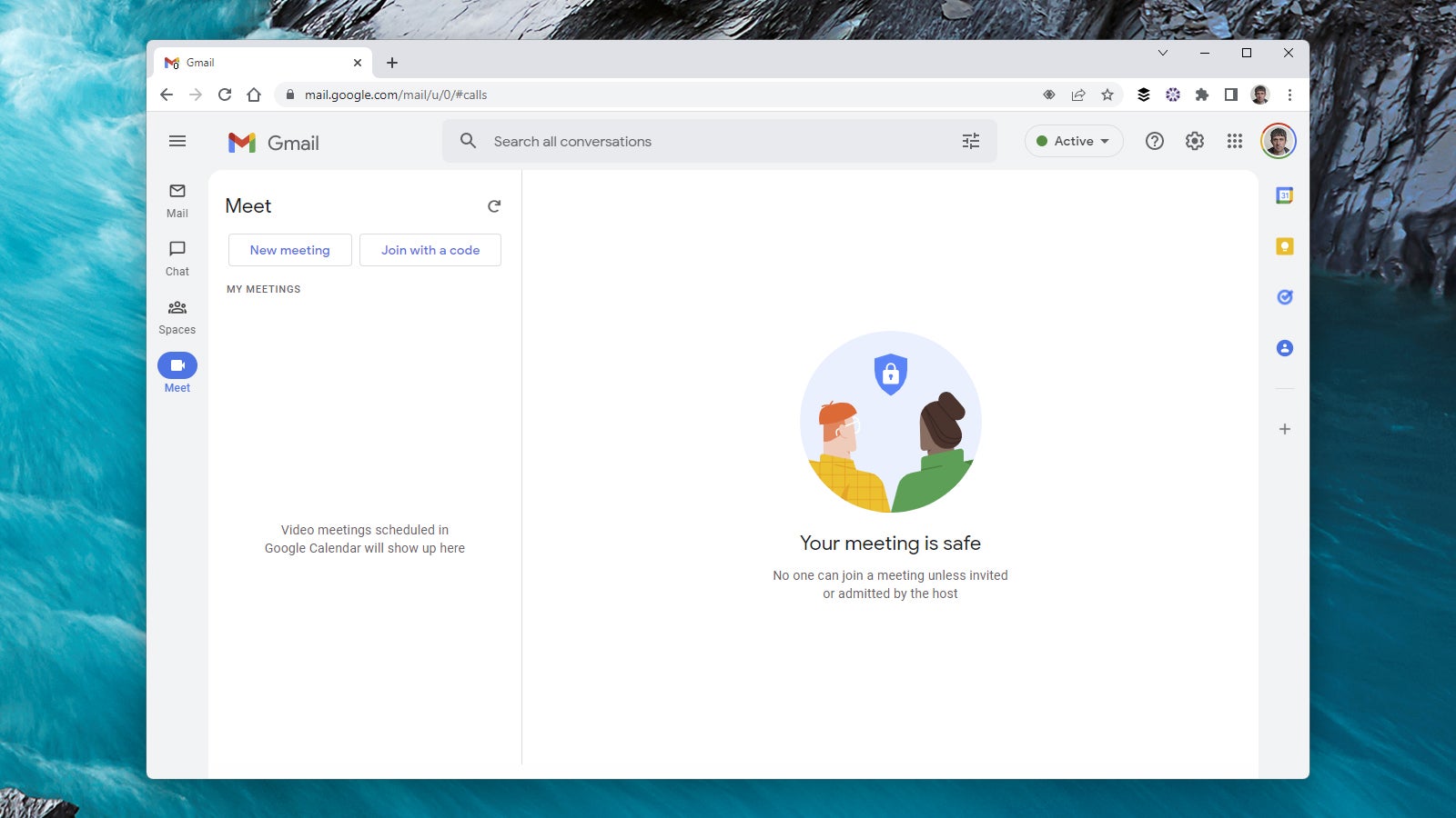
The new layout works better for some apps than it does for others. The Gmail screen is still very busy of course, while the Meet screen is rather sparse if you’re not in the midst of a meeting already — you can see scheduled meetings, create a new one, or choose to join one with a code, but there’s a lot of white space.
Aside from Gmail, there aren’t too many ways that you can customise the look of the interface. You can at least pin your favourite conversations to the top of the list, so you always have quick access to the most important people: Click the three dots to the right of a conversation, then choose Pin to make sure it’s always at the top of the list.
Back on the Gmail tab, most of the layout options work in the same way as they did on the told interface. Up in the top right corner you should see a split pane mode button — if you click the small arrow next to it, you can choose Vertical split or Horizontal split for a more classic email client look, one where the currently selected email can be viewed at the same time as the current folder or label.
Click the cog icon up in the top right corner and you’ve still got the same three layout options to choose between: Default (where attachments and document links appear as separate icons), Comfortable (attachments are hidden but there’s still a fair bit of white space), and Compact (where there’s not much white space at all).
Themes are still available too, from the same menu. You’re able to select from the thumbnails shown on screen, or the View all link will lead you to an ever wider selection. The themes look a bit neater on the new interface than they did on the old one, especially if you’re choosing an image as a background rather than a solid colour — the image shows through very faintly behind your emails but not your chat conversations.
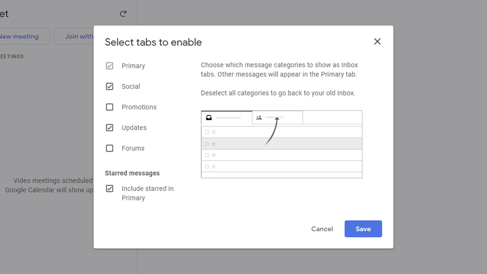
The final layout choice is under the Inbox type heading when you click the cog to open the quick settings menu. Select Customise next to the Default option and you’re able to pick which tabs get shown on screen: Primary, Social, Promotions, Updates and Forums. Remember you can drag emails between tabs if Google gets the sorting wrong.
If you don’t like the default look with the tabs, you can also choose Priority Inbox (email groups like important and unread stacked on top of each other) or Multiple Inboxes — this last option lets you split up your Gmail interface into different panes, each showing a different category of email.
These panes can show labels, folders, search results, starred emails and more. For example, you could have one pane showing starred emails, one showing emails older than a year old, and one showing emails from a specific person. You probably don’t want to have too many on screen at once because it gets too cluttered, but there are lots of different ways that you can use this.
While a lot of the layout options are similar to before after you switch to the new Gmail interface, you still get plenty of scope for changing different elements around, from colours to email tabs. It’s worth spending some time getting your inbox looking exactly the way you want it (until the next Gmail design refresh, anyway).
This article has been updated since it was first published.