Pantone has announced its Colour of the Year for 2021. Typically, we only get one annual champion, but the purveyor of proprietary colour spaces decided that 2021 deserves two colours because 2020 was the worst.
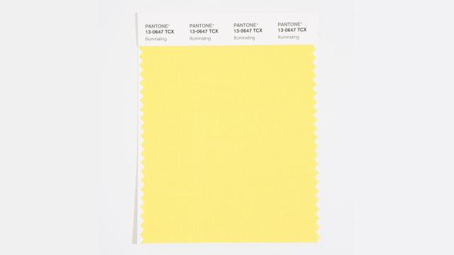
Colour of the Year is a relatively arbitrary award that has nonetheless been used in the past by designers to set trend outlooks or just use as inspiration. The honour has been granted every year since 2000, and its mission has evolved over time. In 2010, Pantone started theming the year ahead, and this edition brings us Ultimate Grey 17-5104 and Illuminating 13-0647 as “an aspirational colour pairing, conjoining deeper feelings of thoughtfulness with the optimistic promise of a sunshine-filled day.”
Pantone’s announcement reads like a horoscope for a person who’ll take a little optimism from anywhere they can get it. “The Pantone Colour of the Year reflects what is taking place in our global culture, expressing what people are looking for that colour can hope to answer,” Vice President of the Pantone Colour Institute Laurie Pressman said in the statement.
They’re good colours that look good together. But how do they stack up against entries from the past? Follow the slideshow to see Gizmodo’s definitive ranking of Pantone’s past picks.
22. Classic Blue 19-4052
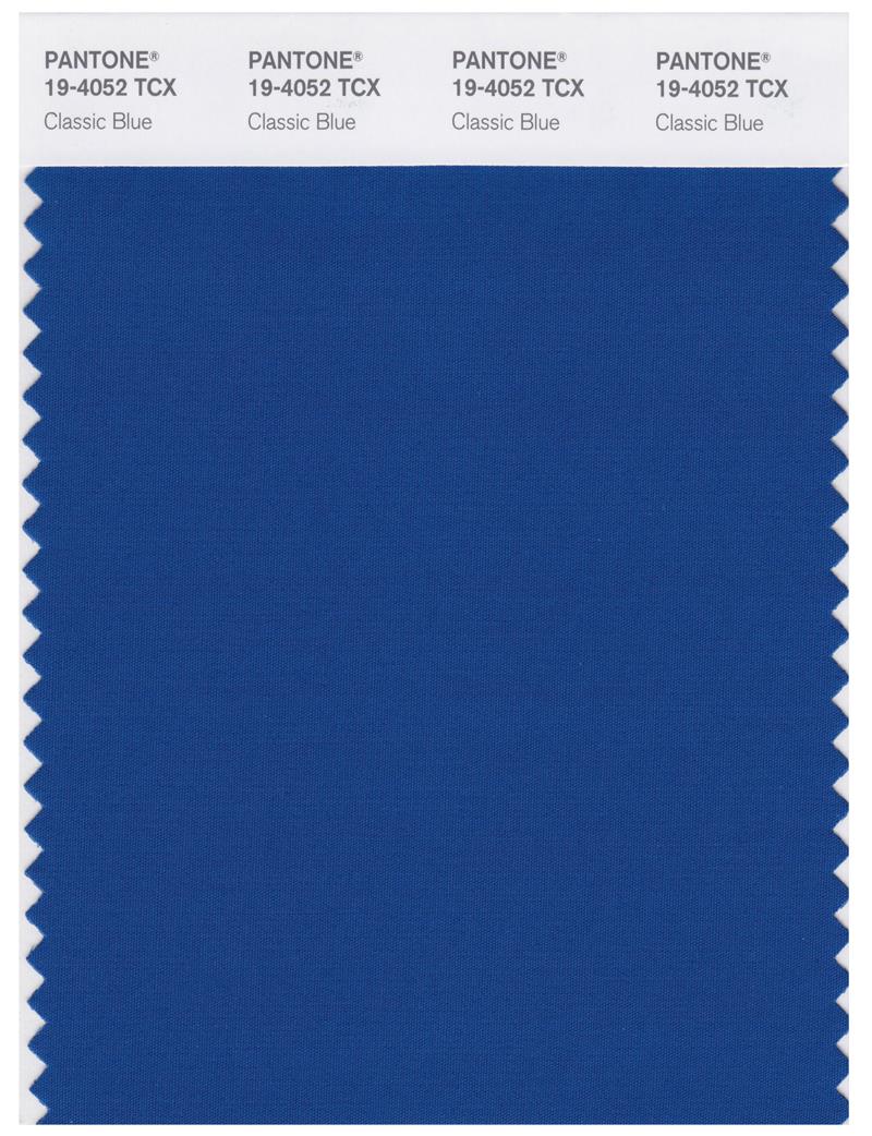
Year: 2020
The most basic and corporate blue. It’s Facebook Blue. It’s Chase Bank Blue. The worst colour for the worst year.
21. True Red 19-1664
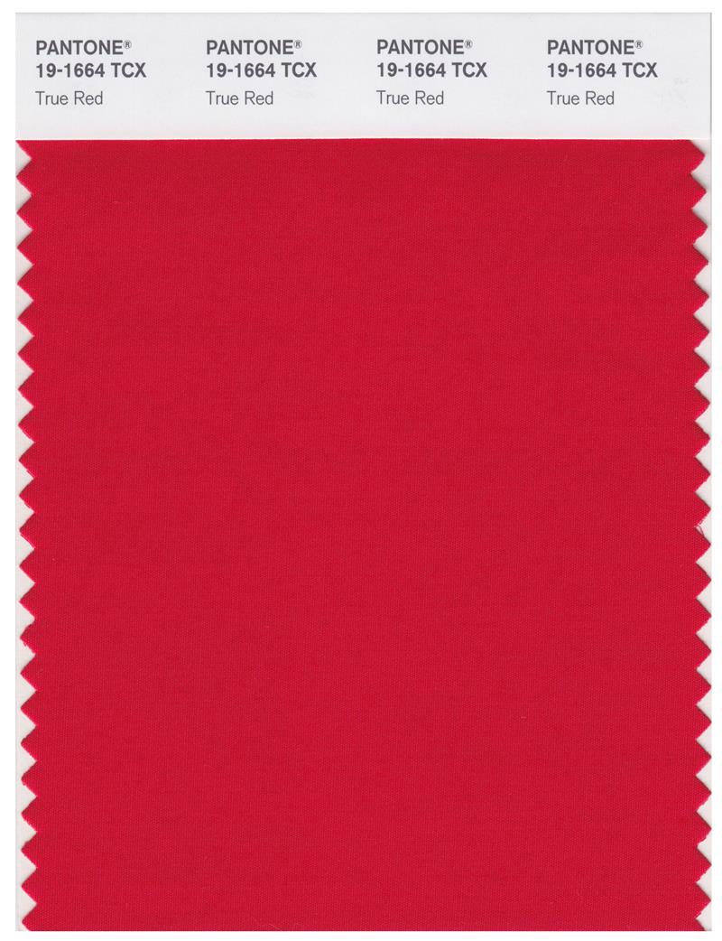
Year: 2002
It’s red, alright.
20. Emerald 17-5641
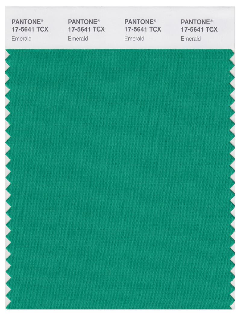
Year: 2013
A colour that’ll make any item look like it was crafted by an evil witch.
18. Fuchsia Rose 17-2031
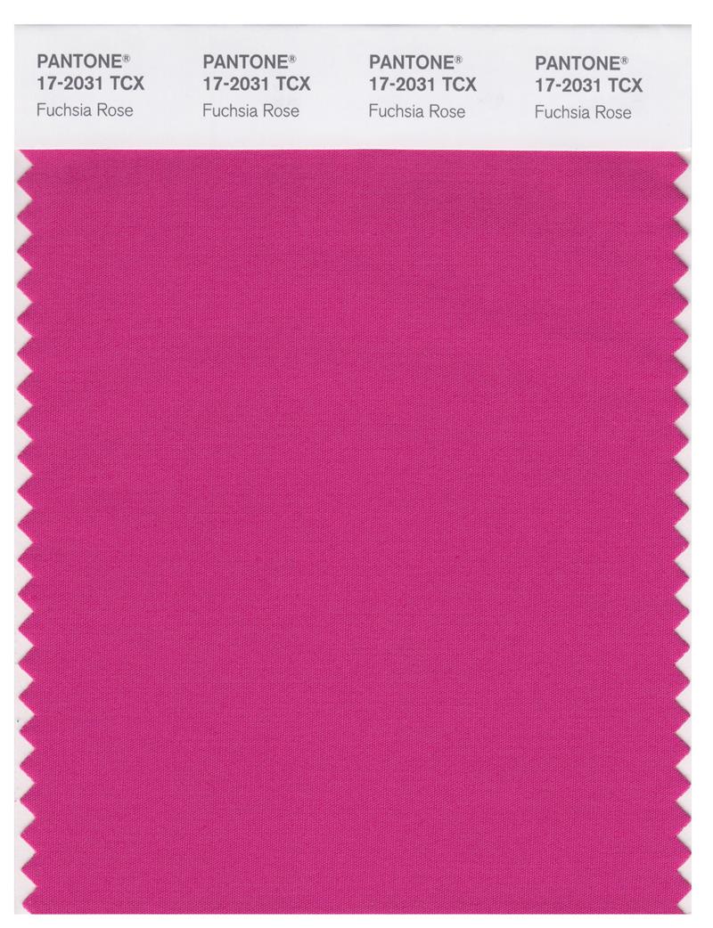
Year: 2001
Is it red? Pink? Purple? It’s confusing.
19. Turquoise 15-5519
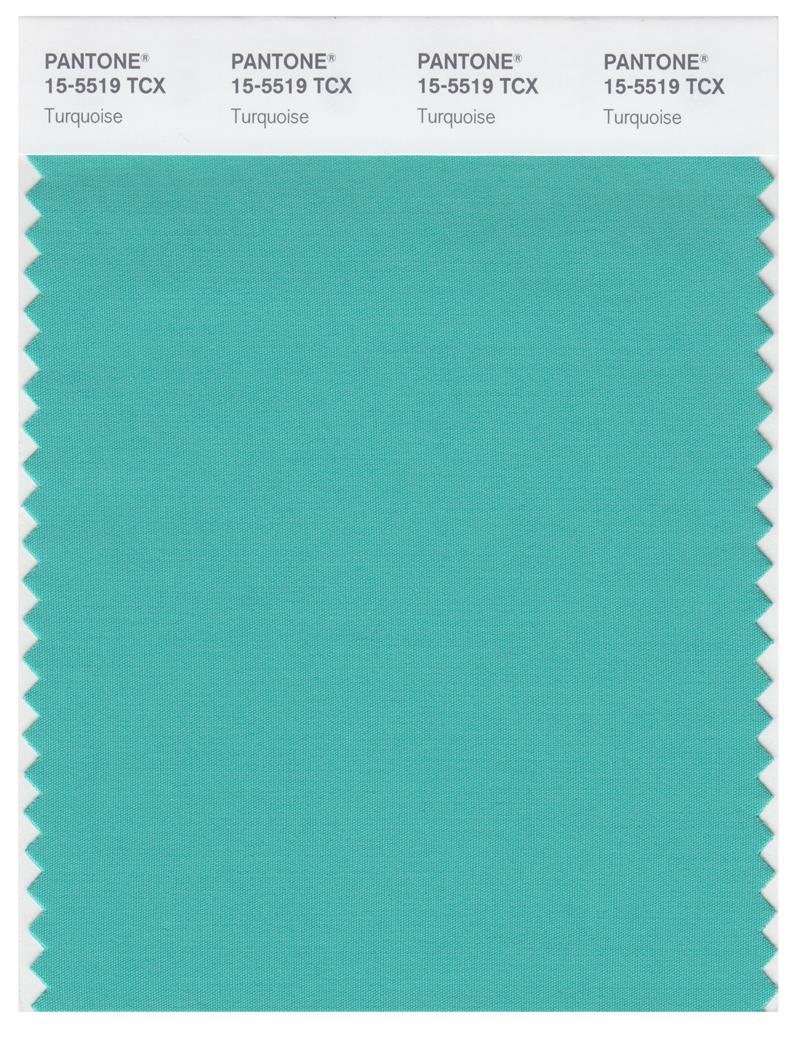
Year: 2010
It’s not so much ugly, as uninspired.
17. Chilli Pepper 19-1557
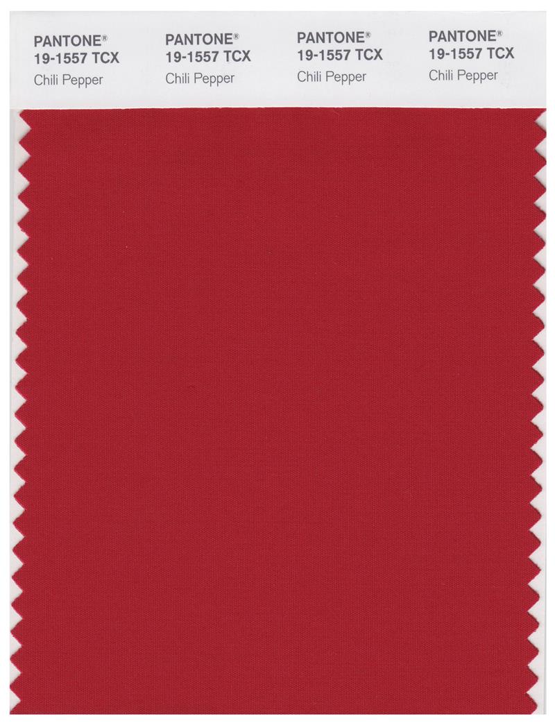
Year: 2007
I love chilli peppers, but Pantone misses the opportunity to evoke their deep and smoky mystery.
16. Blue Turquoise 15-5217
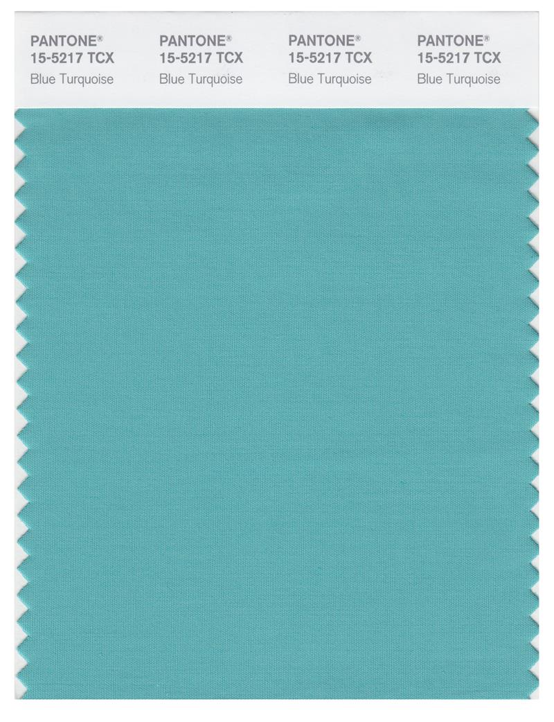
Year: 2005
Pantone finally hits on something greenish that doesn’t immediately offend me.
15. Sand Dollar 13-1106
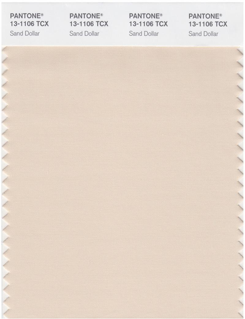
Year: 2006
Sand Dollar 13-1106 was the toughest colour of the year to rank. There’s an argument to be made that this is the classiest selection of them all, but I can’t get over how it reminds me of my grandparents’ bathroom from when I was growing up. For that, we have to dock points for being out of step with the times.
14. Marsala 18-1438
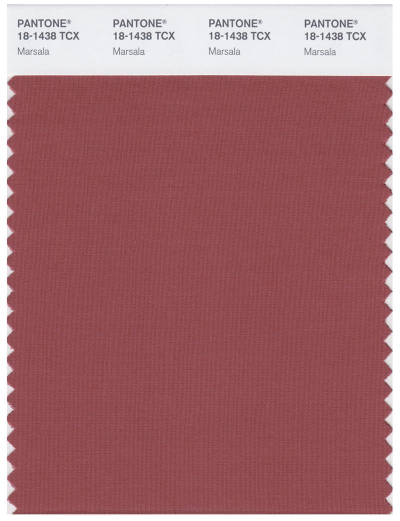
Year: 2015
Brown is underrated but not exactly beloved. Marsala 18-1438 walks the line between brown and red in order to cater to the needs of anyone.
13. Honeysuckle 18-2120
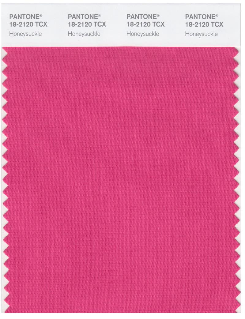
Year: 2011
An energetic colour that accomplishes its stated goal of “warding off the blues.”
12. Tigerlily 17-1456
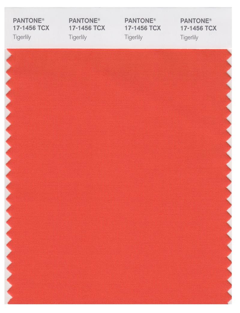
Year: 2004
Our only orange-ish entry. Justice for orange!
11. Rose Quartz 13-1520 and 15-3919 Serenity
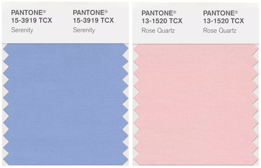
Year: 2016
For the first time, Pantone issued a dual selection for Colour of the Year. The choice wasn’t entirely successful, and the two shades give off an Easter vibe on their own. But when we see the colours in action, they work much better.
10. Blue Iris 18-3943
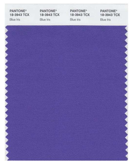
Year: 2008
Deep purple. Period.
9. Living Coral 16-1546
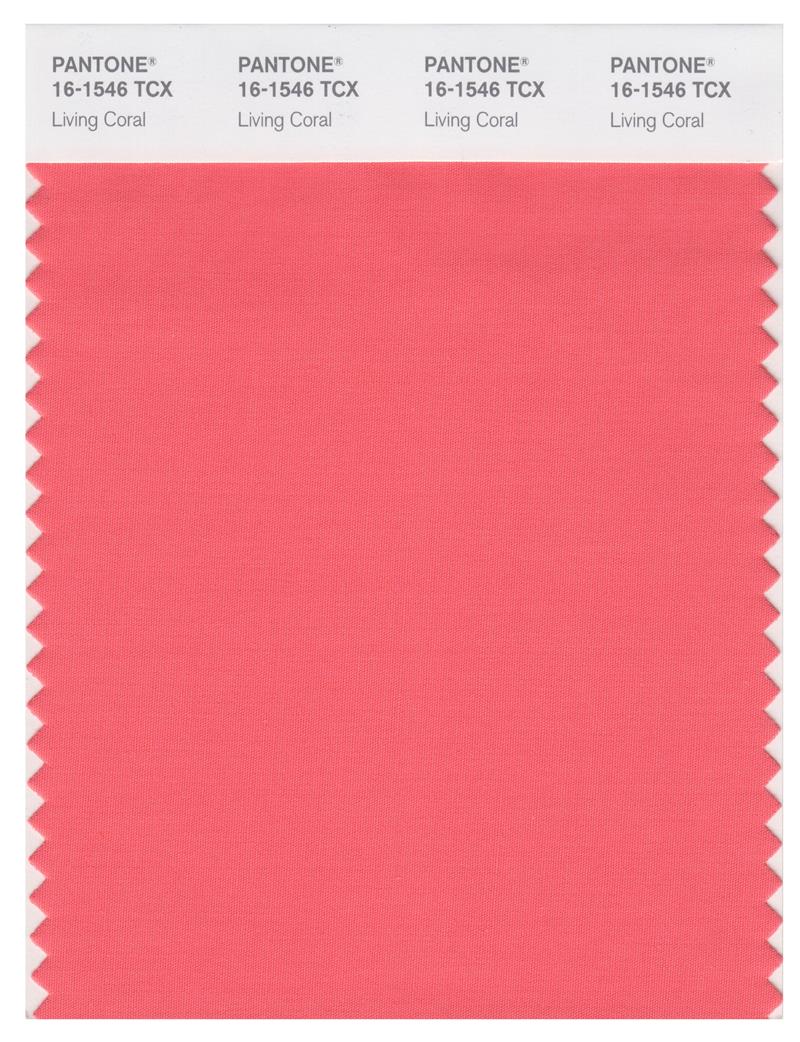
Year: 2019
A salmon that doesn’t make me want to vomit.
8. Aqua Sky 14-4811
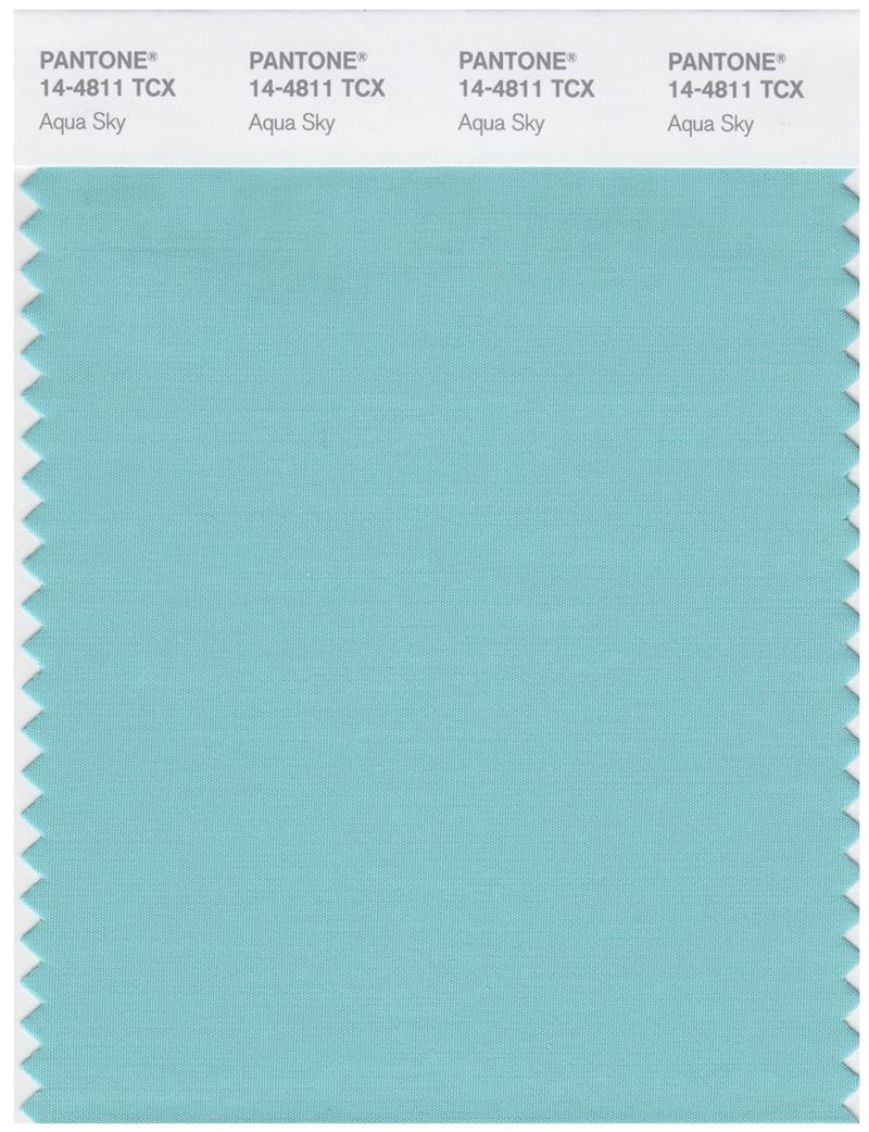
Year: 2003
Aqua Sky 14-4811 is probably ranked a bit high, but it gets extra points for being a form of seafoam green that doesn’t suck arse.
7. Mimosa 14-0848
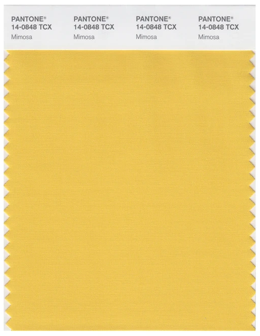
Year: 2009
Blazing colour that’s currently getting me through a snowy NYC day.
6. Tangerine Tango 17-1463
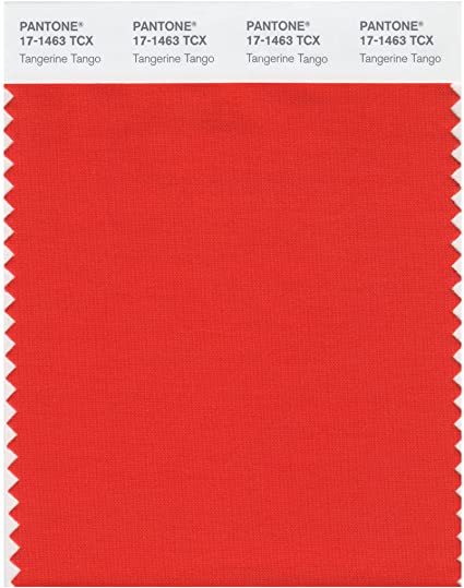
Year: 2012
“True Red” may have taken the prize in 2002, but for my money, red should punch you in the face. Tangerine Tango 17-1463 is loud and demands your attention.
5. Radiant Orchid 18-3224
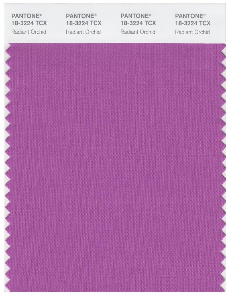
Year: 2014
Lovely. Just lovely.
4. Greenery 15-0343
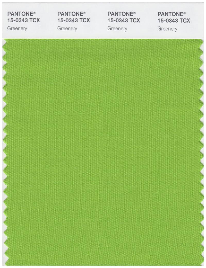
Year: 2017
Greenery comes from the earth.
3. Ultimate Grey 17-5104 and Illuminating 13-0647
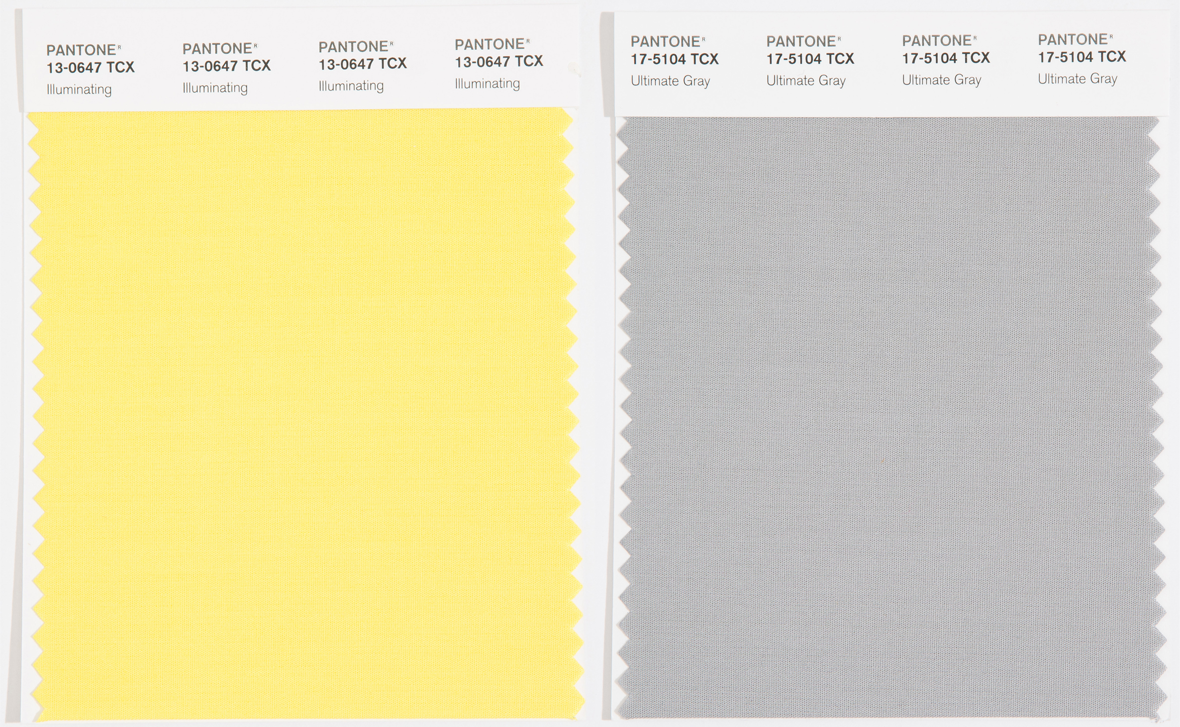
Not too shabby a showing for this year’s winner and a marked improvement over the last time Pantone tried to pass off its indecision as a novelty. These colours work well together, feel modern, and I’d take either one of them on their own.
2. Ultra Violet 18-3838
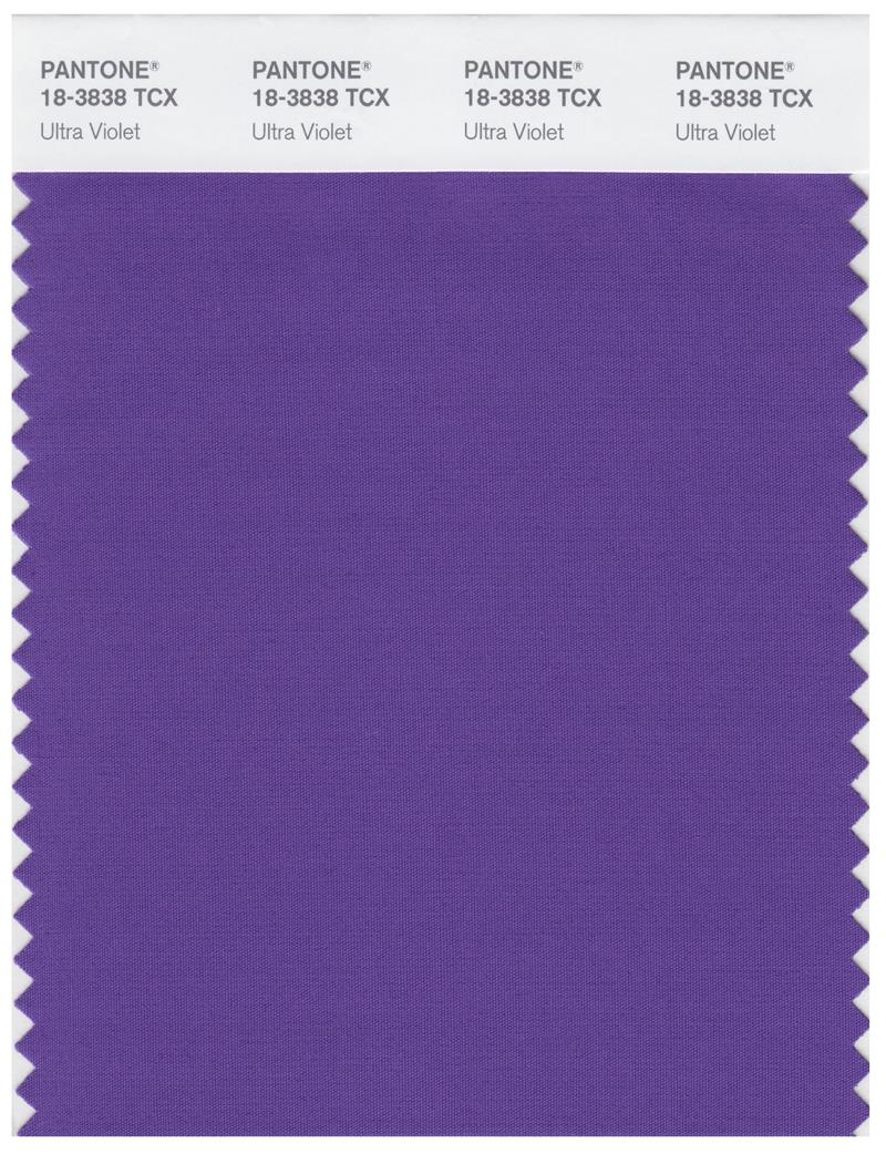
Year: 2018
Cool name. Cool colour.
1. Cerulean Blue 15-4020
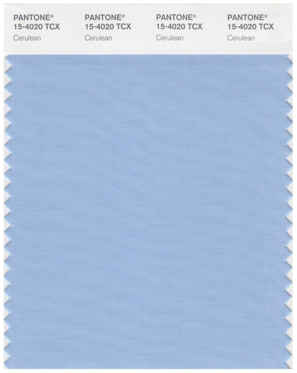
Year: 2000
It was the first colour that Pantone selected as a Colour of the Year, and it’s still the strongest. Cerulean Blue 15-4020 is timeless.