You know how everyone who sees the Rolls-Royce badge and famous Spirit of Ecstasy flying lady hood ornament always asks “Rolls-Royce? Aren’t they Hyundai’s entry-level car brand?” Well, Rolls-Royce, the 116-year-old maker of the most carefully-crafted luxury auto-mo-carriages in the world has decided to finally put an end to all that by re-designing their famous logo. Sorry, I mean their brand identity.
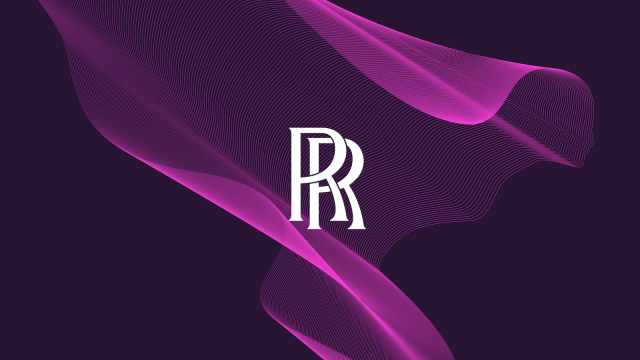
To most of you filthy, unschooled laymen, barely a step above animals, rooting around in your own wastes, you may only notice that Rolls seems to have removed the bounding box from their famous stacked-Rs badge, but it’s so so much more than that, you dirty beast. So much more.
And if you’re wondering why Rolls-Royce decided to do this, it helpfully tells us, right here in the press release:
• Rolls-Royce announces new brand identity further modernising the marque
• New identity continues Rolls-Royce’s journey from automotive manufacturer to House of Luxury
• New visual language will resonate with younger demographic of clients
• Leading design agency Pentagram appointed to envision new Rolls-Royce identity, to be rolled out from September
Yes, it seems Rolls-Royce has gotten tired of how painfully old their traditional clientele were. In fact, I remember hearing a rumour that in the early 2000s, every fifth potential buyer to enter a Rolls-Royce dealership died of old age right there in the showroom, forcing the staff to have to drag and heave the fresh corpse out to the dumpster, which caused a real hindrance to sales and a blow to morale.
Now, though, thanks to daring initiatives from Rolls-Royce like their rich-arsehole-targeted Black Badge line, described by the company as
“The introduction of Black Badge, the marque’s alter-ego, has met the needs of a subset of these clients, answering their call for an edgier, alternative Rolls-Royce, one that carries an assertive and dominant persona.”
…the marque’s average age of clients has dropped to a near-infantile 43 years old.
The new branding is designed to feel modern and forward-looking, and I do think Rolls-Royce is largely successful here. The unbounded stacked-Rs genuinely do feel cleaner and more modern, all while maintaining the same fundamental design that’s been around for over a century — that’s no small feat.
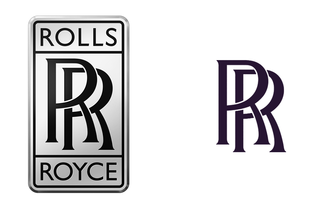
It seems like a simple change — hell, it is a simple change — but I think it’s the right one. I’m sure they went through insane numbers of variations before arriving at this straightforward solution. In fact, an anonymous source found the one that was runner-up to the unbounded Rs there:
No, no, I kid! I kid!
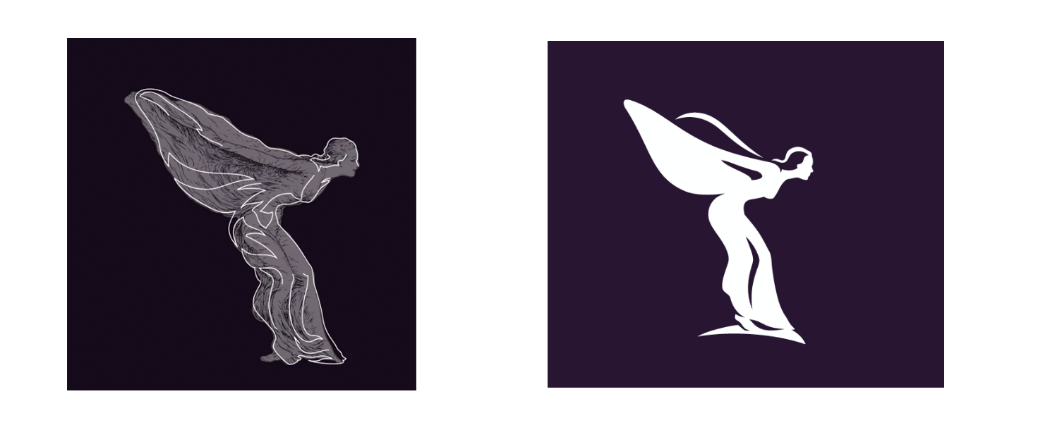
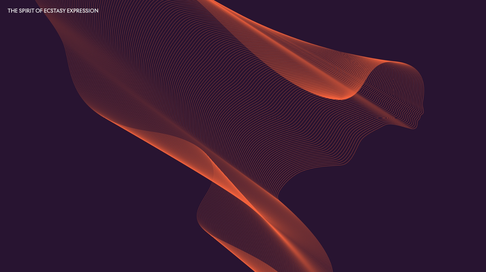
With Rolls-Royce proclaiming, disturbingly, that they intend to “journey from automotive manufacturer to House of Luxury” it makes sense that they’d seek to adapt their most famous physical identifier — the sculptural hood ornament known as the Spirit of Ecstasy but what everyone called the “Flying Lady” into something they can use in contexts other than mounted on a radiator grille.
This is a well-known concept in design — taking a physical thing and, you know, making a drawing of it — but somehow Rolls-Royce explains it as if we’ve never encountered the idea before:
The Spirit of Ecstasy will now gain increased prominence in the marque’s brand identity. While the sculpture that leads each motor car in silent grace remains unchanged, an iteration of the enigmatic figurine has evolved into the form of an illustration – one that reads clearly in today’s virtual world.
The original figurine was drawn and sculpted by British artist Charles Sykes. In homage to this historical commission, Chris Mitchell, a leading illustrator of brand and identity icons, was called upon by Pentagram to envisage the distilled form of the iconic statuette. Working closely with Pentagram’s direction, Chris, drawing on her quiet power and authoritative nature, paid close attention to her proportions which embrace strength and power that cannot be deemed fragile or meek. When depicted in two-dimensional form, her direction has changed from left to right, boldly facing the future, reflective of the marque itself.
Marina Willer, commented, “The use of the Spirit of Ecstasy marks a shift in the resonance of the brand – from an automotive to a lifestyle context. She commands an aspirational quality in the luxury sphere and by placing her at the centre of the visual language. The Spirit of Ecstasy can now be interpreted as the muse for the marque, in addition to the motor cars themselves.”
Yeah, we get it, Rolls-Royce. It’s like how the Transamerica “evolved” their whole damn building into their logo, or any huge number of other companies. We know how this works.
Snarkiness aside, Mitchell did a lovely job distilling our winged friend into a logo design:
I also think the adaptation of it into these wireframe, stylised examples works extremely well, too:
While all of the House of Luxury and “lifestyle brand” bullshit is as eye-rolling as it is from any company and will just likely mean ridiculous catalogues of dizzyingly overpriced crap for rich people to let other people know how rich they are without having to endure the indignity of actually interacting with anyone, the actual design work here is quite nice, and I’m sure when I buy my next Rolls I’ll be excited to see those Rs and that birdwoman stamped all over everything.
Maybe now people will, somehow, equate Rolls-Royce with wealth? Finally?