You don’t know what you have until it’s gone. It’s a well-worn cliche, but also an apt description of a web game called User Inyerface, created by design firm Bagaar.
It takes all the normal conventions of a website’s user interface and throws them out the window, leaving one of the most user-unfriendly experiences you’ll ever try to navigate. Is it worth your inevitable decent into madness to try and get to the end?
As you jump from website to website throughout your day — watching videos, ordering food, paying bills or checking Gizmodo for more excellent content — you probably don’t notice the subtle design patterns and rules that govern the modern web.
We take for granted that a button of a certain size, shape and colour will reliably perform a very specific task, and that it can always be found on a certain part of a web page. It’s the result of years of work and analysis by interface designers striving to make websites accessible and easy to navigate without forcing users to sit through a tutorial each and every time.
In a way, it’s a language we’ve all unconsciously learned, which is why User Inyerface seems to difficult to navigate. The game speaks and entirely different design dialect.
[referenced url=”https://gizmodo.com.au/2018/11/this-solution-to-phone-multitasking-is-either-genius-or-totally-absurd/” thumb=”https://i.kinja-img.com/gawker-media/image/upload/t_ku-large/s60o5wcndan3u5bglaiu.gif” title=”This Solution To Phone Multitasking Is Either Genius Or Totally Absurd” excerpt=”This concept UI that switches apps automatically as you physically move your phone around your desk is potentially a great solution — or just ridiculous. We can’t decide which.”]
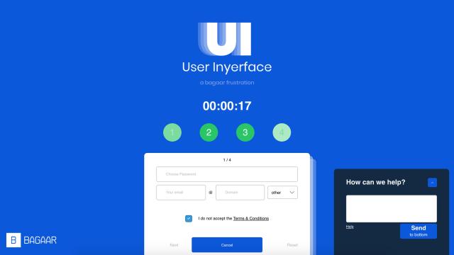
The goal of the game is to complete the four forms it presents as quickly as possible, and on the surface it seems trivial. It’s only when you start clicking on things — at least things you assume should be clickable — that the underlying diabolicalness of the game really start to show.
Even a task as straightforward as choosing a password becomes an uphill battle once you realise the list of requirements includes “at least 1 Cyrillic character”.
Forms with sample text don’t auto-erase when you select them, clickable buttons don’t trigger a cursor change, and you can’t close nagging pop-up windows until you realise the close button is hiding in plain sight as copyright text at the bottom of the window.
You’ll walk away frustrated, both at the game’s maddening lack of logic, but also because you’ll probably throw in the towel long before solving it. The secret goal of User Inyerface is to get users to finally notice all the hard work that goes into making the rest of the internet a little less frustrating to use.