Last year, a visualisation that turned data on our planet’s temperature into a gradient of colourful stripes made a splash by showing how severely the world has warmed to-date.
Now, a new visualisation riffs on that by showing what the future holds depending on when and how fast humanity cuts its greenhouse gas emissions. And folks, the choice is pretty stark.
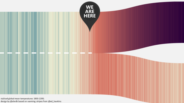
Scientists and policymakers often talk about the global average temperature and what things will look like in the future, but it can feel vague and hand-wavy. But plot it in technicolor and suddenly the future becomes a lot more visceral. That’s exactly what German engineer Alexander Radtke has done with his new illustration, which extends last year’s climate stripes out to 2200.
Each stripe represents the annual global temperature’s departure from average under two different scenarios that leading climate scientists have created. In one, carbon pollution continues unabated through 2100. In the other, emissions peak in the next 12 or so years and begin their decline.
I could bore you with all sorts of details on the work that went into creating these scenarios, but Radtke’s visualisation cuts to the chase.
In a world of unmitigated emissions, the planet would warm up to 9 degrees Celsius above average (which in this case is 1961-1990) by 2200. That’s the pathway on the top, and it would be a hellacious world inhospitable to civilisation as we know it.
But as Radtke’s bottom illustration shows, cutting emissions rapidly means the global average temperature would peak near the 1.5 degree Celsius threshold by mid-century and then begin to decline into the future. You can almost feel the fire of global warming being put out in the second visualisation. He also created images for pathways between these two, showing what awaits if the world takes mild or belated action to address carbon pollution.
Radtke told Earther he was inspired to make the illustration after witnessing the Fridays for Future climate strike in Dusseldorf last week.
He said many students incorporated the original climate stripes graphic made by University of Reading scientist Ed Hawkins into their signs, and that “I wanted to make a visualisation that shows the paths we can choose and simultaneously puts ‘us and now’ from the edge [to] the centre of the picture.”
And with a “you are here” reminder placed right in the middle, the crossroads the world is at are clear.