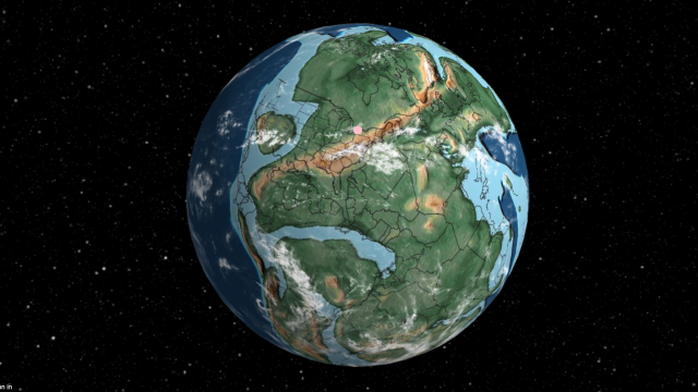
My location in Oakville, Ontario (just outside of Toronto) as seen 260 million years ago. Image: Ancient Earth/Ian Webster
Ever looked at a picture of the supercontinent Pangea and wondered where your current address would have been 250 million years ago? A new interactive map provides this very service, allowing you to see modern locations across 750 million years of our planet’s history.
This awesome 3D map is the brainchild of Ian Webster, curator of the supremely impressive Dinosaur Database. It defaults to 240 million years ago, during the Early Triassic, a time when life was rebounding from the Permian mass extinction and early dinosaurs began to make an appearance. Back then, our planet was dominated by the giant Pangea supercontinent, and it makes little sense from our current perspective.
To help, Webster overlays the map with modern political boundaries, and you can even search for present-day addresses to pinpoint specific locations. Using the left or right cursor keys, you can scroll back or forward in time to see the shifting of the continents. In all, the map goes from 750 million years ago to the 21st century, so you can watch how a specific location on Earth changes across the Devonian, Jurassic, Neocene, or whichever period strikes your fancy.
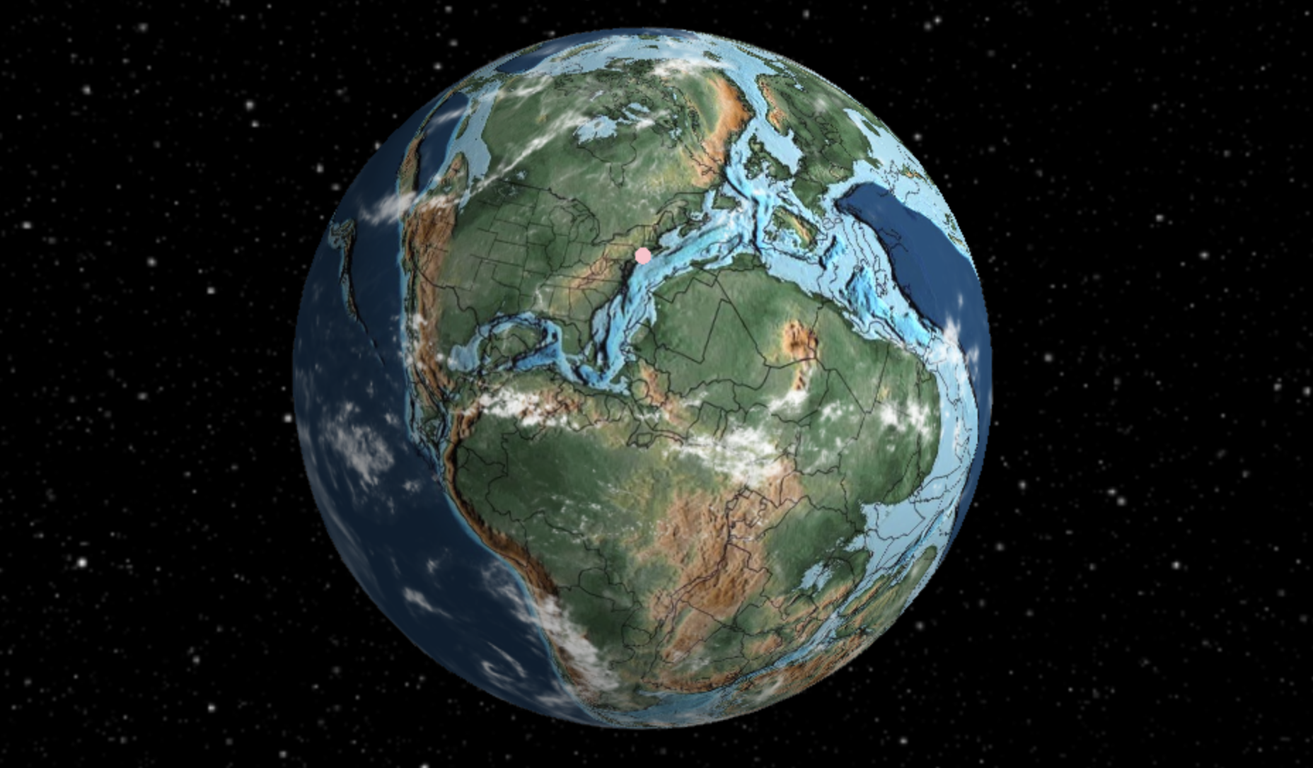
New York City, as seen 170 million years ago.Image: Ancient Earth/Ian Webster
The Ancient Earth map comes with some neat features, including a brief description of the chosen period at bottom right, and the ability to remove clouds and stop planet rotation. Using the mouse, you can orient the map to your liking. Specific time periods can be chosen using a dropdown menu at top. Another dropdown menu lets you jump to specific stages in the evolution of life, such as the emergence of the first land animals or the first hominids.
Writing in Hacker News, Webster says he built the open-source visualisation by adapting GPlates, a project that provides geologists with desktop software required to investigate tectonic data. “I’m amazed that geologists collected enough data to actually plot my home 750M years ago, so I thought you all would enjoy it too,” he writes. The system returns precise results, but Webster says the plot points should be considered approximations, “obviously we will never be able to prove correctness.”
For sure, it’s probably not the most accurate thing in the world, but it’s still pretty neat. You can find the map here.
[Dinosaur Database via Kottke]