It’s hot in the US. It’s been hot in the US. It’s going to be hot in the US.
Image: NOAA
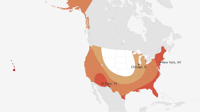
The National Oceanic Atmospheric Administration just released its 2017 summer temperature outlook for the United States. And hopefully this won’t surprise you, but chances are that this summer will be hotter than average.
The map might look confusing, at least it confused me at first, since red usually means “hotter” and blue usually means “colder”. But in this case, red means more likely to be much hotter than average, blue means more likely to be much colder than average, and white means equal chances, hot or cold. In this case, much hotter or cooler means temperatures falling in the top or bottom third of recorded data from 1981 to 2010.
If you need me to explain the map too, in the Upper Midwest, Plains states and Mountain states, it’s a toss up whether or not it will be hot. Everywhere else, it will probably be hot.
I think this is a good time to ask, what exactly is “the Midwest?” As a child, I thought the region included anything west of New Jersey and north of the Ohio River (including upstate New York and Texas) and east of California. But after spending a few years in Wisconsin and getting lots of scolding, I now know that there is, in fact, an Upper and a Lower Midwest, Prairie States, and even Mountain States. Apparently, the Dakotas are NOT part of the Midwest, according to Wisconsinites. Feel free to sound off in the comments about your preferred definition of “the Midwest”.
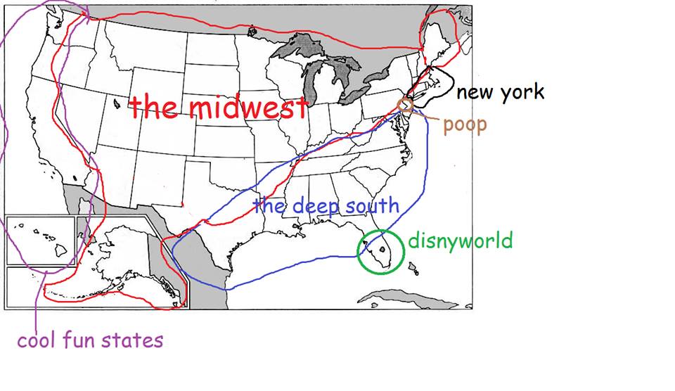
This is what I used to think. Not what I think any more. Image: Ryan F Mandelbaum
Anyway, the NOAA explains the maths behind their prediction map more in their 2016 outlook.
You probably want me to say something about climate change now, but this is a post about the weather, not the climate. I will say, though, that things are looking hot. The autumn of 2017 was hot. 2016 was the hottest year on record. We can’t stop breaking carbon emissions records. So, yep, 2017 is going to be hot.
In other words:
[NOAA]