There’s been plenty of talk lately about why certain typefaces are better (or truly awful) for our increasingly screen-based reading. A new typeface by celebrated typographer Tobias Frere-Jones is designed to elegantly bridge what is perceived to be a growing gap between print and digital worlds.
After a very public split from longtime business partner Jonathan Hoefler last year, Frere-Jones has launched a new foundry — Frere-Jones Type. His new typeface, Mallory, is the first he’s developed from scratch in two years.
Mallory actually began innocently enough, with a thought experiment: What if there were a typeface that drew equally from both English and American type histories? Frere-Jones himself is a kind of hybrid, as he’s the child of both English and American parents (Mallory is actually a family name on his father’s side).
Here’s Mallory in all its Transatlantic glory
For inspiration, Frere-Jones looked at the work of some of the most famous type designers in history. The English reference points are Edward Johnston, best known for the hyperlegible typeface developed for the London Underground system, and Eric Gill, known for the equally utilitarian Gill Sans. The American reference point is W.A. Dwiggins, a typographer who was credited with coining the term “graphic designer” back in the 1920s, and therefore made slightly more decorative (but still useful!) fonts like Caledonia. Frere-Jones notes the British influences are as “dignified and austere”, while the American side is more “friendly and approachable”.
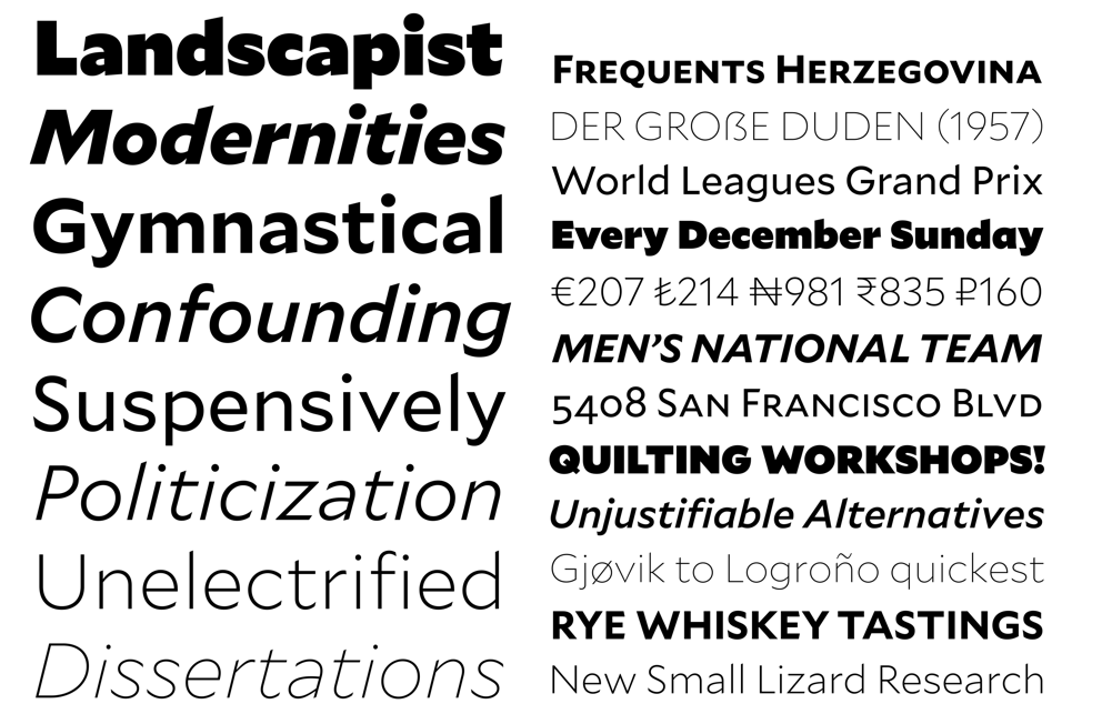
Mallory — nicknamed the “Transatlantic Sans” — actually oscillates between the two influences as well. You can see how some letterforms have a very rigid, angular geometry, and others are curvaceous and flowing. This makes it a typeface that plays exceptionally well with others, easily moving into the leading role or stepping aside to be the supporting actor.
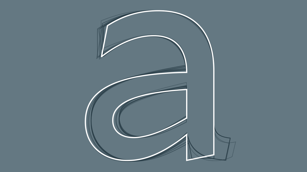
Sketching out the perfect ‘a’
In fact, this is how Frere-Jones sculpted Mallory, using the font-building software Font Lab and RoboFont as well as a suite of custom-built tools. He’d begin with a very thin, delicate version of each letter, and a thick, boisterous version, then see how far in either direction each letter could go. But as far as the weight that eventually won out, it all came down to legibility at tiny sizes — a key component to Mallory.
The biggest challenge facing new typefaces is that they’re often being used in smaller and smaller applications; Frere-Jones developed one named Retina for the Wall Street Journal to display stock information in 5-point letters. These teeny characters have become more difficult to execute with the advent of tiny screens, where letterforms are even less forgiving. That’s why Apple developed an entirely new typeface for its Watch, San Francisco, which has become standard for its other operating systems as well.
Mallory Standard is shown here in solid, MicroPlus is the outlined version
But for Mallory, Frere-Jones didn’t want to make one family for print and a special one for the web, as many contemporary type designers do. “I didn’t want to make a font that only had relevance in one environment,” he says. “As print and web become less divided, the crossover between them becomes more frequent. It seemed like having one side of the divide was like building a car that can only turn left.” And that’s where Mallory’s MicroPlus comes in, the super-tiny double purpose version that’s the same for both mediums.
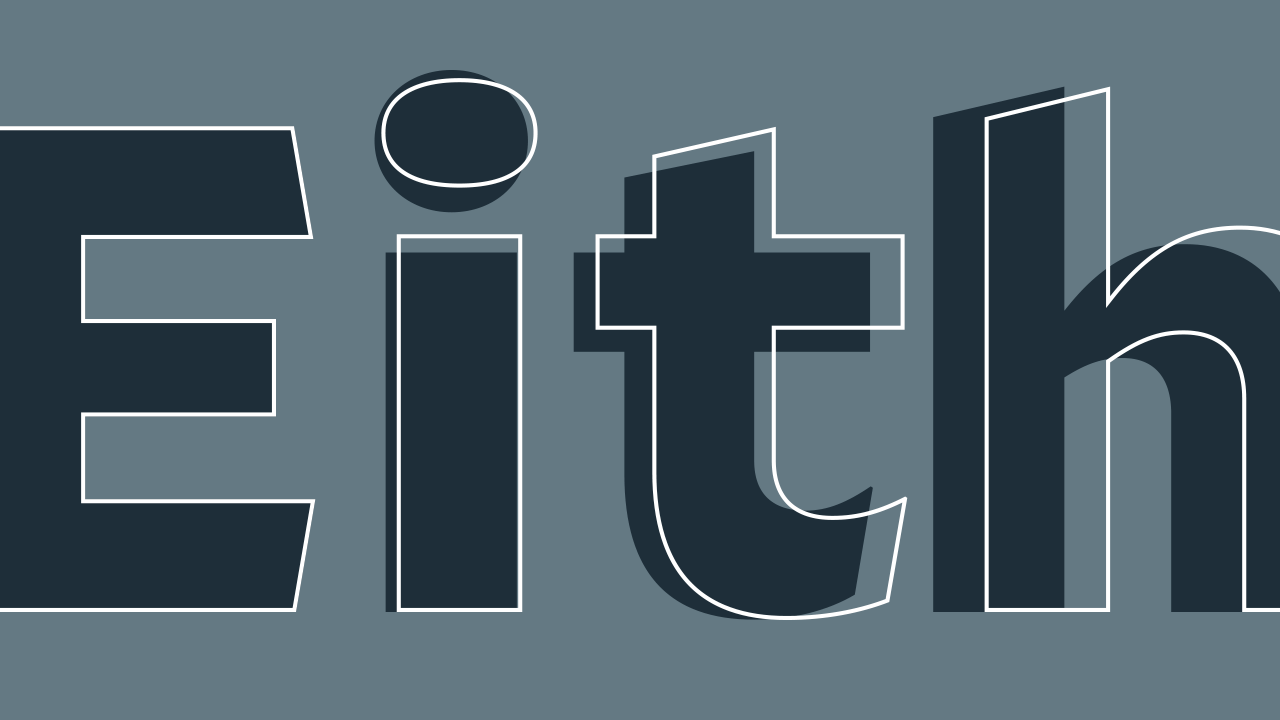
There’s been a lot of talk about simplicity in type over the past few years. For example, Google claims that changing its logo from a serif to a sans serif typeface helps its digital applications load faster. But something you can see easily in Mallory is that sometimes a letter’s shape becomes more legible if it’s slightly more complicated. This is the key to smaller letterforms — the ‘l’ and the ‘i’ must look very different from each other to set themselves apart from one another.
Note the elongated ‘l’ and the very discernible round dot over the ‘i’; the way the ‘e’ and ‘a’ could never be confused
And that’s another thing that Frere-Jones wants to emphasise. Type has evolved for hundreds of years, but one truth has remained for all those centuries: Legibility is everything. It doesn’t matter if you’re reading a poster or an iPad.
“I’m glad people are taking more time to think about what’s more legible. I’m hoping this will help them understand that Helvetica’s not this invincible thing because it’s actually very terrible for text,” he says (to which I cheered). “But this idea that typefaces react to what the human eye needs and how we read — that never changes.”