I’ll come right out and say it: OS X El Capitan isn’t that exciting. However, Apple’s newest operating system wasn’t meant to be a revelation but rather an under-the-hood upgrade full of little improvements. I will admit that a handful of the design tweaks are downright delightful.
As the name implies, OS X El Capitan is a nice change of scenery rather than a whole new realm. Yosemite was most definitely a dramatic improvement over Mavericks — which was markedly different than Mountain Lion. Big changes can be jarring, and in that respect, El Capitan is refreshingly subtle. It’s also full of neat little surprises that are surprisingly useful.
The Typeface
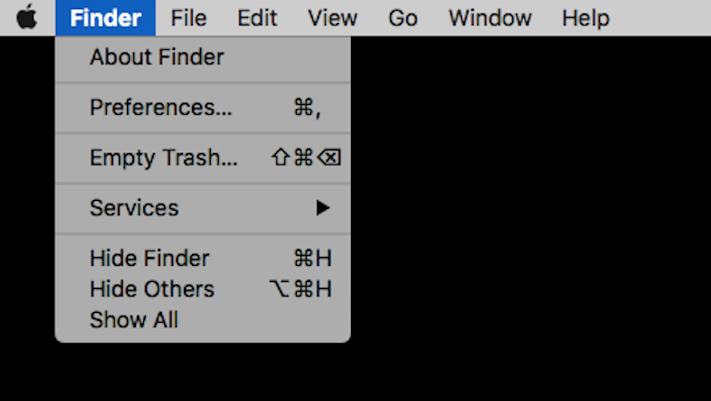
The most significant but perhaps least noticeable change is the typeface. Apple furrowed some brows last year when it ditched the old Lucida Grande typeface for Helvetica Neue. Designers thought this was a strange choice, and we thought it was downright bad. Apparently, Apple took notice. In El Capitan, there’s another new system-wide typeface: San Francisco. It’s nice!
For reference, here’s what the same menu looks like in Helvetica Neue:
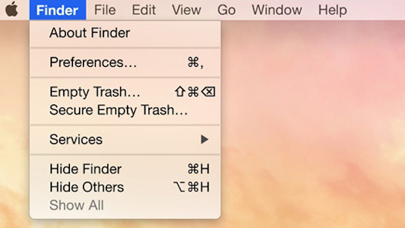
The difference is very subtle, but that’s kind of the point. San Francisco subtly adapts across devices and screens, making it the perfect typeface for Apple’s stable of devices.
The Cursor
Speaking of points, let’s talk about cursors. Within my first hour of using El Capitan, I thought I spotted a bug. My cursor would suddenly become massive, I suspected, for no good reason.
Then I realised that this was a feature. You know how sometimes you’ll lose track of the cursor and shake the mouse to find it? The new feature makes the cursor about ten times its original size when you do that shake so you can see it more easily. It usually takes, like, three shakes — but once it’s gigantic, you can’t miss it.

New Gestures
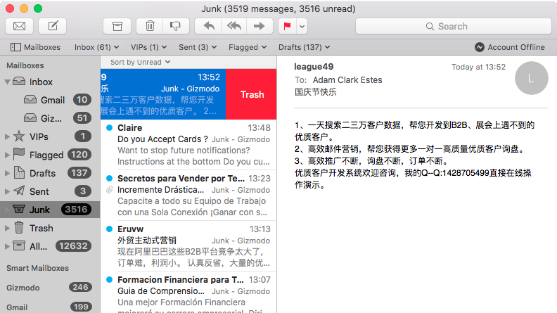
El Capitan is actually full of gesture-based features, some of which have been borrowed from iOS. The one I like the most deals with one of the native OS X apps that I use the most: Mail. In my recent history as an iPhone user, I’ve especially enjoyed the ability to swipe things away, namely unwanted emails. A hard swipe to the left, and it’s gone. El Capitan adds that functionality Mail. You just swipe left on the Magic Mouse or trackpad to delete, and you swipe right to mark as read. It’s fun!
The New Beach Ball of Death
I saved the best for last. You know the spinning pinwheel, a.k.a. the beach ball of death? It’s awful, because whenever you see it, you’re being forced to wait for your computer to catch up with your brain. The beach ball of death was always an ugly sight, too. Look at it:
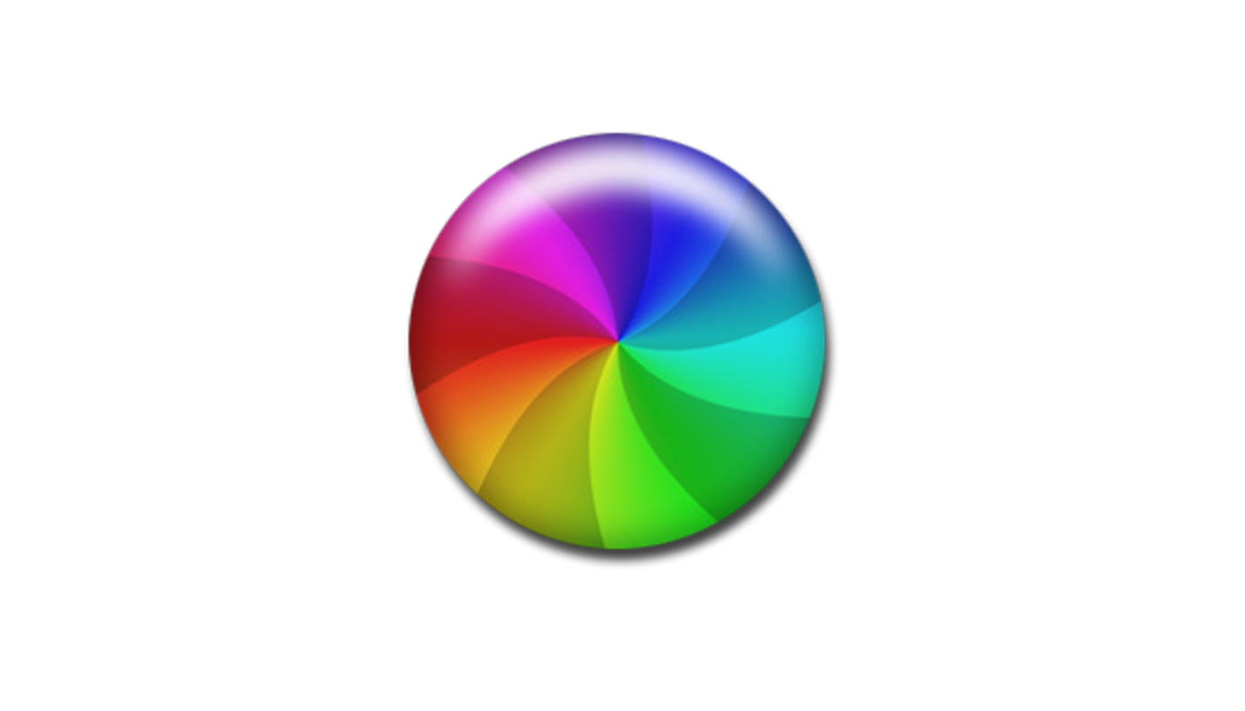
Jony Ive doesn’t like ugly UI, so the design team made a new beach ball of death. It’s very pretty!
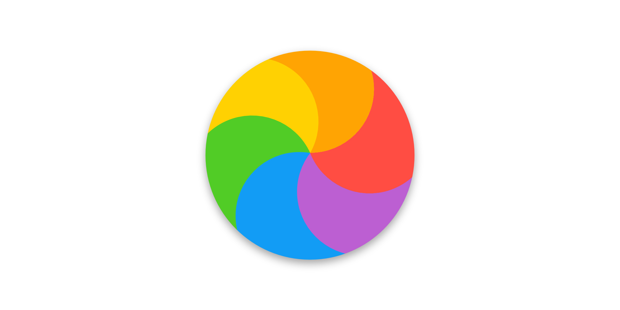
I love it.
Now are these little design tweaks going to transform your life? Probably not. However, they do make an otherwise boring upgrade feel like a lot of fun. And they definitely make El Capitan worth downloading the upgrade. After all, it’s free.