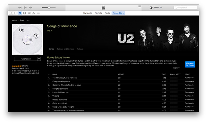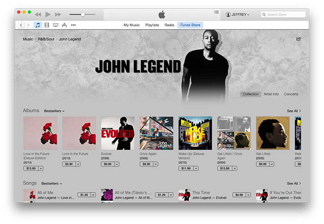
As well as a bunch of new iPads and the launch of OS X Yosemite, Apple is likely to roll out an updated version of its iTunes storefront this week, according to Apple Insider. Check out an early look in these screenshots.
It seems the changes are mostly (if not purely) aesthetic. Revealed to iTunes 12 beta testers, it’s definitely taking its cues from iOS 7 and iOS 8’s push towards a flatter user interface. As a result, iTunes’ shadowed buttons and gradients are out, and crisp lines and bold, solid colours are in.
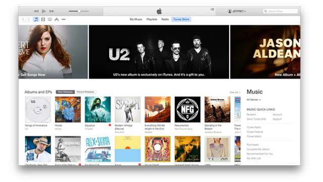
The shift is most obviously apparent with the homepage carousel that no longer rotates with depth, but instead scrolls horizontally with flat featured content panes. OS X and iOS may not be fully merging, but they’re increasingly on the same page when it comes to aesthetic design. [Apple Insider]