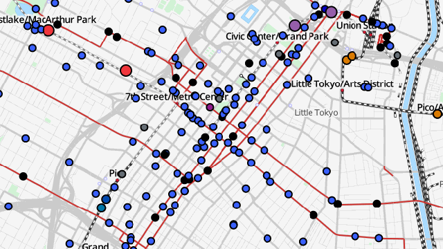
Google Maps is great for transit directions, but what if you want a gods-eye view of a city’s public transportation network in motion? Try TRAVIC.
Developed by University of Freiburg grad student Patrick Brosi and geOps, TRAVIC (Transit Visualisation Client) harvests public data feeds supplied by transit operators like L.A. County’s Metro to visualise the location, second-by-second, of all the buses and trains in a given system. Transit vehicles appear as coloured dots on a map. Click on a dot, and the software will highlight the applicable route on the map and list scheduled arrival/departure times:
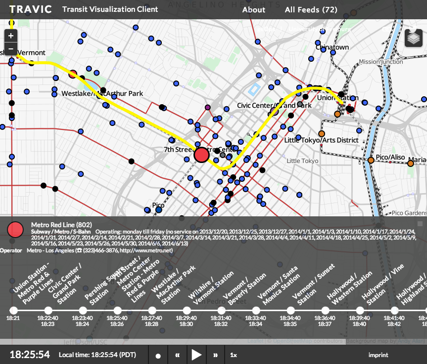
Best of all, it’s animated. By default, the software runs in realtime so that the dots merely crawl along the city streets, but users can speed up the animation as much as 60x. At that rate, the buses and trains zip through the city, and it’s much easier to visualise frequency — and hence how well a neighbourhood is saturated with transit options.
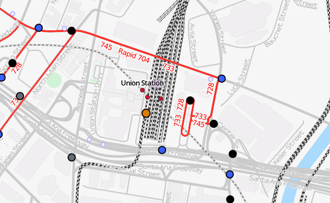
Here’s the area around Union Station, a major transit hub for Los Angeles:
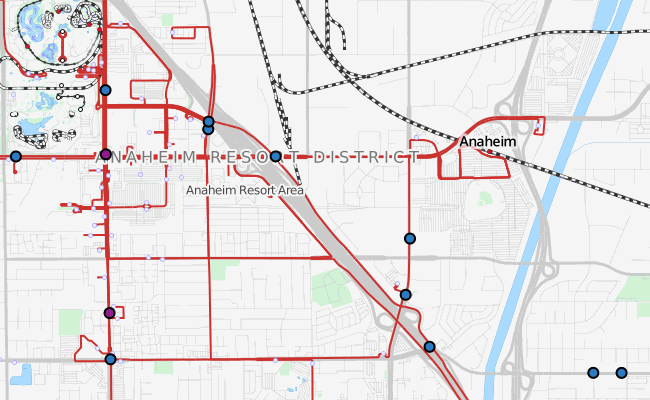
And here’s a snapshot of Anaheim, using schedule data from the Orange County Transportation Authority:
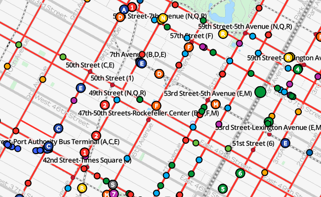
TRAVIC actually integrates data from 72 feeds covering cities on four continents, so there’s much more to explore beyond the Southland. Here’s a snapshot of Manhattan:
[h/t Digg]