IMDb is one of the most useful sites on the web. But it’s also one of the most outmoded. Now, two web designers have taken it upon themselves what an IMDb for 2014 would look like — and the results are great. Here’s how they explain their design.
For anyone who isn’t already aware of it, IMDb stands for Internet Movie Database. It’s “the world’s most popular and authoritative source for movie, TV and celebrity content”, and when they say “popular”, they mean it: the website brings over 160 million visitors per month.
When we first decided to do this redesign, we wanted to do something meaningful and not just good looking. “Internet Movie Database” is a cool name, and it’s a great mark of authority — but what really is a database? What does it says about the website? Basically, from this point of view, IMDb is supposed to be a resource to exploit in its integrality. It means that every single datum has its importance.
The problem is that the larger the database, the more chances we have to lose, or forget, some of those precious data points. And, well, this is a bit of a problem when it comes to movies isn’t it? A movie is a piece of art, and we cannot afford to lose it. What’s the point of a database if, in the end, it swallows them up — when it could be a great way to rediscover them?
Tomorrow, we want the user to go to IMDb.com to find movie suggestions, to admire collections as they would in an archive room, to be guided. Therefore, our objectives for this redesign were:
- Valorise every work and prevent the database from becoming a mess by helping the users to rediscover great movies and TV shows.
- Create a website focused on passion rather than media. Bring IMDb back to its roots.
- Transpose authority and legitimacy.
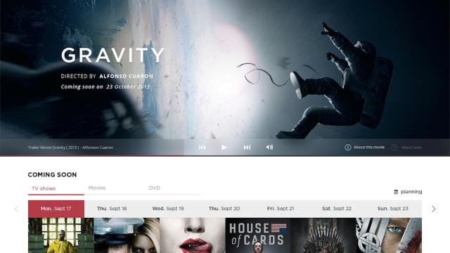
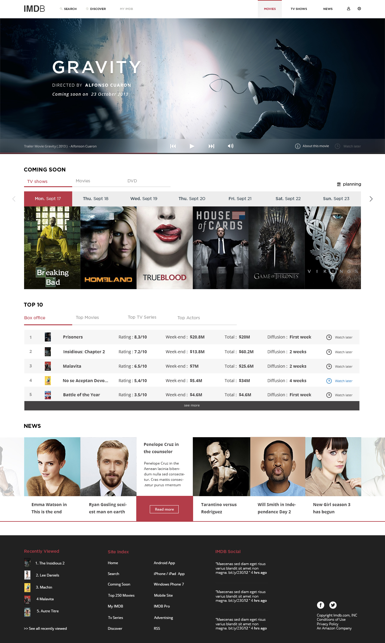
The IMDb Home Page
The main function of the home page is to deliver and valorize the latest information about what’s happening in show business. The main purpose of going to a site like IMDb is to watch the latest trailers or get a quick review about the newest movies. So basically, we tried to bring all that information above the fold line on the homepage so that we don’t lose any time searching for it.
We structured the page this way by order of importance: A big interactive player for the trailers, then a calendar for the latest shows on air, the latest top tens and news.
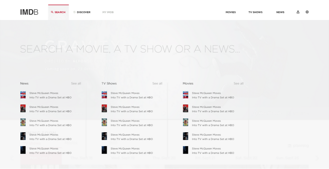
The IMDb Search Feature
When we designed the search feature for this IMDb concept we looked for great practices for a very long time. We really wanted something that returned results instantaneously (that could be useful for a database) in the most clear way, and of course, something intuitive.
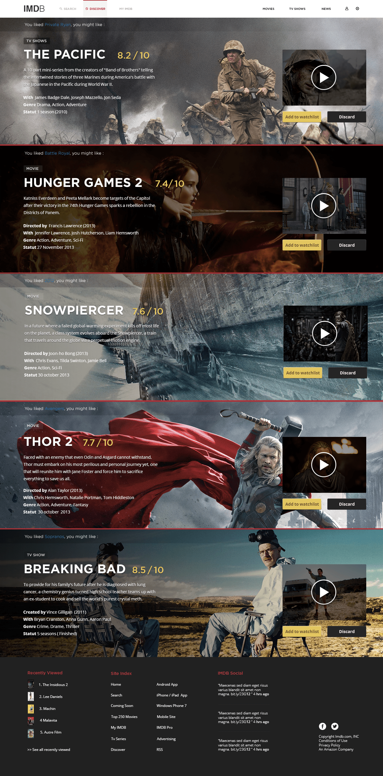
The IMDb Discover Feature
When we thought of this feature, what we had in mind was pretty much what Spotify does. We wanted to have the very same thing, but for the most importance movie website. It had to be simple, attractive, and it had to give every valuable information and interactions in a minimum of time.
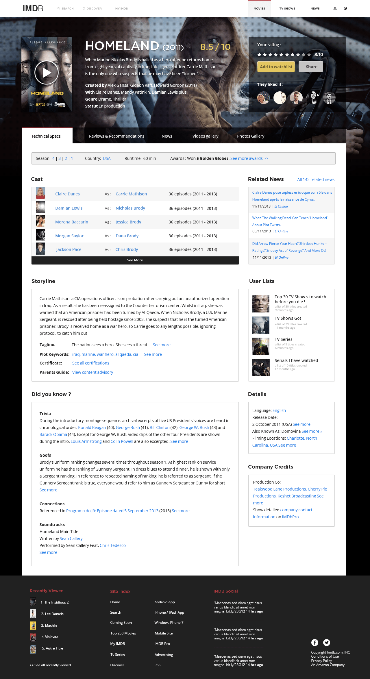
The IMDb Detailed Sheet
This page was maybe the most challenging: it provides a lot of information of very different types. So, we created six information clusters:
- Technical specs
- Reviews, recommendations
- Related News
- Media
Everything else was just prioritization: What do I must know first about a movie before I scroll or move on to the next one? We brought all of that information above the fold line.
Conclusion
We really enjoyed doing this redesign, we learned a lot about design and movies of course, but, most of all, we learned to work as a team and confront ideas. And even if it is not a real project, we really encourage people to have the same approach because it is a really great way to improve and actually work on cool projects.
Rémi Fayolle and Gilles Bertaux are both UE/UX designers based in Paris. Follow them on Twitter (@remifayolle and @gilles_bertaux) and check out the original IMDb presentation on Behance.