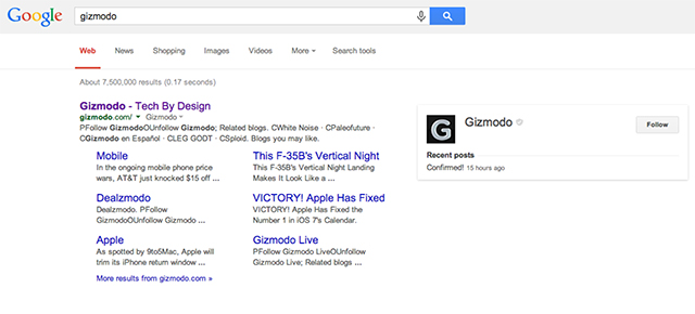
Yesterday, Google’s desktop search page got a redesign. Now it looks the same as Google’s mobile and tablet search pages — bigger titles and, notably, no more underline for linked text. Did you notice? And, if you did, which do you prefer?
I gotta admit, I felt like something looked unusual in my Google searches yesterday, but I couldn’t put my finger on it (that’s a touch-optimised interface joke, folks!). And maybe I’m just averse to change, but Google’s desktop browser search has looked the same since the 1990s. I got used to Google’s look. I liked the old look. So far, this one just feels weird to me. What do you think? [Jon Wiley via The Verge]