Tall Infographics Suck

Tall Infographics Suck

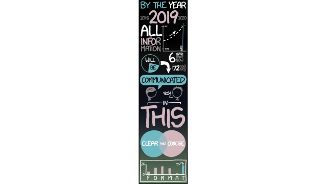
There’s an ever-increasing trend to display information in the form of tall, indecipherable infographics: long colourful panels that look like they contain a wealth of information but don’t. That’s not a good thing.

Like Randall Munroe says in today’s XKCD, “‘Big Data’ doesn’t just mean increasing the font size.” But then, if you can find any decent data on most of these kinds of infographics, do let me know. [XKCD]

Tall Infographics Suck

The Cheapest NBN 50 Plans

It’s the most popular NBN speed in Australia for a reason. Here are the cheapest plans available.

At Gizmodo, we independently select and write about stuff we love and think you'll like too. We have affiliate and advertising partnerships, which means we may collect a share of sales or other compensation from the links on this page. BTW – prices are accurate and items in stock at the time of posting.