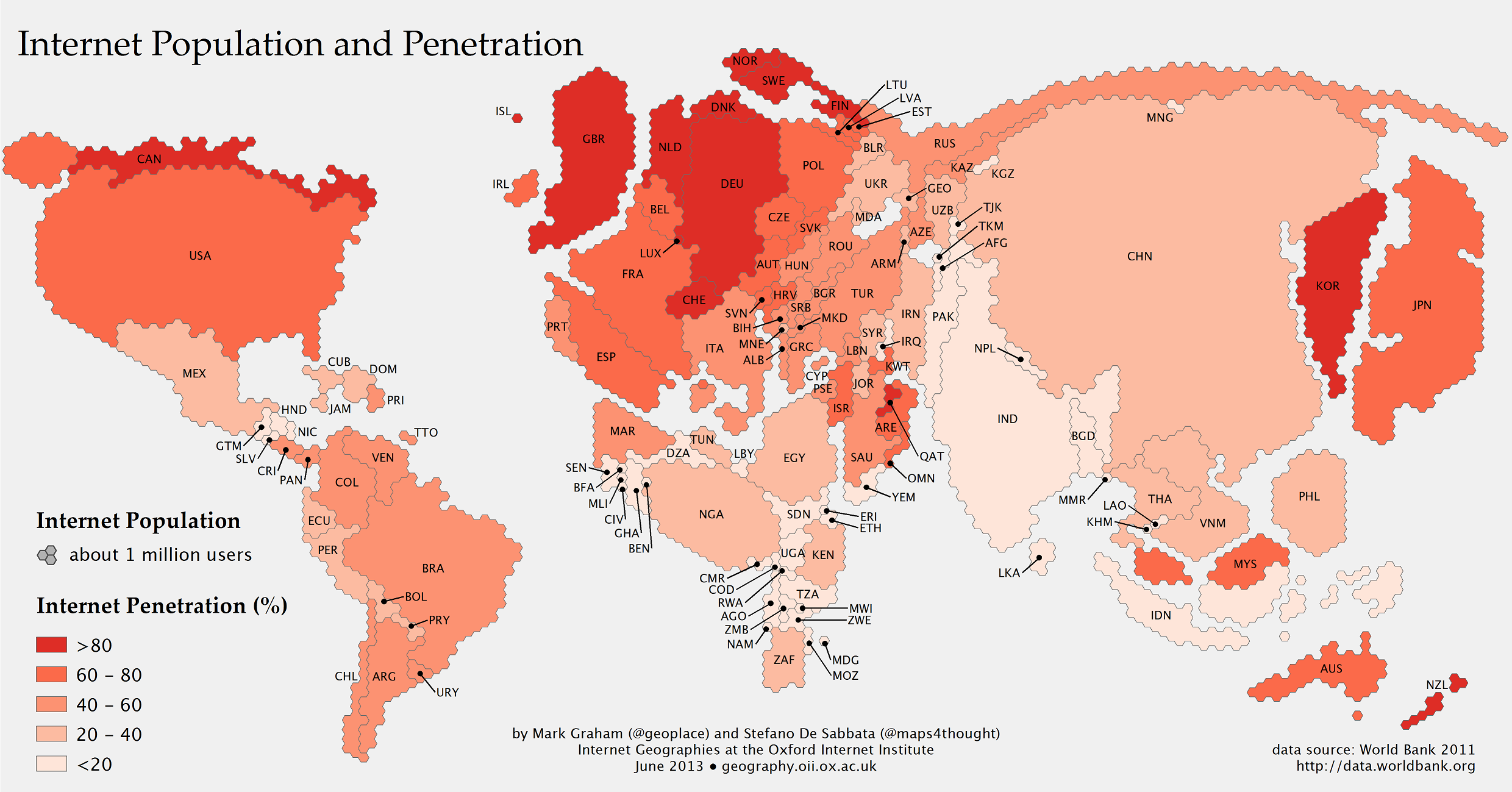
It’s surprisingly easy for us to become so enraptured with our own comfortable microcosm that we completely lose sight of how absolutely minuscule our little corner of the net actually is. This map by the Information Geographies project at the Oxford Internet Institute should put things back into perspective.
Taking 2011 data on both a country’s internet users and total population from the World Bank, this map actually presents us with two different bits of knowledge. The countries themselves are scaled up and down, depending on how much of the total internet population they’re contain. The colour of the countries, however, remains insular — the darker the red, the higher the percentage of that country’s population that’s online.
So in places like China, which boasts a huge number of internet users mostly due to the fact that it has a massive population in general, the percentage of citizens actually on the internet is way lower than some European countries. One thing this map doesn’t show us, however, is how quickly these countries are growing. Information Geographies notes in their findings:
Some African countries have seen staggering growth, whereas other have seen little change since we last mapped Internet use globally in 2008. In the last three years, almost all North African countries doubled their population of Internet users (Algeria being a notable exception). Kenya, Nigeria, and South Africa, also saw massive growth. However, it remains that over half of Sub-Saharan African countries have an Internet penetration of less than 10%, and have seen very little grow in recent years.
Still, all the people represented in the map only equal about one-third of Earth’s global population. So for the majority of the world, there is still a very, very long way to go. [Information Geographies via The Atlantic]