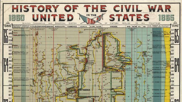
Back in the 1930s, the infographic scene was already humming with crazy products like the Histomap and its 4000 years of visualised history. But the roots of infographics go back even further. This intense visual recollection of the Civil War dates back to the 1800s.
The “History of the Civil War in the United States, 1860-1865” was published by The Comparative Synoptical Chart Company back in 1897. And while its gloriously complex form has been preserved by the Library of Congress in great detail, instructions on exactly how to read it properly seem to have been lost to time.
Along the sides you’ll notice a few columns that keep track of the value of a confederate dollar until it eventually plummets to nothing, but the frenetic linear orgy in the centre there is a little harder to make heads or tails of. But it’s still damned impressive.
You can take a closer look at a larger version below, or an insanely huge version over at the Library of Congress. Maybe you’ll learn something! If that’s you’re goal, Wikipedia might be a better option. [Library of Congress via Slate]