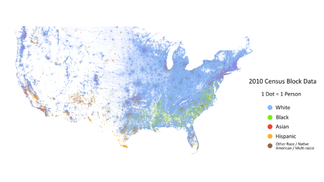
This map is covered in dots. In fact, there are 308,745,538 of the little things — each one representing a single individual living in the US, and its colour indicating ethnicity.
Sure, sorta similar maps have existed before, but none this detailed. Created by Dustin Cable, a demographer at the University of Virginia’s Weldon Cooper Center for Public Service, it’s based on the publicly available 2010 census and colours by ethnicity. He explains:
This map is an American snapshot; it provides an accessible visualisation of geographic distribution, population density, and racial diversity of the American people in every neighbourhood in the entire country. The map displays 308,745,538 dots, one for each person residing in the United States at the location they were counted during the 2010 Census. Each dot is colour-coded by the individual’s race and ethnicity. The map is presented in both black and white and full colour versions. In the colour version, each dot is colour-coded by race.
If this image isn’t enough for you, then you can go explore a fully zoomable version here. [Dustin Cable via Flowing Data]