One thing infographics are really good for is providing a sense of scale. Certain numbers are just too big to really comprehend, and can also be made to sound bigger or smaller than they actually are depending on how they’re presented. Let’s take shark finning as an example.
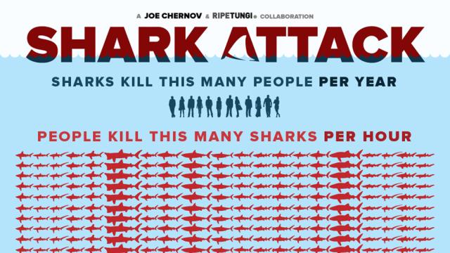
When fishermen remove sharks’ fins (sold to make things like traditional Chinese medicine and shark fin soup) and throw the disfigured animals back into the water, the sharks can’t swim or move properly and sink to the bottom of the ocean or are eaten by predators. Shark fins are big business, but you may not have heard a lot about the industry or understand the gravity of the issue. 100 million sharks are killed every year because of finning, but how big is that?
This infographic will help. And if it doesn’t impress upon you the number of sharks killed through finning you’re not really scrolling. Speaking of which, by the time you scroll to the bottom of the graphic about 73 more sharks will have died. The graphic also points out that sharks kill 12 people a year, which is not none, and therefore shouldn’t be trivialised. But the gravity of the finning situation is still clear. No soup for you. [Alltop]
