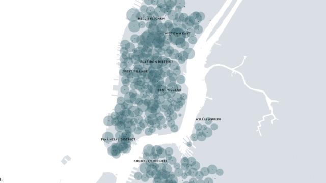
New York’s Citi Bike scheme has been up and running for a couple of months now — which means there’s a glut of data available to analyse. This interactive New Yorker visualisation shows how the bikes were used every 15 minutes between June 8 and July 8.
It does look a little chaotic, but there are some interesting trends in there. You can make out stacks of commuters in the week — especially towards the Financial District — and longer slower journeys at the weekends. Most fun though, as The Verge points out, is the mass migration west before the July 4 fireworks on the Hudson. What else can you see? [New Yorker via The Verge]