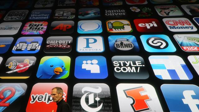
It’s no coincidence that the best and most popular apps frequently have striking and memorable icons. It might seem like just a colourful tile, but a good icon is critical piece of an app’s design that has a huge effect on how people think about and interact with what’s inside. Here’s a rare look at how Apple thinks icons should look, straight from one of the company’s design gurus.
Last week, Apple published the videos from all of its developer breakout sessions from this year’s WWDC. Most of it is deep, deep developer nerdery that’s of no interest to mortal human beings, but amongst the coder-babble is a wonderful overview of iOS design best practices. The whole hour-long shebang will really open your eyes if you’ve ever thought to yourself “gee, I really think this app is slick, but I have no idea why.”
The presentation begins with Apple Design Evangelist Mike Stern diving into the elusive art of app icon design. As Stern points out, an app icon doesn’t just entice you to buy when you’re shopping, it keeps you engaged once the app is on your phone or tablet. If an icon jumps out at you every time you look at it, you’re more likely to keep using it.
So how do you make a good app icon? Here’s the official Apple line on what works and what doesn’t, as well as some of the examples that Stern uses to illustrate his points.
Create a unique, striking shape
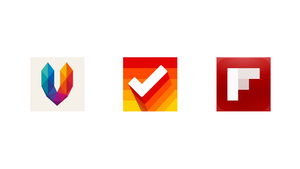
The central design element in an app icon should be an eye-catching shape you recognise instantly. Examples: Flipboard, Clear and Vyclone.
Stick to a limited colour palette
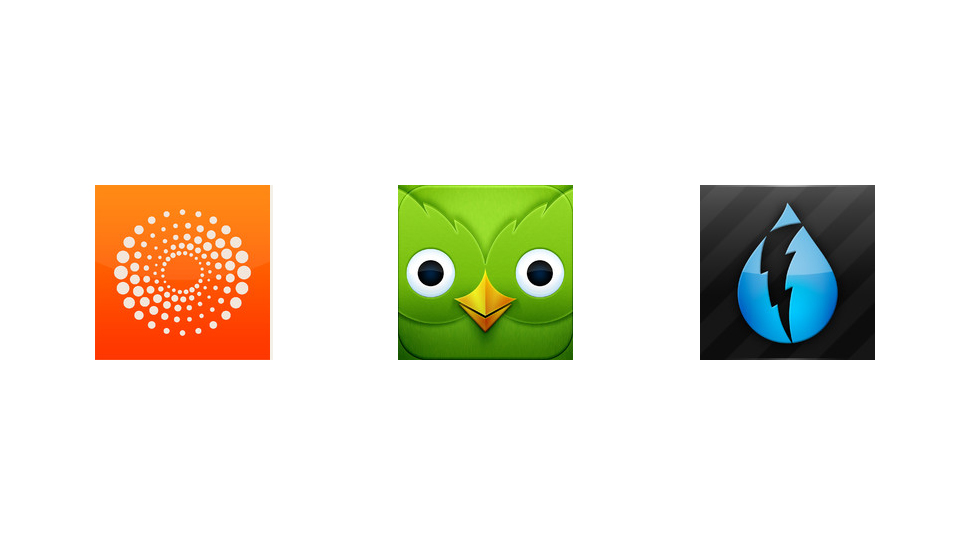
In general, it’s better to focus on a limited colour palette. You can do lots of colours, but it’s harder to pull off. Examples: Duolingo, Reuters, Dark Sky.
Avoid text whenever possible

This can be tricky in the case of apps for companies that aren’t strictly apps because most have logos that incorporate a company name. In these cases, it’s smart to try to reduce the logos to a simpler graphic element. Pocket is a perfect example of how to reduce a logo into an icon.
Icons should portray the “material” that’s inside tastefully
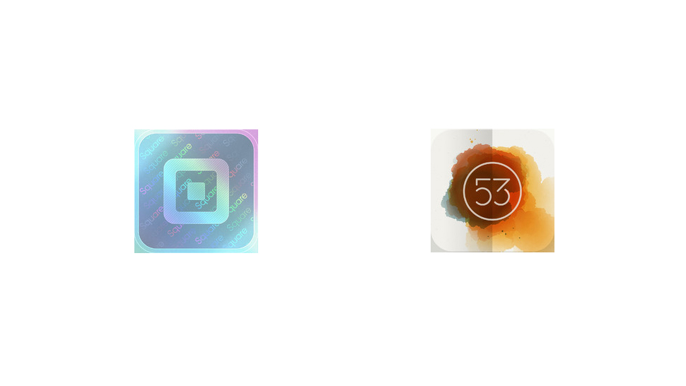
Stern is quick to point out that this particular note can sound dangerously close to the skeuomorphism, which Apple abandoned in iOS 7. The watercolor splotch on the icon for Paper reflects that it’s an art app. The hologram design for Square’s icon looks like the hologram on the back of your credit card. These are graphic elements used to serve a purpose rather than to simply adorn, as is the case with skeuomorphs.
Bottom line: Keep it simple
It all seems so marvelously simple doesn’t it? Indeed, like a lot of good design advice, it sounds obvious when it’s explained to you. That’s always been one of the beautiful parts of Apple’s approach: design so well executed it seems effortless.