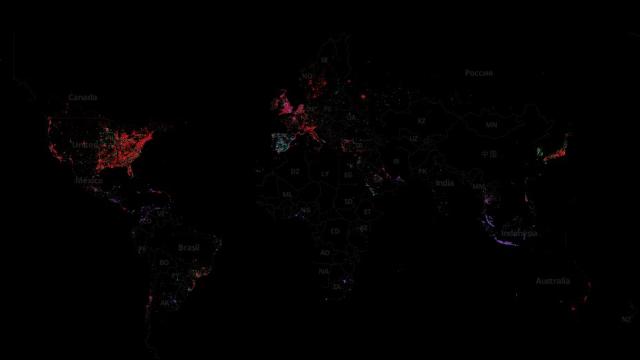
iPhone versus Android is a battle for the ages, and it will never really be settled. But now you can see which camp is claiming what territory with this map the that shows the geographic use of both devices across the entire world. Oh, and also there’s Blackberry.
Now to be fair, this isn’t a comprehensive map that indexes what kind of phone everybody uses for everything. Instead, Tom MacWright and data artist Eric Fischer used geotagged data from people posting to Twitter and threw it into MapBox for a visualisation. The result is that you’ll only see Twitter users, but it’s still a pretty representative (and huge) sample. After de-duplicating some 2.8 billion overlapping data-points, they still had 280 million unique locations to work from.
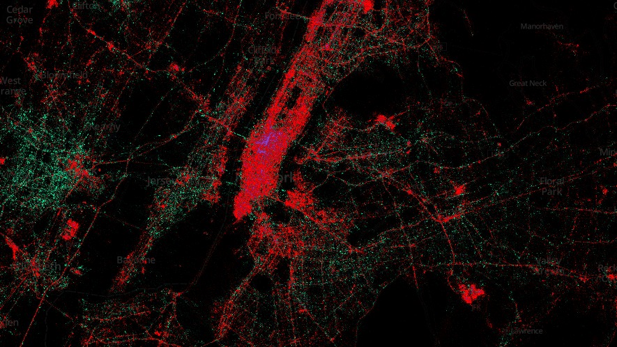
In Spain there’s hardly an iPhone at all, and Jakarta is Blackberry heaven. So poke around a little bit and see if there’s any hidden curiosities you can find. Are you living in enemy territory? Better find out for sure. [MapBox via The Atlantic Cities]