
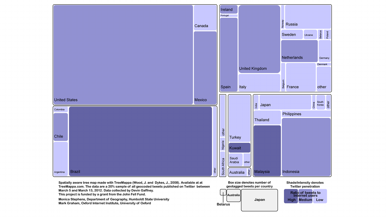
If you’ve ever wondered where all the world’s tweets come from, wonder no more. This visualisation, put together by researchers at the Oxford Internet Institute, shows the origins of the entire globe’s tweets.
The data set comprises a sample of 20 per cent of the planet’s geocoded tweets taken during a week-long period in March of this year. In total, that amounts to 4.5 million data points. The data (click on the image for a larger version) shows that the most prolific twitterers — for geocoded tweets, in absolute terms — are the United States, Brazil, Indonesia, the UK, Mexico and Malaysia, in that order.
The visualisation also shows, using colour intensity, Twitter penetration. In others words, the darker the rectangle, the higher the percentage of internet users on Twitter. That makes Brazil and Malaysia stand out as forward-looking countries. In that vein, the researchers write:
By mapping the distribution of tweets in the world it becomes apparent that Twitter is allowing for broader participation than is possible in most other platforms and media. In other words, it might be allowing for a ‘democratization’ of information production and sharing because of its low barriers to entry and adaptability to mobile devices. Similarly barriers to the dissemination of information, such as censorship, are also visible through the small proportion of tweets originating in China (home to the largest population of internet users in the world).
Of course, there are some limitations. The data could be slightly skewed, because only 1 per cent of all tweets are geocoded in the first place, and some countries may tend to geocode more than others. But, moans aside, it’s interesting to see the distribution. Any surprises that you can spot? [Oxford Internet Institute]