user interface
-
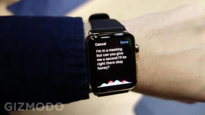
The Coolest Apple Watch Feature Is Silent, Invisible And 65 Years Old

On the first day of Apple Watch pre-orders, I put on a $17,000 wristputer and tried to figure out what was so special about it.
-
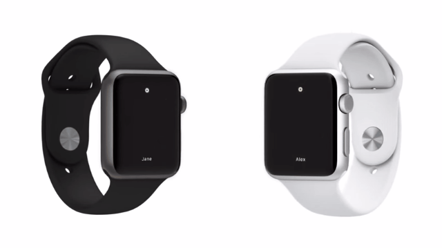
Apple Debuted A Brand-New Custom Typeface With Its Watch

Something I was watching closely as the Apple Watch was revealed today: Which typeface would grace this shiny, tiny new device? Well, it’s not Helvetica, the troublesome font that Apple recently adopted for its iOS and OS applications. It’s a brand-new typeface that was designed for excellent readability — by Apple.

-
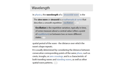
Do You Miss Google’s Old School Look?
Yesterday, Google’s desktop search page got a redesign. Now it looks the same as Google’s mobile and tablet search pages — bigger titles and, notably, no more underline for linked text. Did you notice? And, if you did, which do you prefer?

-
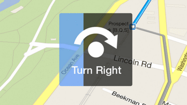
What Turn-By-Turn Navigation Should Look Like
The new Google Maps app was finally released, and I’m loving it so far. But it’s missing a feature I’ve been hoping to see map apps implement for some time. I have this problem where as soon as I pull up directions on my phone, whether right after entering my destination or getting out of…