icons
-

Who Designed The Weather Icons?

To modern eyes, they’re as intuitive as the alphabet: the bubbly cloud, the circle and its simplistic rays of sunshine. But our weather icons are actually pretty new inventions. Up until the 1970s, meteorologists used an enigmatic system of symbols to forecast the weather — until a design student came along and changed everything.

-
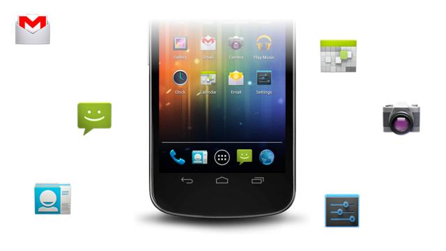
Android’s Tips For Beautiful Icon Design Are The Opposite Of Google’s

Today, Android published a helpful blog post offering up a list of design tips for developers slaving away over new app icons, encouraging them to use shadows, textures and micro detail. We’re watching Android grow up into its own distinct visual identity — independent even from Google mothership.
-
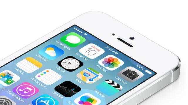
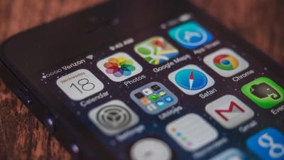
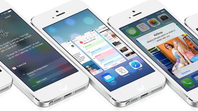
What’s Wrong With The iOS 7 Icons?
“It looks childish.” That was the first reaction I heard to iOS 7. I’m not going to lie — when I saw it for the first time, I freaked out a little too. Like any good simplicity-loving designer, I was eagerly waiting for Jonathan Ive to reveal a fresh, clean take on iOS.

-
Everyday Objects With Broken Image Icons Are Endlessly Frustrating
Is there anything more frustrating than a web page with a broken image icon? It’s so tantalising: what was I supposed to see, and am I missing out? Well, with this series of artworks by graphic designer Beom Young that frustration transfers to the real world. He explains: