data visualisation
-
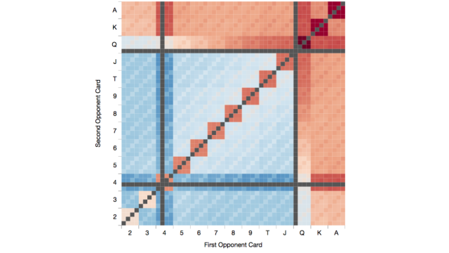
The Chances Of Your Texas Hold’Em Hand Winning, Visualised

The baize rubs against your wrist. A small bead of sweat rolls down your forehead. You ease the corner of your two cards from the table to glimpse at what you’ve been dealt. “How much chance do I have of winning with this,” you think. Well, if you had this neat visualisation, you’d be all…
-
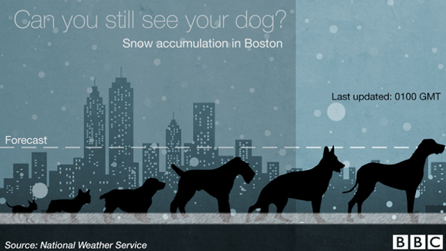
Judge The Depth Of Snow By Looking At Passing Dogs
Overnight, nearly a metre of snow is set to blanket the east coast. Or, if you don’t have a tape measure to gauge the fall, approximately one dog’s worth.
-
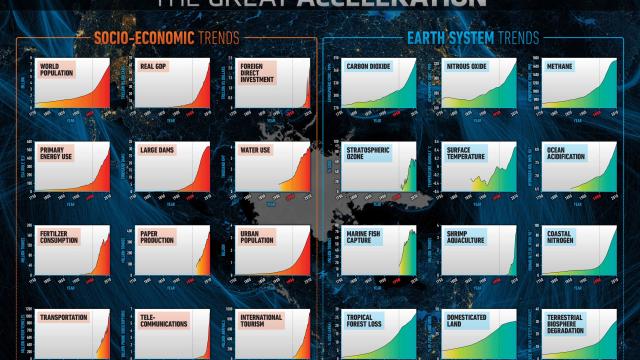
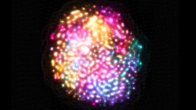
Graphic Clearly Shows Human Pressure On Earth Reaching Critical Level

Using 24 key social, economic, and environmental indicators, our friend Félix Pharand-Deschênes has created a dashboard that shows how human pressure on planet Earth is reaching critical level. Fast. The acceleration shown over the last 60 years is absolutely crazy. Zoom in. Freak out.
-
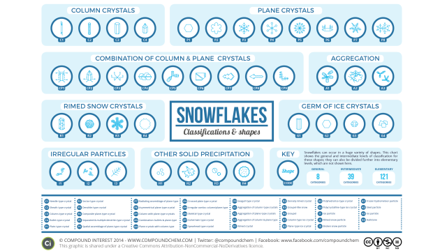
The Different Types Of Snowflake, Visualised
Snowflakes are endlessly fascinating and incredibly beautiful. But while they’re all (sort of) unique, they can be neatly divided into well-defined types of flake. This chart shows them all.