charts
-
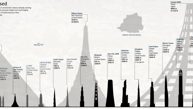
Neat Chart Shows The Tallest Planned Buildings In History

Briefly: The tallest building in the world? The Burj Khalifa. Duh. But if plans had worked out differently for other buildings, the Burj Khalifa wouldn’t even crack the top 10 tallest buildings in the world. Here’s a cool chart showing all the tallest planned buildings in the world. Some of them are still ongoing while…
-
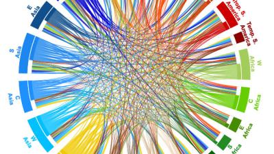
The Tallest Buildings On Each Continent Throughout History, Visualized
I love these fantastic charts from Halcyon Maps that show which skyscrapers or churches or temples or mounds of dirt or other structures that have been the tallest buildings on each continent throughout history. You can see the ridiculous skyscraper arms race that develop in each area over the years and see what outdid who.
-
Chart The Quality Of Your Favourite TV Show With GraphTV

Not convinced whether it’s worth sticking with The Wire, Game of Thrones or The Walking Dead? Kevin Wu’s Graph TV tool lets you see whether you’ve picked a winner. The site compiles a chart of users’ ratings of TV show episodes on IMDb, plotting the rise and fall of ratings over each season.
-
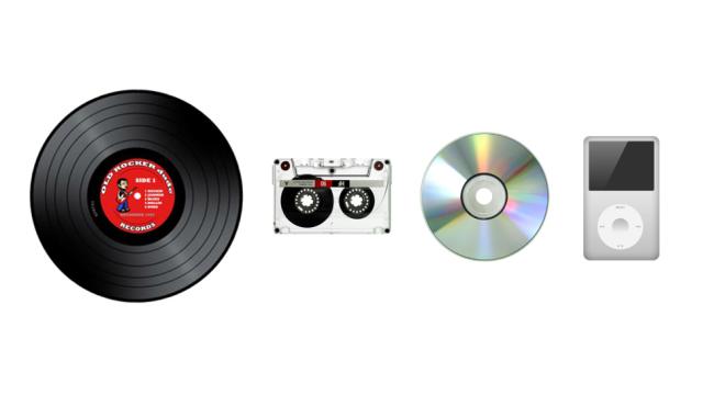
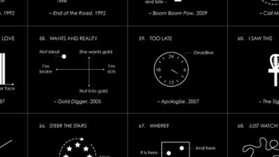
How Music Has Evolved In The Past 70 Years

As society changes, our favourite music changes too, and variations in musical memes are passed down through the years. To examine these changes in popular music, The Echo Nest data alchemist Glenn McDonald traced nine distinct audio attributes in the 5,000 songs from each year, 1950 to 2013. This demonstrates the ability of The Echo…