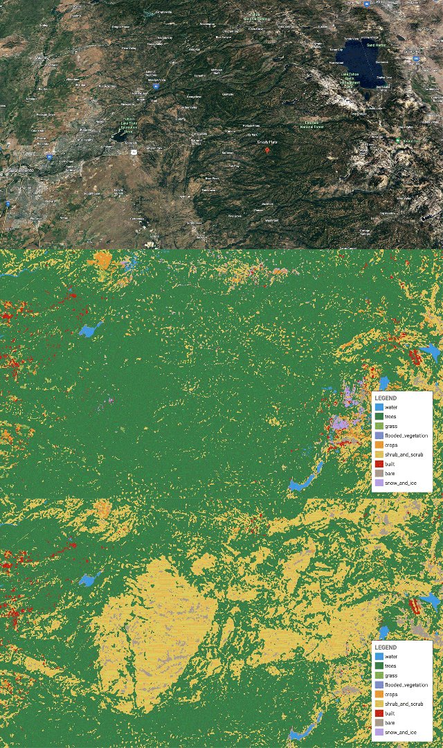
I can remember when Google Earth was merely a tool for me and friends to zoom in on our old streets and homes. I recall squinting at the screen trying to pick out if the satellites managed to pick out my stubby little head poking out the corner of the cul-de-sac where I lived.
Now with a new release from the tech giant showing off changes in land over time, I can now witness over-development creep over the land I once called home. In several year’s time, if my hometown is flooded over due to rising seas and coastal erosion, I will be able to use Google’s systems to see how and when things started to go wrong.
Google announced Thursday its new Dynamic World app — which uses the Google Earth engine — and actively displays how the earth’s surface is changing due to climate change and land development. The maps can display nine different land coverage types, such as water, trees, shrubland, or buildings. Using the map, users can show changes in tree growth, flooded areas, and human development in “near real-time.” Each pixel in the dataset represents around 102 sq km, using AI to conclude how likely a different type of ground covering will be available in that space.
The app was developed alongside the World Resources Institute, a nonprofit research group, to offer “an unprecedented level of detail about what’s on the land and how it’s being used — whether it’s forests in the Amazon, agriculture in Asia, urban development in Europe or seasonal water resources in North America.”
Craig Hanson, an executive with the WRI, wrote in Google’s post “the global land squeeze pressures us to find smarter, efficient, and more sustainable ways to use land.”
The site allows users to compare areas side-by-side from different dates, although the data only goes back to June 2015. The system advertises it produces 5,000 images every day, with the most up to date pictures as recent as two days ago.
Alongside the company’s forest fire tracking ability, Google is also promoting a new setting released Thursday that helps users track air quality through Google Maps. Google’s air quality layer takes information from the U.S. Environmental Protection Agency seen on AirNow.gov, alongside data from PurpleAir, a private air quality monitoring company.
Gizmodo has previously reported on the company’s in-browser app that lets users track air quality data with a Google search, but we found the system was rather spotty and inconsistent depending on what area you searched for. We also found that data for air quality in pockets with known breathability and pollution issues weren’t available using Google’s in-browser search, due to a lack of either government or private data.
The new map layer, which can be accessed by clicking on the layer button in-app, is much more user-friendly than the browser version. The new app offers data points from multiple spots within an area, most of which comes from PurpleAir’s home systems. Still, there is an issue with a lack of data for localised air quality data outside major urban centres.
A Google spokesperson told Gizmodo the company would be adding smoke data across the U.S. from the National Oceanic and Atmospheric Administration to its air quality map. They said that data should be coming to the air quality map layer “in the coming months.”
