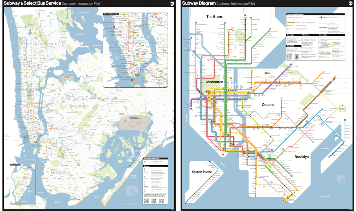
New York may get a reboot of the iconic 1970s subway map, if it likes. The Metropolitan Transportation Authority (MTA) is currently testing an update in nine stations, including Times Square and Grand Central; the MTA’s chief customer officer Sarah Meyer tells the Wall Street Journal that it’ll replace the current one if it goes over well.
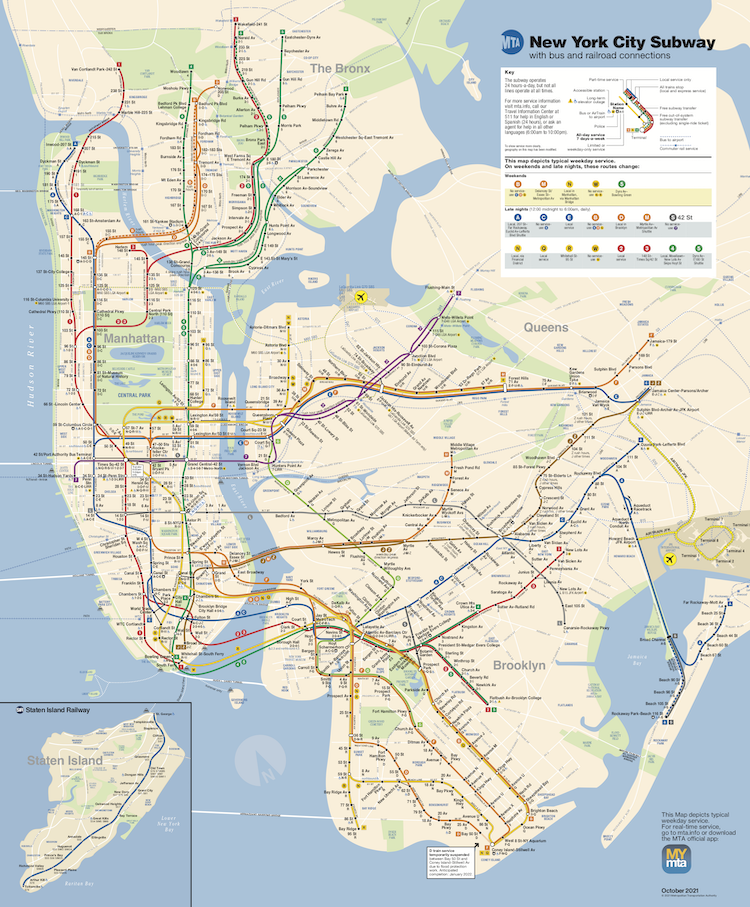
Unlike the current, more geographically accurate one, the new map strips out lakes and small islands, smushes Manhattan, and replaces the veiny network of tracks with a rectilinear schematic. Here’s the current one, in use since 1979:
It’s fine.
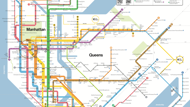
And here’s the new one, calling back to Italian designer Massimo Vignelli’s map, in use 1972-1979:
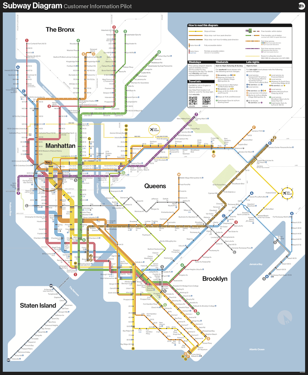
…which will be displayed alongside a geographically accurate one for good measure:
The MTA’s chief customer officer Sarah Meyer told the Wall Street Journal that she’s trying to “introduce this map in a way that doesn’t cause fear, introducing it gradually so people can get used to it.” Fear sounds like a wild reaction to a map, but redesigning the subway map is an explosive advancement in what’s become known as the map wars. People have proposed slow maps, with detailed landscapes labelling parks and neighbourhoods, and fast maps like the circles map that fans Manhattan and the boroughs out like a rainbow around Staten Island. There’s a map with no land at all and a more inclusive map that tidily incorporates the Long Island Railroad and Jersey City. Each makes assumptions about how much people need to know; if a tourist asks for directions, you can tell them to make a left, or you can give them five routes with restaurant recommendations.
The current map seems to have been designed with generosity in mind, conceived by tour guide and historian John Tauranac, who’d had no professional design training. Some designers consider it an embarrassment, with lines so delicate that you have to ask someone to move their hair to decipher them. But the more proportional, sprawling lines also give a more realistic estimate of how long it takes to get to JFK, and then the details recede into the subway car walls. Its beige islands have gentle, rounded coasts on a kind blue sea, a safe distance from Staten Island.
Soon, if New York goes for the update, the Earth will flatten into a Tetris block, various islands will sink beneath the ocean, and the Mob Wives will drift close enough to hit Manhattan with a high heel. Vignelli’s original map is a design manifesto in efficiency over redundant realism. Striking. Timeless. Clear, bright lines that straighten up the tangle of the dispersed track into tidy parallel angles. The arrangement helped earn Vignelli a reputation as “one of the greatest graphic designers of the 20th century.” Later in life, he maintained that his map was “perfect.”
But the map also infamously edited irrelevant parks and condensed landmasses, to the extent that people left the subway disoriented; in 2006, the New York Times wrote that “[t]ourists were getting off the subway at the bottom of Central Park and trying to stroll to the top, for example, expecting a 30-minute walk.” Manhattan is chonky, and the airport is for ants. Neighbourhoods where the subway ends are gone.
The map argument was so contentious that a 1978 debate between the designers at Cooper Union inspired a book. Vignelli said the new map made him want to “puke.” Tauranac later told Gothamist that Vignelli “felt that he was above it all.”
In 2006, Vignelli told the New York Times that he didn’t need spatial accuracy because that’s not the purpose of this map. “Of course I know Central Park is rectangular and not square,” he said. “Of course I know the park is green, and not grey. Who cares? You want to go from Point A to Point B, period.”
The sea is blue in the update. Assuming people don’t freak out, the timeline to retire the current one is unclear.